Enterprise SaaS storage for the world’s biggest [most detailed casestudy]

Before you start, I’d advise you to be on your PC for the best experience reading this case study.

Simplifying data management for the next billion users

The challenge was to simplify the user experience of an incredibly complex data management tool and enhance its adoption without compromising its advanced functionalities.

We needed to rebuild value to data-intensive industries and re-solidify our market position.

Before After
What does this product do?

Ngenea: the 24/7 global digital librarian for efficient data management and collaboration

Imagine a super-efficient librarian, but for the digital world. Ngenea not only stores a vast amount of data (our digital books), but also knows exactly where each piece is and can fetch it for you in a snap! The icing on the cake is they also make these digital books available to anyone, anywhere in the world. So if a company has offices in different locations, Ngenea helps them all work together on the same digital files, no matter where they are. It’s like having a global library that’s open 24/7!

Ngenea operates in the data management and storage industry, providing solutions for data-intensive workloads and global collaboration. The software manages and stores large volumes of unstructured data, enabling better insights and accelerated workflows across various industries.

The challenge

Overcoming complexity to improve user adoption and maximize capabilities

This tool though powerful, faced a significant challenge: its intricacy hindered efficient utilization of its extensive data capabilities. This complexity left Ngenea’s potential for streamlining workflows and enhancing global collaboration largely untapped. The tool’s intimidating nature for users hampered its adoption and limited its business efficiency impact.

Addressing this challenge required a nuanced approach: we needed to simplify the user experience while ensuring the tool’s advanced functionalities remained accessible and not overly simplified. But confident in our expertise, we embarked on a complete overhaul to make Ngenea more user-friendly in a bid to enhance its value for data-intensive industries and solidify its market position.

Roles & responsibilities

Collaborative efforts + my role in research, design, and testing

In this collaborative project that took approximately 7 months, I served as a hands-on designer on a two-person team, focusing on research, design execution and testing. Alongside Jonathan, the lead designer, I conducted 40% of our user research sessions, then led the documentation process to capture user insights and problems, setting the stage for our ideation.

Working closely with Jonathan, who managed the overall design strategy and stakeholder communications, we jointly engaged in deep ideation to develop new features and modifications. My role further evolved to include conducting testing sessions, using feedback to iterate and refine our design prototypes. Additionally, I worked to ship Pixit’s first design system, ensuring its practicality and relevance in collaboration with developers.

Besides developers, we collaborated closely with several key stakeholders, including the Head of Development at Pixit Media and Kalray DMS, the Head of Research and Development at Pixit Media, the Head of Development Services at Pixit Media, the VP of Product at Pixit Media, and the CEO.

The redesign

First the destination, then the journey

Unlike other case studies you might have read in the past, this one will be a bit different. First, I will be showing you the solutions and interfaces we ideated. Then, I will walk you through how we derived these solutions from the extensive research I and my partner conducted over many hours. 

BUT If you are more interested in the research and ideation phases of this project, please click the button below to skip the visuals and go directly to the discussion about the design process for this project.

or

*Please note that some screens may show placeholder text instead of the final version. Also, there might be slight deviations from the final product. All of this is due to legal reasons.

Search flow

The power to find needles in any haystack

How could we give users the ability to sift through thousands of files with the highest accuracy?  How could we align the functionality of our search mechanism with the thought processes of our users?

It’s a Monday morning, and Charles the animator resumes work, brimming with enthusiasm. He executes his first task smoothly, but when it’s time for his second task, he encounters a problem.

The assets he needs for this project are scattered throughout the file storage system. He needs to find files that contain specific prefixes and exclude those with certain phrases, all while filtering for a specific filetype. Accomplishing this seems impossible with the existing, limited search functionality, leaving him frustrated.

Situations like this and more are what we wanted to solve, we wanted to give users a search tool that allowed them specify exactly what they wanted to see and not see in their search results.

*Click on any image to expand it for a clearer view.

Initial basic userflow to kickstart ideation

Users can replicate their search thought process by combining rules, including or excluding specific words, phrases, or word parts. For example, a search might be: Show files that contain “rand” but do not contain “car.” Also, show files that contain the exact word “range” or the phrase “red hot lava.”

Build your search and execute.

Explore search results.

Edit your search setup on the fly.

The search process begins by building search queries, then applying filters to refine the results.

After executing the search, search results are shown detailedly.

Media files can be previewed directly from the search results page.

Here’s a user flow diagram of the high-fidelity screens, illustrating how they connect.

File browser flow

Enabling effortless folder navigation

How do we optimize the file browser interface to intuitively align with the user’s natural browsing habits and expectations? How do we integrate advanced but user-friendly tools in the file browser to handle large-scale file management efficiently?

The seasoned project manager at XY media, Jane, knows exactly where the files she needs are in the storage system. However, the outdated, inefficient user interface constantly slows her down. She needs to quickly select and send specific files for jobs or sync them with other sites for her team’s urgent projects.

But despite knowing the file locations, the old UI complicates her task, making it a frustrating, time-consuming challenge due to poor navigation, limited file visibility, and a tedious selection process. The absence of user-friendly features leads to a clumsy, inefficient workflow.

Problems like these are what we sought to tackle. After talking to many users, the need for a redesign of the file browsing UI became evident. We aimed to address these pain points by offering clear navigation, quick file access, and streamlined operations, ultimately enhancing productivity and user satisfaction. And that’s exactly what we did.

*Click on any image to expand it for a clearer view.

Initial basic userflow to kickstart ideation
Before After

Here’s a user flow diagram of the high-fidelity screens, illustrating how they connect.

Site flow

Management at scale

How can we enable users to efficiently and in real-time manage Pixtor storage devices at various global sites? How can we prevent mistakes in the modification of mission critical settings?

Tom, the sites manager at GlobalTech Solutions, is adept at overseeing the company’s Pixit Pixtors, a series of advanced storage devices located in various countries. These devices are crucial for storing and managing the company’s extensive data. However, Tom’s expertise is constantly challenged by the Pixtors’ complex interface. With a user experience that requires specific coding skills for basic operations, Tom struggles to efficiently manage these international storage systems. This complicated interface not only slows him down but also affects his team’s productivity, making data management across borders a tedious and time-consuming task.

Problems like these are what we sought to tackle. After talking to many users, the need for a redesign of the site management UI became evident. We aimed to address these pain points by offering clear navigation, quick settings access, and streamlined operations, ultimately enhancing productivity and user satisfaction.

*Click on any image to expand it for a clearer view.

Initial basic userflow to kickstart ideation
Before After

Below are some screens from before the redesign

And these are screens from after the redesign:

Create site flow

Here’s a user flow diagram of the high-fidelity screens, illustrating how they connect.

Jobs flow

Effortless file movement

How can we enable users to efficiently and in real-time manage Pixtor storage devices at various global sites?

Alice, the CTO at Creative Media Inc., faces daily challenges with Pixit’s Ngenea Hub in managing global data flows. Despite her expertise, the complexity of orchestrating tasks like migration and hydration is daunting. The system demands technical prowess, often leading to delays as Alice relies on her team for even basic operations. This bottleneck in the job flow not only strains resources but also impedes quick data access across branches, magnifying the difficulty in balancing storage costs and data availability. The necessity for manual intervention and coding for routine tasks exacerbates these issues, making efficient global data management an elusive goal for Alice and her team.

In response to user feedback, we revamped the Ngenea Hub’s jobs flow interface for easier use. The redesign focused on simplifying task management, such as migration and hydration, and provided clearer navigation, quick settings access, swift error detection, and efficient error resolution and escalation. This enhanced productivity and user satisfaction in data management and orchestration.

*Click on any image to expand it for a clearer view.

Initial basic userflow to kickstart ideation

Here’s a user flow diagram of the high-fidelity screens, illustrating how they connect.

User flow

Easy user management

How can we intelligently simplify user creation and profile management in Ngenea Hub?

In the bustling tech hub of Silicon Valley, Jordan, the Head of IT at Dynamic Tech Solutions, grapples with the challenges of managing user profiles and access controls within the company’s proprietary platform, QuantumNet. Despite his vast experience, the task of creating user profiles, assigning roles, and managing the groups these profiles belong to is a herculean effort. The platform’s interface is not as intuitive as he’d like, turning what should be simple administrative tasks into complex puzzles.

Each day, Jordan finds himself navigating a labyrinth of menus and options just to onboard new employees, assign them to the correct roles, and ensure they have access to the necessary resources. The manual process is time-consuming and prone to errors, often requiring repeated adjustments to get everything just right. This inefficiency is a thorn in the side of productivity, as Jordan and his team are frequently pulled away from their primary responsibilities to address user management issues.

In response to user feedback, we revamped the Ngenea Hub’s user management flow. The redesign focused on simplifying the management of user profiles and groups with a blend of automation and intuitive design.

*Click on any image to expand it for a clearer view.

Initial basic userflow to kickstart ideation

User groups | creation & editing

User profiles | creation & editing

User profiles | creation & editing

Here’s a user flow diagram of the high-fidelity screens, illustrating how they connect.

Policy flow

Smart policy management

How can we enable users to efficiently and in real-time manage Pixtor users at various global sites?

Alice, the CTO at Creative Media Inc., faces daily challenges with Pixit’s Ngenea Hub in managing global data flows. Despite her expertise, the complexity of orchestrating tasks like migration and hydration is daunting. The system demands technical prowess, often leading to delays as Alice relies on her team for even basic operations. This bottleneck in the job flow not only strains resources but also impedes quick data access across branches, magnifying the difficulty in balancing storage costs and data availability. The necessity for manual intervention and coding for routine tasks exacerbates these issues, making efficient global data management an elusive goal for Alice and her team.

In response to user feedback, we revamped the Ngenea Hub’s jobs flow interface for easier use. The redesign focused on simplifying task management, such as migration and hydration, and provided clearer navigation, quick settings access, swift error detection, and efficient error resolution and escalation. This enhanced productivity and user satisfaction in data management and orchestration.

*Click on any image to expand it for a clearer view.

Initial basic userflow to kickstart ideation

Policies

Here’s a user flow diagram of the high-fidelity screens, illustrating how they connect.

Policy flow

Smart settings control

How can we enable users to efficiently and in real-time manage Pixtor users at various global sites?

Alice, the CTO at Creative Media Inc., faces daily challenges with Pixit’s Ngenea Hub in managing global data flows. Despite her expertise, the complexity of orchestrating tasks like migration and hydration is daunting. The system demands technical prowess, often leading to delays as Alice relies on her team for even basic operations. This bottleneck in the job flow not only strains resources but also impedes quick data access across branches, magnifying the difficulty in balancing storage costs and data availability. The necessity for manual intervention and coding for routine tasks exacerbates these issues, making efficient global data management an elusive goal for Alice and her team.

In response to user feedback, we revamped the Ngenea Hub’s jobs flow interface for easier use. The redesign focused on simplifying task management, such as migration and hydration, and provided clearer navigation, quick settings access, swift error detection, and efficient error resolution and escalation. This enhanced productivity and user satisfaction in data management and orchestration.

*Click on any image to expand it for a clearer view.

Initial basic userflow to kickstart ideation

Ngenea target | Add, Edit, Explore

Identity management

Profile

Edit SMB & NFS Advanced settings

Shares | Add, Edit, Explore

Here’s a user flow diagram of the high-fidelity screens, illustrating how they connect.

How we built all this: The design process

My design process, consisting of four distinct parts, reflects a comprehensive approach to problem-solving and innovation. Below is an articulated description of each stage:

1. Research:


In this initial phase, I immerse myself in understanding the company’s context, delving deeply into the problem space and the business environment in which it operates. This involves gathering extensive information and insights about the company’s goals, challenges, market dynamics, and user needs, laying a robust foundation for the subsequent stages.

2. Ideate:


Building upon the findings from the research, this stage is where I synthesize the gathered data into actionable design insights. It involves brainstorming, conceptualizing, and formulating design recommendations and solutions. This creative process transforms theoretical knowledge from the research phase into practical, innovative ideas that can address the identified challenges.

3. Create:


I start with crafting low-fidelity wireframes, which serve as the initial visual representation of the ideas. These wireframes gradually evolve into high-fidelity designs and eventually into interactive prototypes. This step-by-step enhancement allows for a detailed exploration of the design’s functionality and aesthetics, ensuring that the final product is both user-friendly and visually appealing.

4. Test and Iterate:


This phase involves rigorous user testing of interactive prototypes, gathering crucial feedback on usability and user preferences. Based on this feedback, the design is refined and enhanced, potentially revisiting earlier stages for modifications. This iterative process of testing and refining ensures that the final product effectively meets user needs and expectations, resulting in a robust, user-friendly solution.

Business discovery meetings

Learning about the company

The early business discovery process for the Pixit Ngenea Hub redesign was critical for several reasons, and learning from this phase informed our foundational strategy.

Why Early Discovery Was Essential
  1. Understanding User Needs and Market Demands: The media and entertainment industry, being Pixit Media’s primary market, is dynamic and technologically evolving. Early discovery helped us understand the specific needs and pain points of our users, including their expectations from data management and workflow solutions. This understanding was vital to tailor the redesign to meet these needs effectively.

  2. Identifying Technical and Design Gaps: By assessing the current state of Ngenea Hub, including its features, capabilities, and challenges, we pinpointed areas where improvements were necessary. This early recognition of issues like the complex user interface and limited customization options set the direction for a user-centric redesign.

  3. Aligning with Business Objectives: The discovery process aligned the redesign with broader business goals, such as boosting user adoption, enhancing customer satisfaction, and expanding market share. Understanding these goals early on ensured that every aspect of the redesign contributed towards these overarching objectives.

  4. Setting Realistic Redesign Objectives: The early discovery phase helped in setting clear, achievable redesign objectives. Knowing what we needed to improve, from the user interface to system performance, allowed for more focused and strategic planning.

Key Insights
  1. Integration and Market Position: Ngenea’s robust integration capabilities with storage platforms and creative applications position it strongly in the media industry.

  2. User Interface Challenges: The current interface is complex and outdated, necessitating a redesign for improved intuitiveness and modernity.

  3. Performance Issues: Enhancing performance, especially under heavy data loads, is crucial for handling large-scale media workflows.

  4. Advanced Functionality: Ngenea2’s AI-assisted insights and cloud integration mark significant advancements, emphasizing the need for continued functional enhancement.

  5. Scalability and Flexibility: Maintaining and improving the software’s scalability and flexibility to meet diverse business needs is essential.

  6. Global Collaboration: Enhancing multi-site collaboration capabilities and reducing data replication costs are key for global operations.

  7. Business Goals Alignment: The redesign should aim to increase user adoption, customer satisfaction, and market share, reinforcing Pixit Media’s innovation-led approach.

In conclusion, this early business discovery process was not just a preliminary step but a foundational phase in the Pixit Ngenea Hub redesign. It provided the critical insights and direction needed to ensure that the redesign was user-focused, technically advanced, and strategically aligned with business objectives in the competitive media and entertainment industry.

Target audience analysis

Who are our users and who do we want to attract?

In our Pixit Design Project, understanding Pixitmedia’s target audience was key. The goal of this phase was to align Pixitmedia’s solutions with its users’ needs, crucial for enhancing user experience and satisfaction.

Pixitmedia aims to reach a wide range of users, including experts and groups in media processes, data handling, visual effects and animation, post-production, broadcasting and media services, and design firms. These users need specific solutions for managing data and content. They look for systems that are advanced, can grow with their needs, and are efficient.

Key Learnings
  1. Diverse Audience: Catering to a wide range, from media companies to individual creative professionals.
  2. Data Management Needs: Emphasis on security and efficiency, underlining the need for robust data platforms.
  3. Global Audience and Varied Sizes: Solutions must be scalable and adaptable for a global market.
  4. Technology Trends: Adaptation to emerging trends like AI is vital for staying relevant.
  5. Effective Marketing Channels: Identified as industry events, digital presence, and content marketing.
Key performance indicators

What are the goals?

The development of Key Performance Indicators (KPIs) for this project involved thorough analysis and cross-team collaboration. These KPIs, addressing user satisfaction, workflow efficiency, and system reliability, were integral to evaluating the success of the redesigned interface. This process highlighted the importance of aligning technical development with user needs, engaging stakeholders effectively, and remaining adaptable to market feedback. Ultimately, creating these KPIs not only guided the project’s success but also enhanced our strategies in project management and user-centric design.

These KPIs provide a comprehensive framework to measure the success and impact of the software redesign, focusing on user experience, operational efficiency, and market engagement.

You can find the KPIs in the document below.

Company dictionary

Keeping track of important terms

As we delved deeper into the project, I realized that there were terms that came up often which I was not familiar with, but which were essential to how the entire system works. To help both myself and my co-designer, I started documenting these terms and their meanings. Then, with a bit of personal research online and from the company’s internal development document base, I made simpler definitions of these terms to help me think about these terms more flexibly, in ways that would promote ideation.

Documenting these terms was crucial because it provided a clear understanding of essential concepts, fostering effective communication and collaboration within the team, and aiding in more creative and informed decision-making throughout the project.

You can view it in the document below

Competition analysis

What is the competition doing?

For the Pixit Ngenea redesign project, conducting comprehensive competitive research was a critical step. This research served several key purposes:

  1. Understanding Market Position: By comparing our product with those of competitors, we gained insight into where Pixit Ngenea stood in the market. This helped identify our unique selling points and areas where we lagged behind.

  2. Identifying Industry Trends: Analyzing competitors allowed us to spot emerging trends in features, technology, and user preferences. Staying abreast of these trends ensured that our redesign was not only contemporary but also forward-looking.

  3. Informing Feature Development: By focusing on the presence or absence of features in competing products, we could strategically decide which features to enhance, introduce, or possibly remove. This informed our development priorities to meet and exceed market expectations.

  4. SWOT Analysis: Understanding the Strengths, Weaknesses, Opportunities, and Threats related to both Pixit Ngenea and its competitors was vital. This analysis provided a balanced view of our position relative to others, helping us leverage strengths, address weaknesses, seize opportunities, and mitigate threats.

  5. Refining Marketing and Positioning Strategies: By analyzing competitors’ marketing strategies, we could adapt and refine our own strategies. This helped in positioning Pixit Ngenea effectively in the market, targeting the right audience with more precision.

Execution of Competitive Research

The execution of this competitive research likely involved several stages:

  1. Data Collection: Gathering detailed information about competitors’ products, including feature lists, pricing, user reviews, and marketing materials. This could have involved online research, market reports, and user feedback.

  2. Feature Comparison: Closely examining each product to compare features with those of Pixit Ngenea. This step was crucial to understand how our product matched up against others in terms of functionality and user experience.

  3. SWOT Analysis: Each competitor’s strengths, weaknesses, opportunities, and threats were analyzed. This would have required a deep dive into market data, user perceptions, and industry trends.

  4. Product Offering Analysis: Assessing the overall value proposition of competitors, including their product portfolios, to understand how Pixit Ngenea’s offerings could be diversified or improved.

  5. Marketing Strategy Review: Analyzing competitors’ marketing strategies entailed looking at their advertising channels, messaging, and target demographics. This would help in crafting a more effective marketing approach for Pixit Ngenea.

  6. Synthesis and Reporting: The final stage would involve synthesizing all the gathered data into actionable insights. This likely included preparing comprehensive reports and presentations to inform the redesign strategy and decision-making process.

Through this meticulous process, the competitive research for the Pixit Ngenea redesign project provided a robust foundation for strategic planning, ensuring that the redesigned product was well-positioned to meet market demands and stand out in a competitive landscape.

 
Key Learnings from Competition Research Exercise
  1. Platform Strengths:

    • Ngenea Hub: Notable for its powerful features and robust security, key for media and entertainment sectors.
    • Competitors: Offer effective data sharing and collaboration; some focus on high-performance and real-time collaboration, critical in media workflows.
  2. Identified Weaknesses and Differentiation Opportunities:

    • Ngenea Hub: Improvement needed in user training and integration capabilities.
    • Competitors: Challenges include limited support for diverse cloud services and high complexity in deployment. Ngenea Hub can differentiate by enhancing its cloud integrations and simplifying user experience.
  3. Growth Opportunities:

    • Market trends lean towards enhancing cloud support and developing integrated solutions. Ngenea Hub could capitalize on this by expanding its cloud service offerings and partnerships.
  4. Market Threats:

    • The rapidly evolving data management landscape presents intense competition, requiring Ngenea Hub to continuously innovate and adapt.
  5. Unique Selling Points:

    • Each platform has distinct features; Ngenea Hub’s integration with Pixit Media’s storage solutions and its focus on media workflows are key differentiators.
  6. Product Range and Market Adaptation:

    • Competitors offer a diverse range of storage solutions. Ngenea Hub might explore broadening its product offerings to cater to wider market needs, particularly in data-heavy sectors like AI and genomics.
  7. Marketing Strategy and Target Audience:

    • Competitors use varied marketing tactics, highlighting specific use cases and integration features. Ngenea Hub can attract its media-centric audience by emphasizing its tailored solutions for global media workflows.

We also analyzed the interfaces of other companies in the space.

We also analyzed our own interfaces over a number of meetings. For privacy reasons i have scribbled out certain details.

This then informed the features comparison phase.

In essence, all of these analysis underscores the need for Ngenea Hub to focus on user-centric innovations, expand its cloud capabilities, and strategically market its unique strengths in the competitive data management sector.

User research report

Which users do we want to talk to?

The user recruitment screener for Pixitmedia’s software redesign is key for selecting diverse participants, ensuring the research addresses a wide range of user needs. It collects data on participants’ experience with Pixitmedia products, technical proficiency, industry background, and specific challenges with current software, alongside their availability for research activities.

This screener is crucial for a few reasons: it helps in choosing a representative sample of users, aligns research with real-world user issues, streamlines scheduling for interviews and tests, and establishes trust through upfront consent and privacy acknowledgments. These aspects are essential for a user-centric redesign and ethical research conduct.

You can find some of the recruitment questionsin the document below.

Research report

Documenting learnings

In the Pixit redesign case study, user feedback was systematically documented through a structured approach, ensuring comprehensive analysis and solution ideation. This method entailed:

  1. User Statement: Captures exact or paraphrased user interview statements, providing raw data for insight derivation.
  2. Problem Identified: Concisely defines the problem based on the user’s statement.
  3. Desired Functional Outcome: Outlines users’ expected functional benefits from solving the identified issue.
  4. Desired Emotional Outcome: Focuses on the emotional satisfaction users anticipate upon problem resolution.
  5. Heuristic Violated: Identifies which usability heuristic the current system violates, based on the problem.
  6. Severity Rating: Assigns a 1-5 severity rating to each problem, indicating urgency and impact.
  7. Actionable Recommendation: Brainstorms preliminary solutions addressing the problem and fulfilling user outcomes.
  8. Implemented Solution Feature: Initially blank; post-solution, summarizes what was built, allowing comparison with initial recommendations.

This tabular approach creates a clear, logical flow from user feedback to implemented solutions, crucial for user-centered design in Pixit’s case study. 

If you want to learn more about this documentation method, click here.

Some of the key themes of identified problems that emerged from the research were:

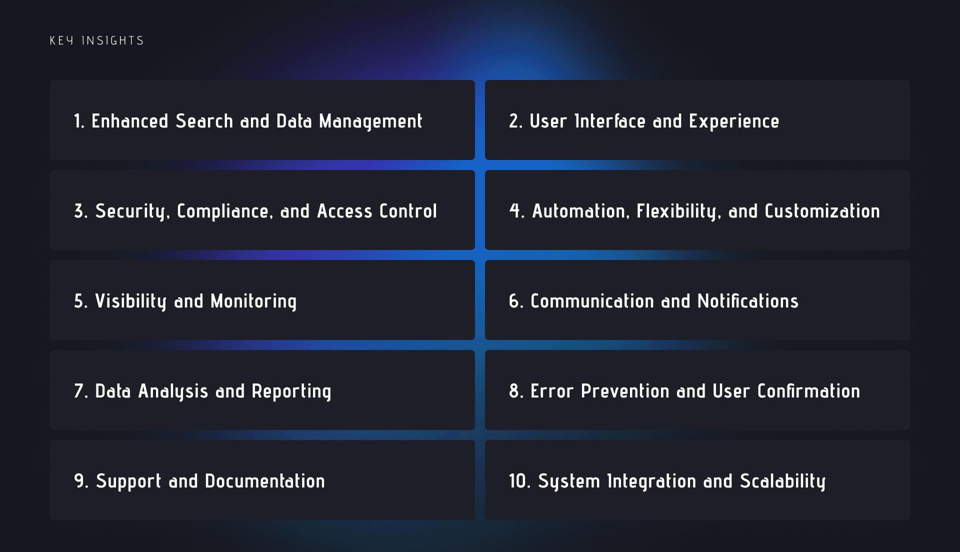
Based on the provided research reports, the major themes and insights can be condensed into the following key areas:

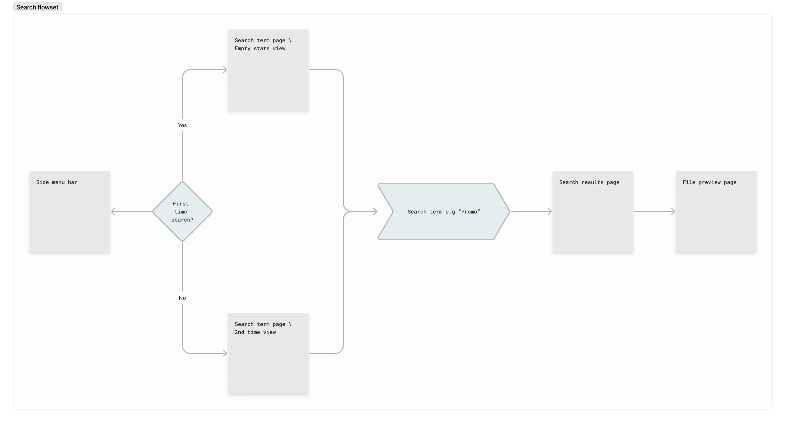
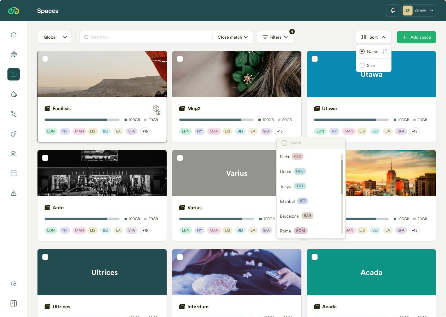
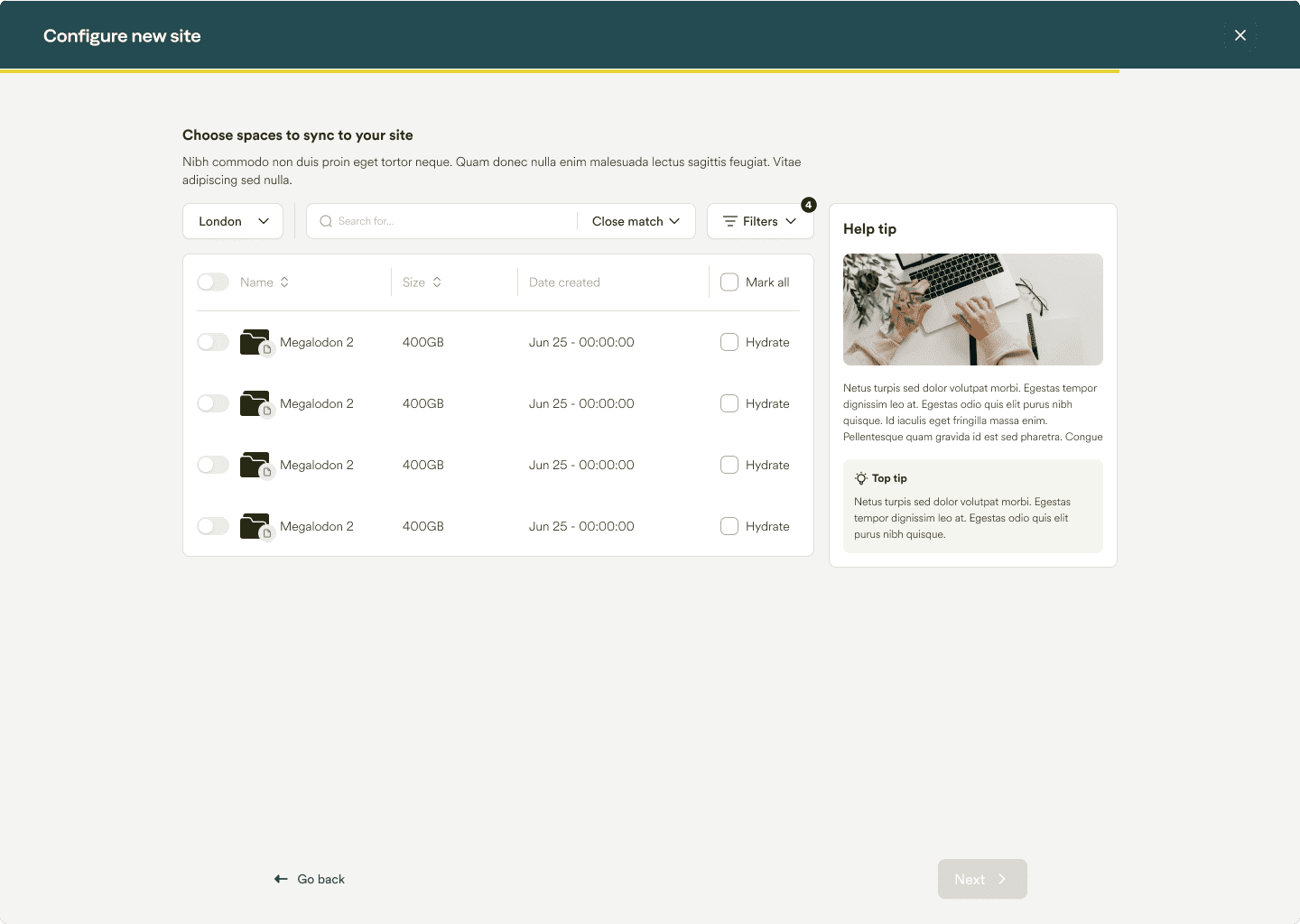
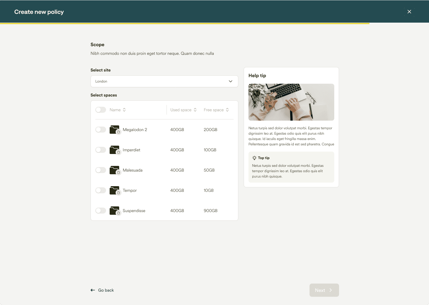
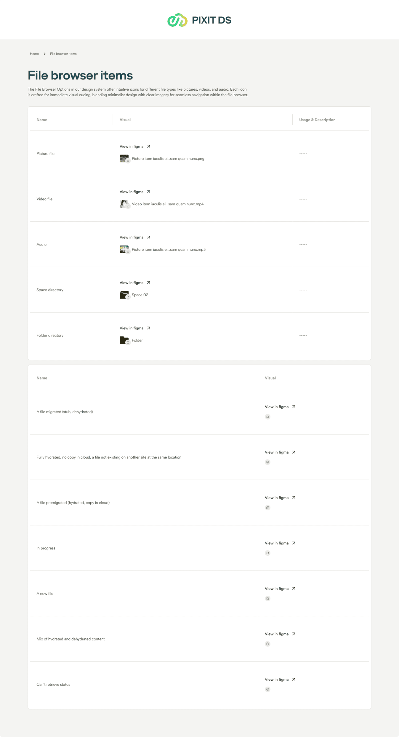
1. Enhanced Search and Data Management:
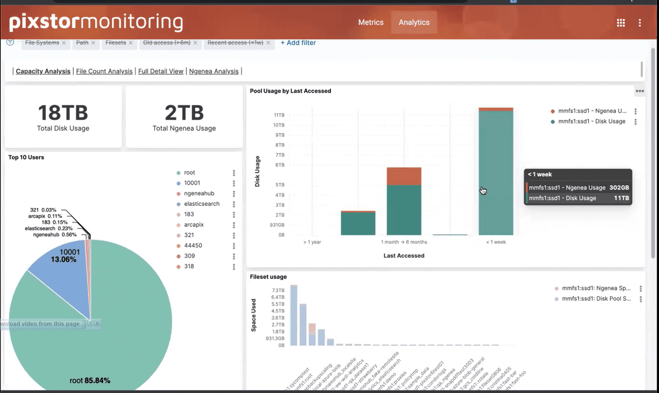
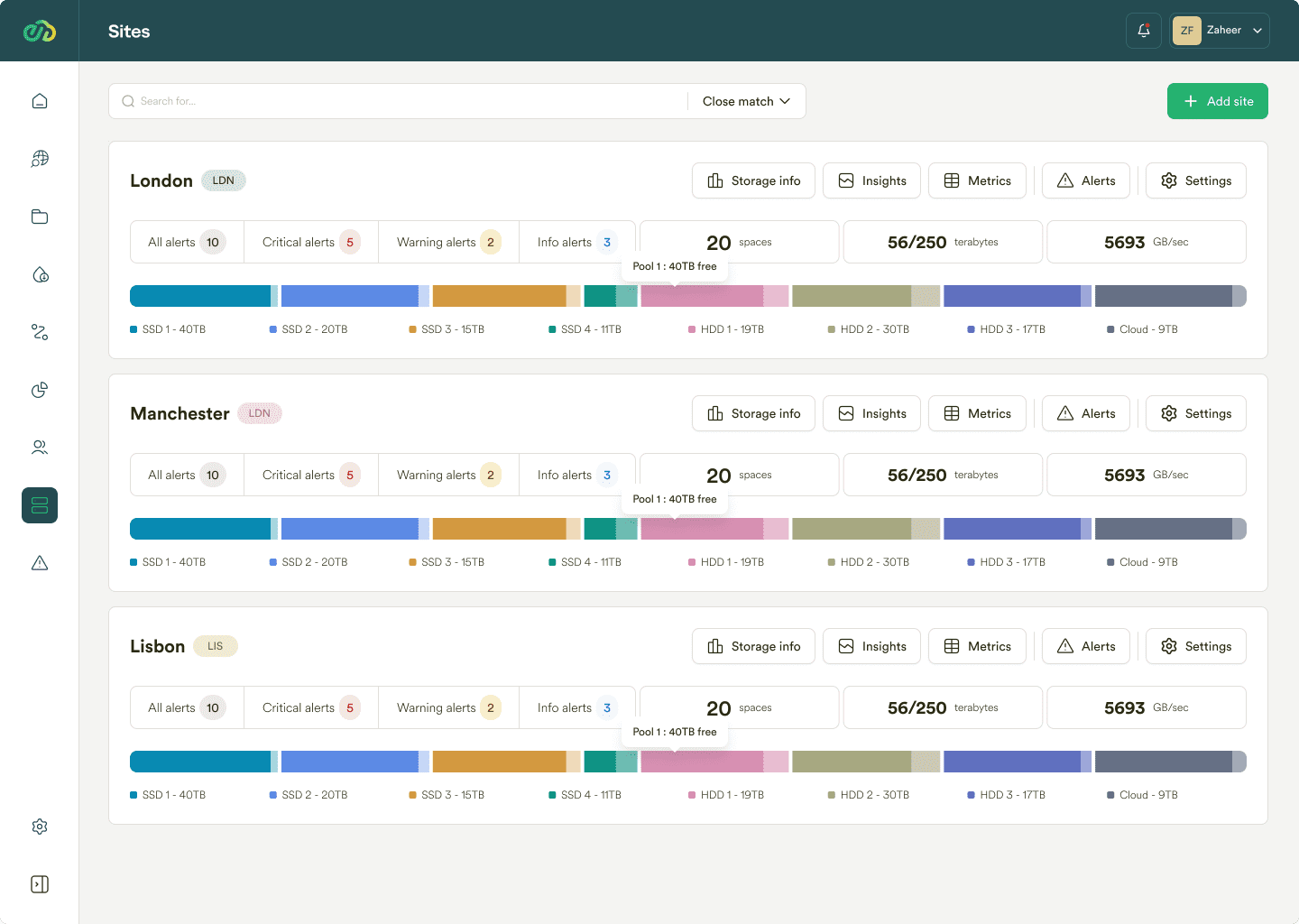
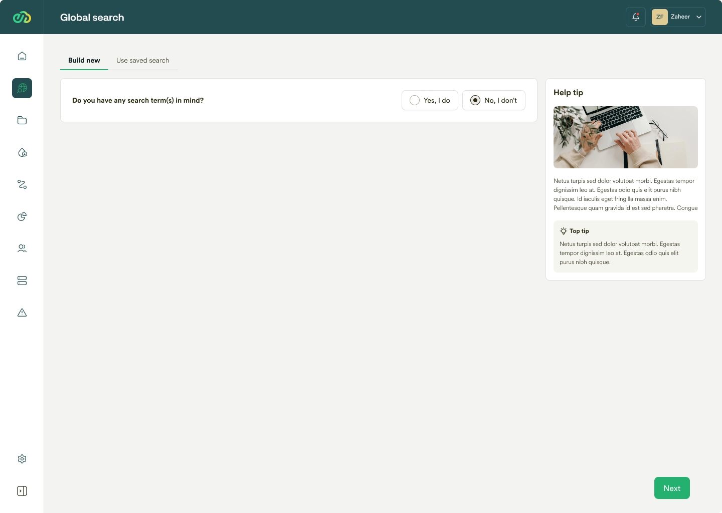
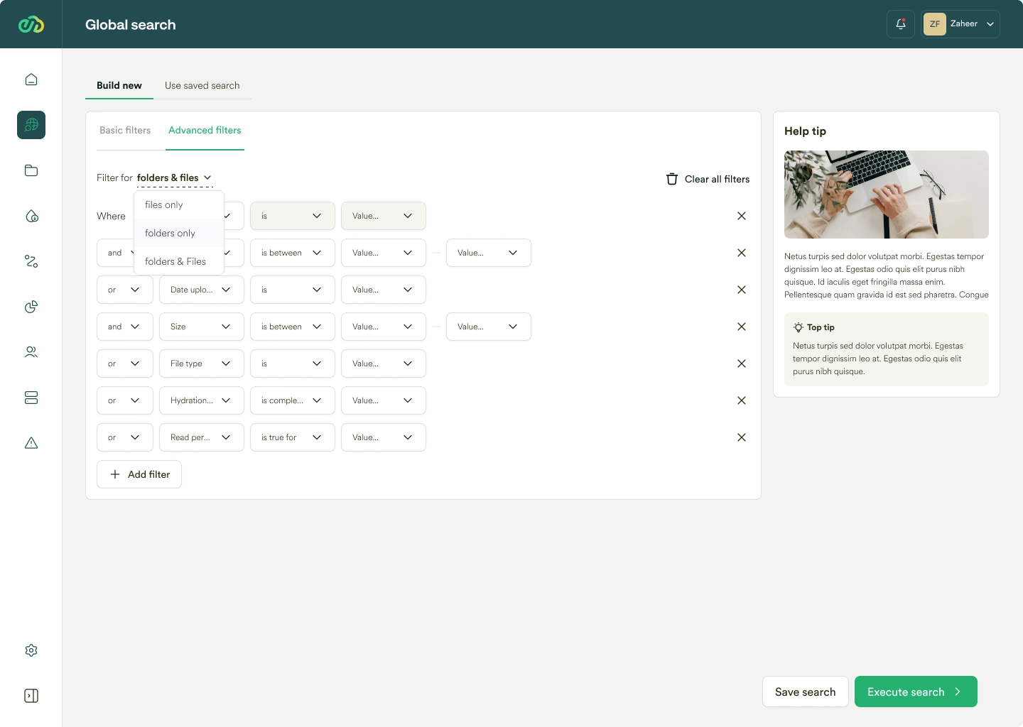
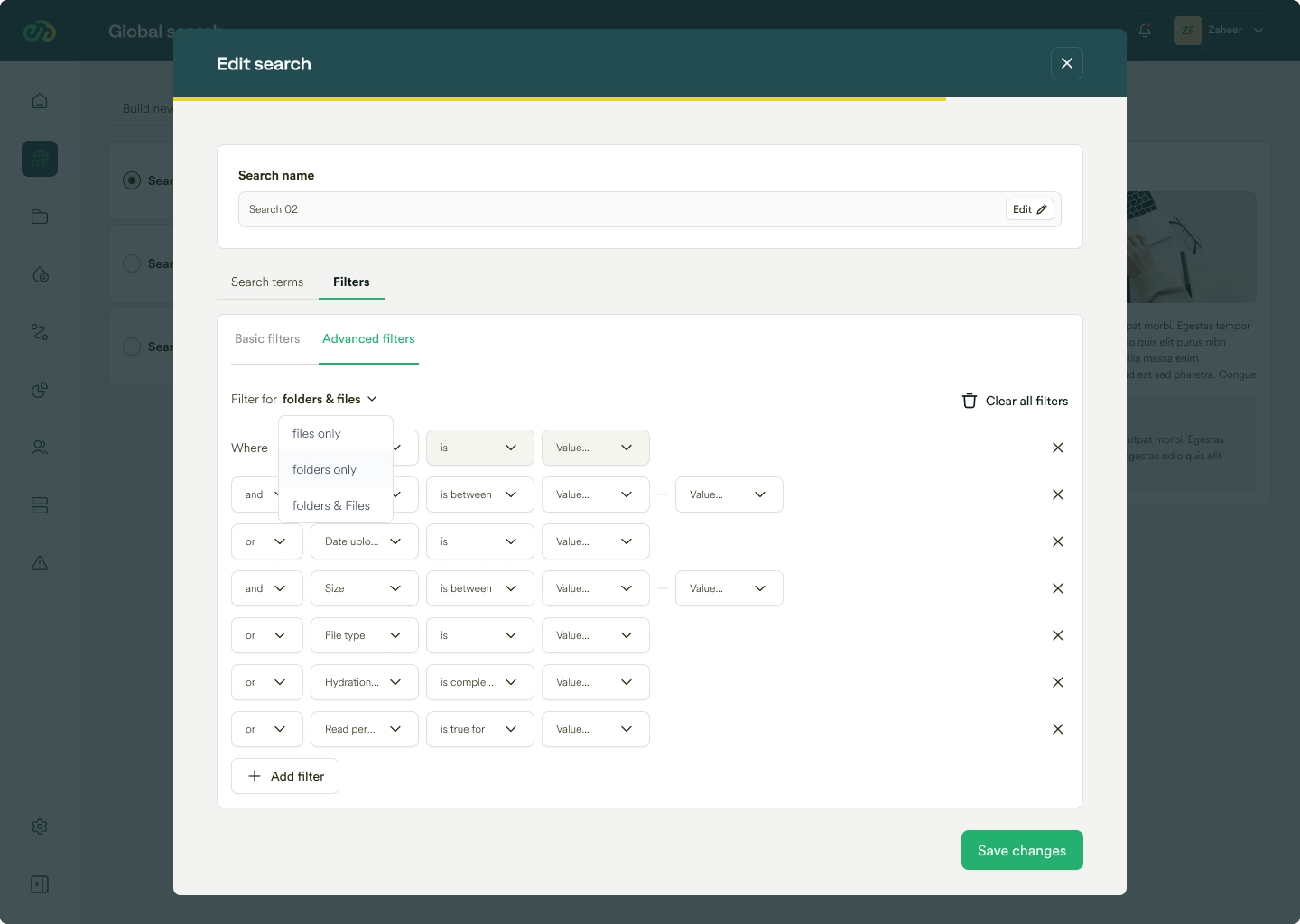
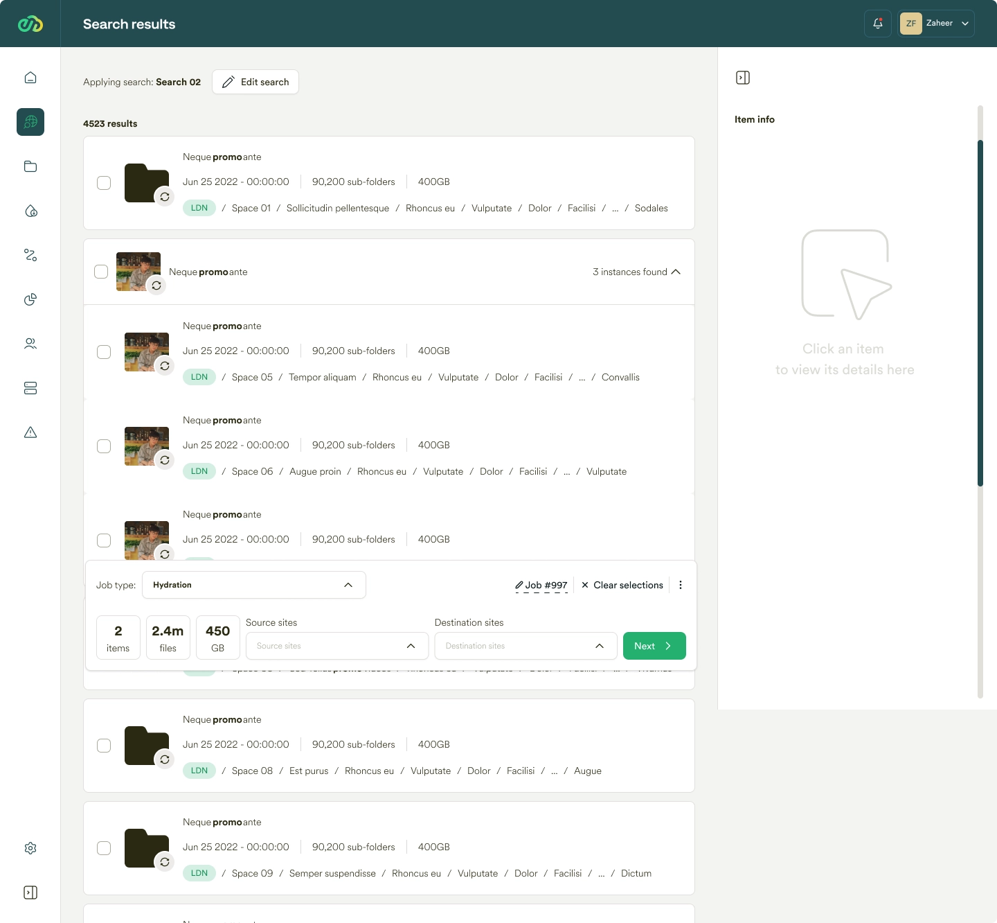
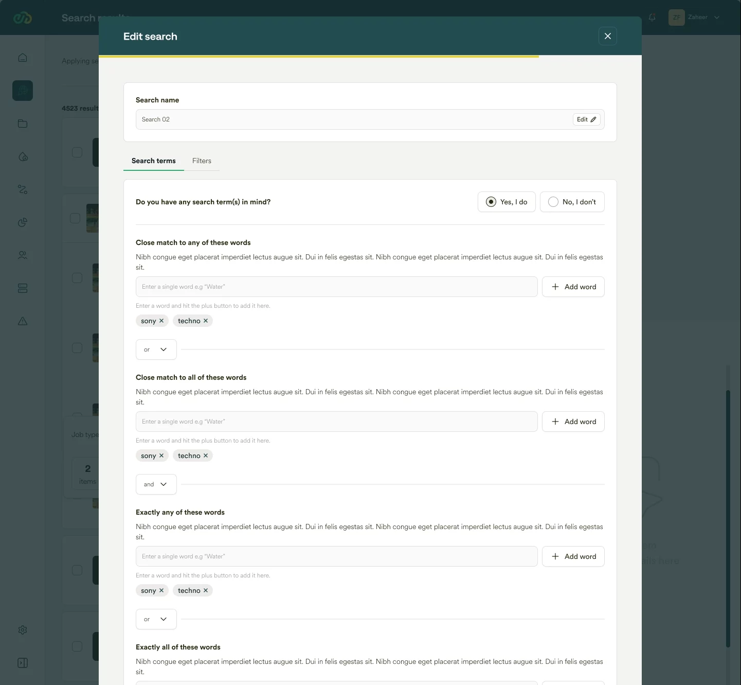
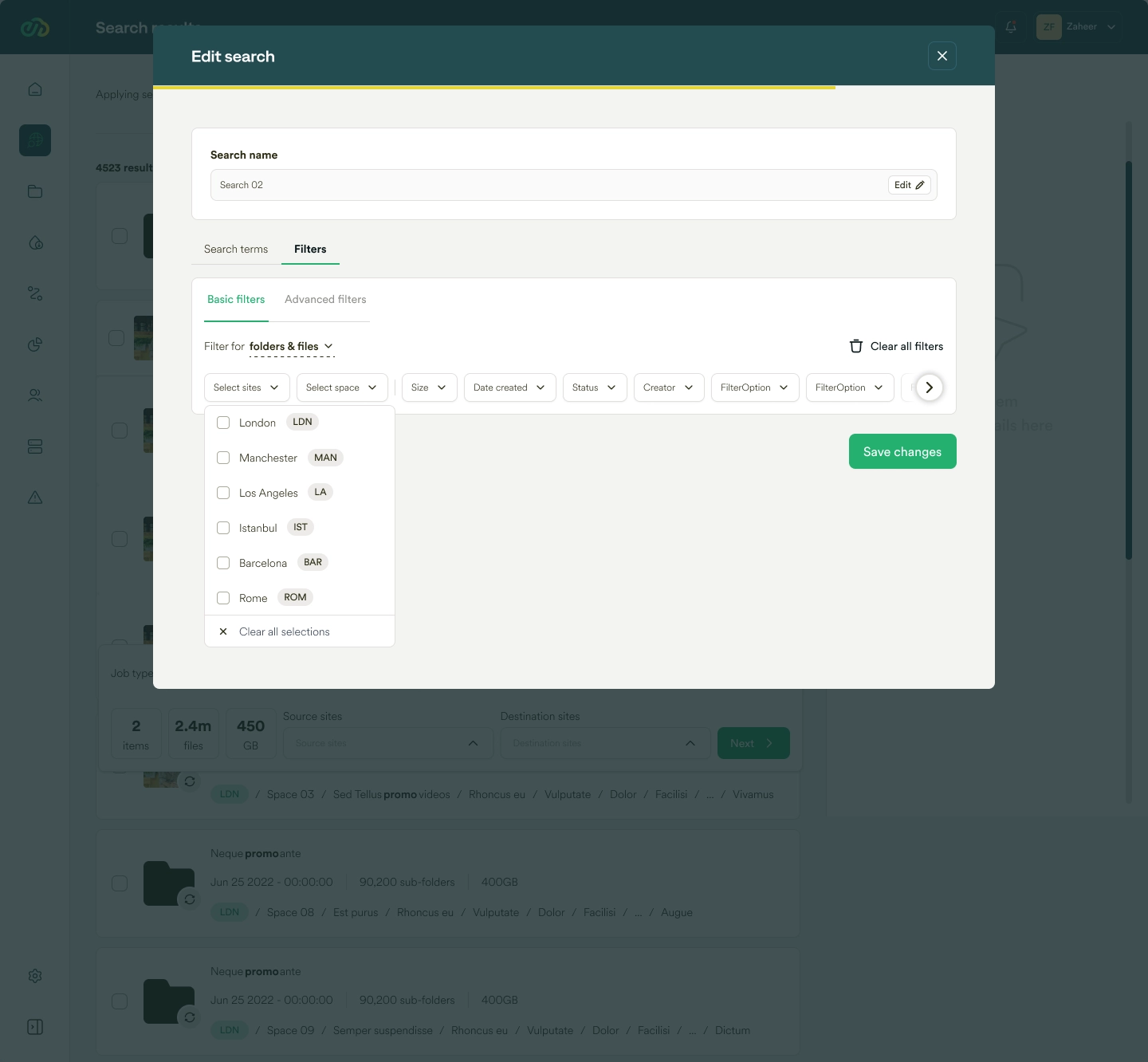
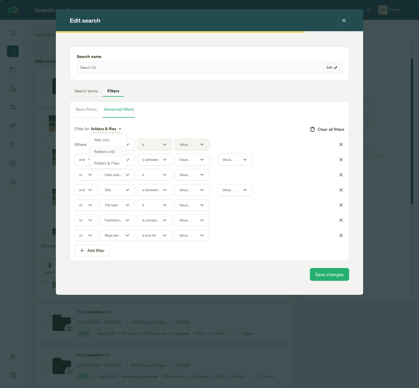
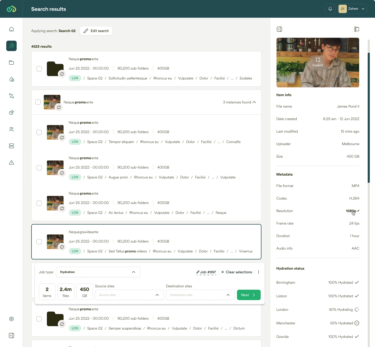
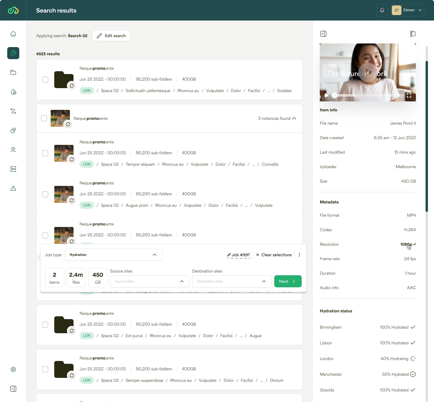
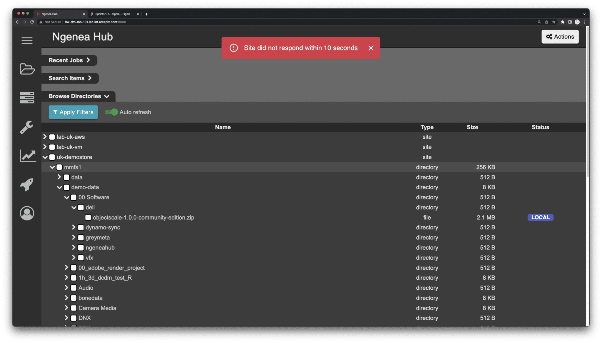
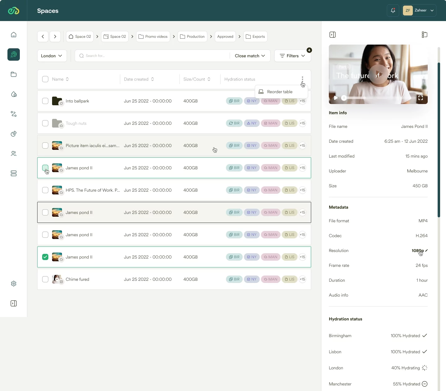
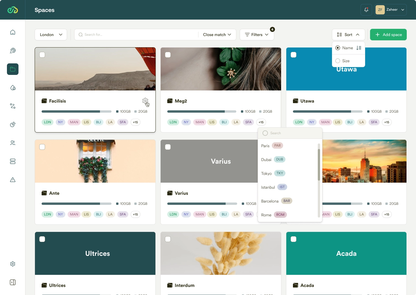
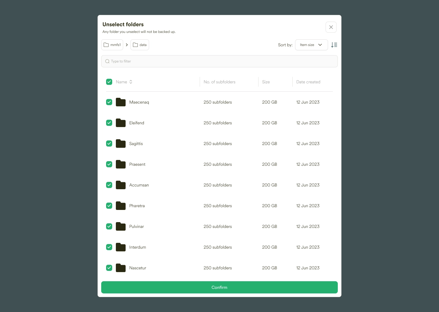
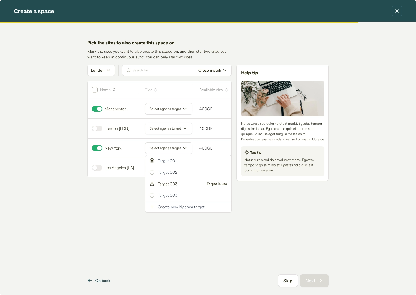
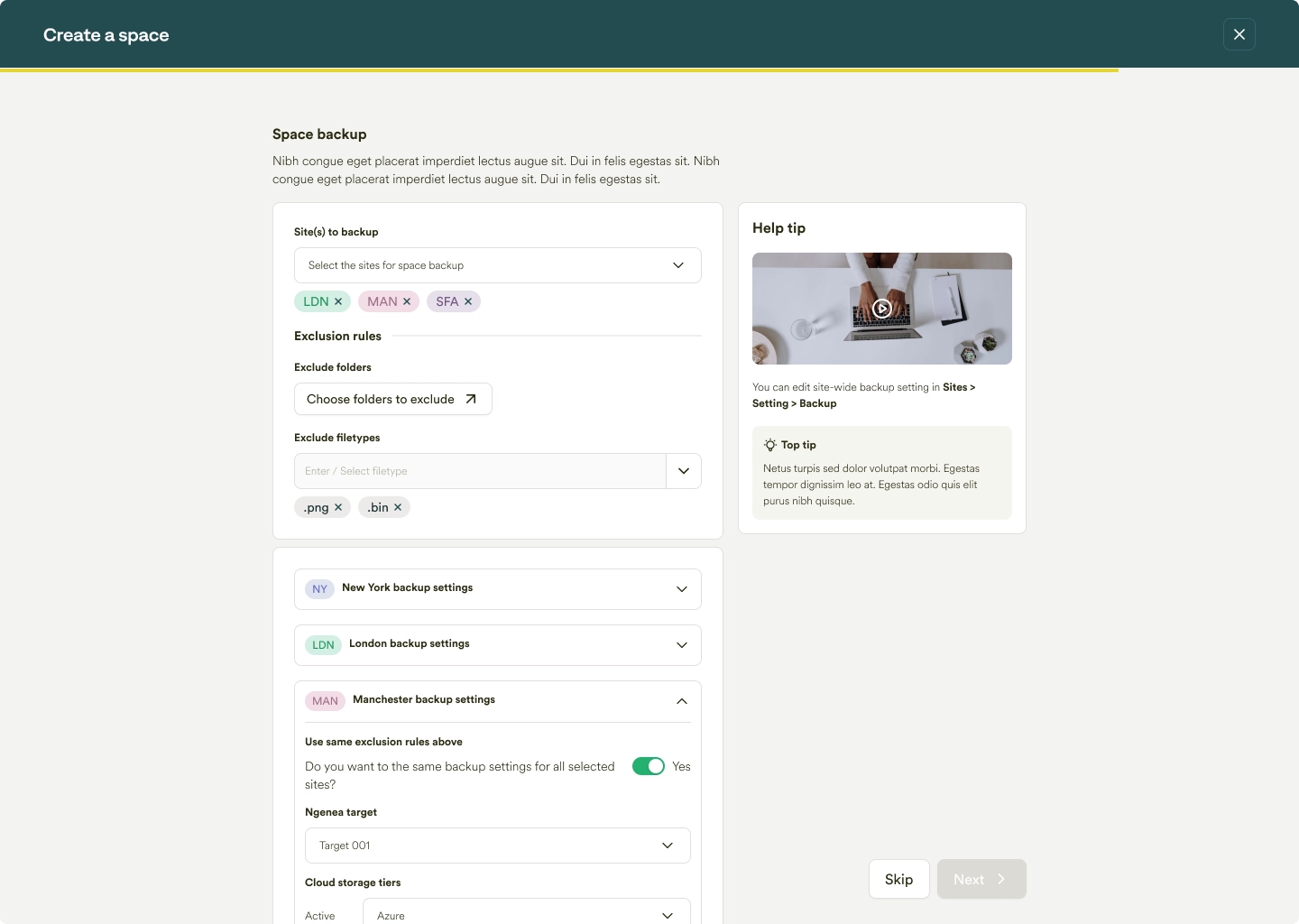
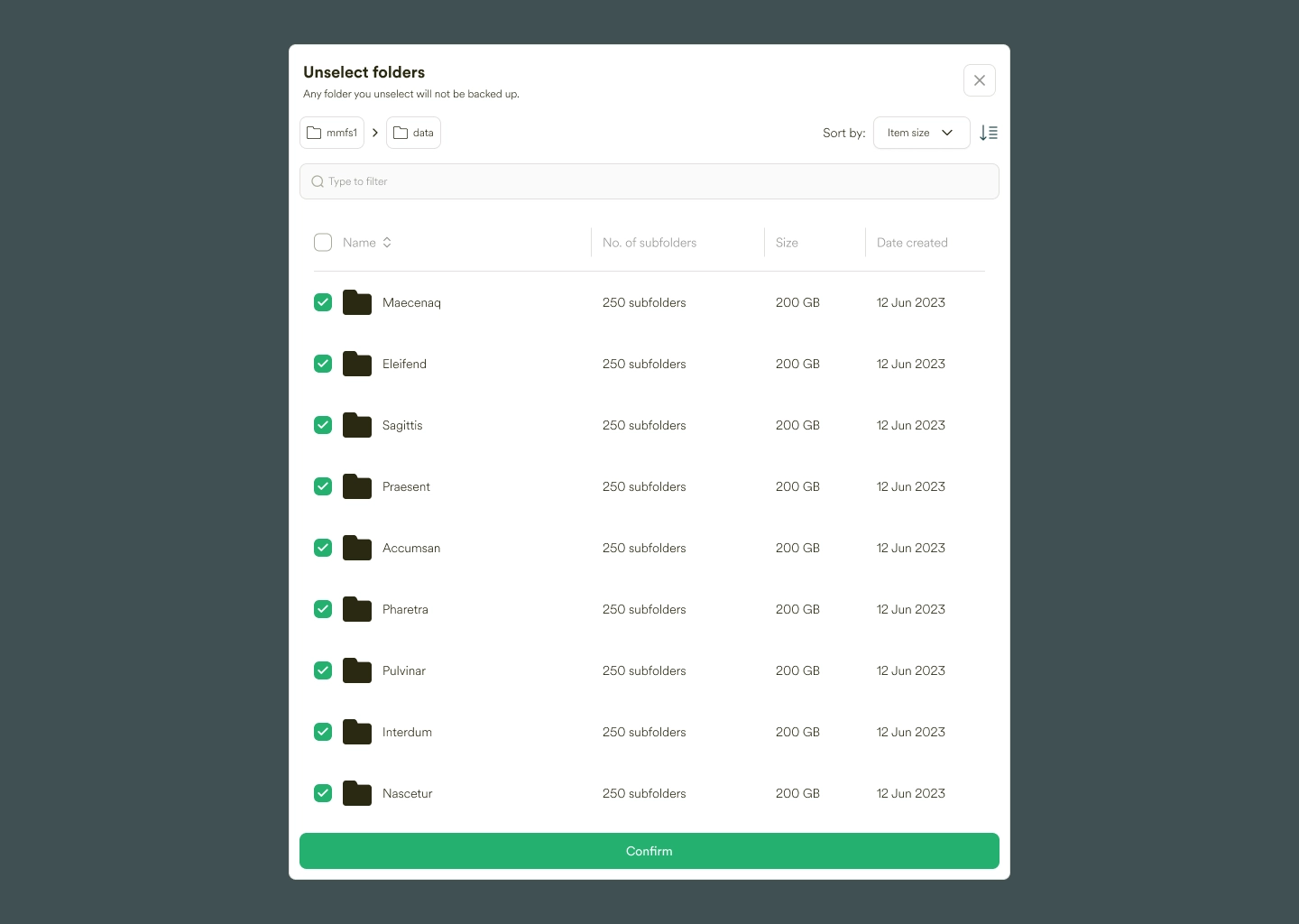
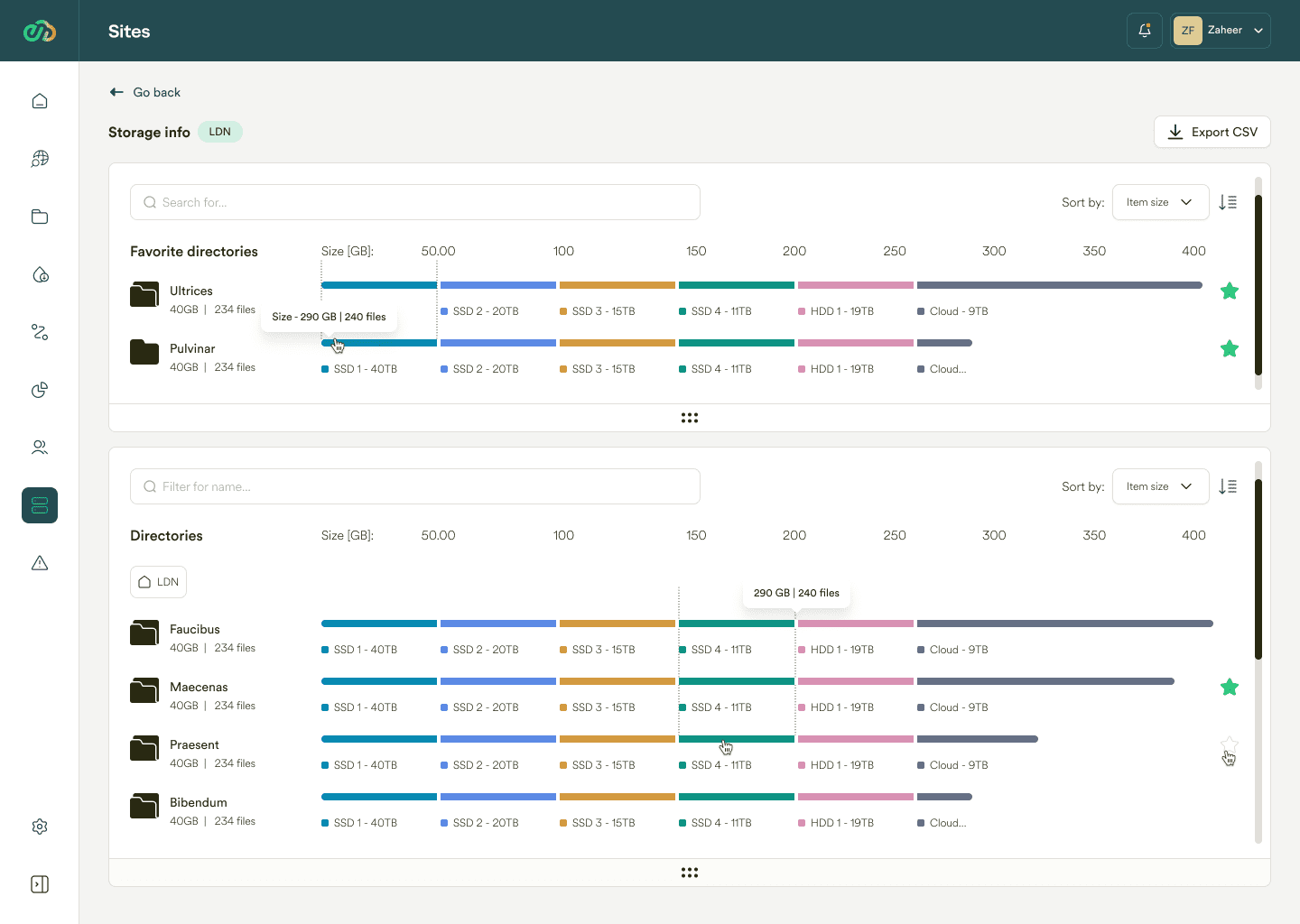
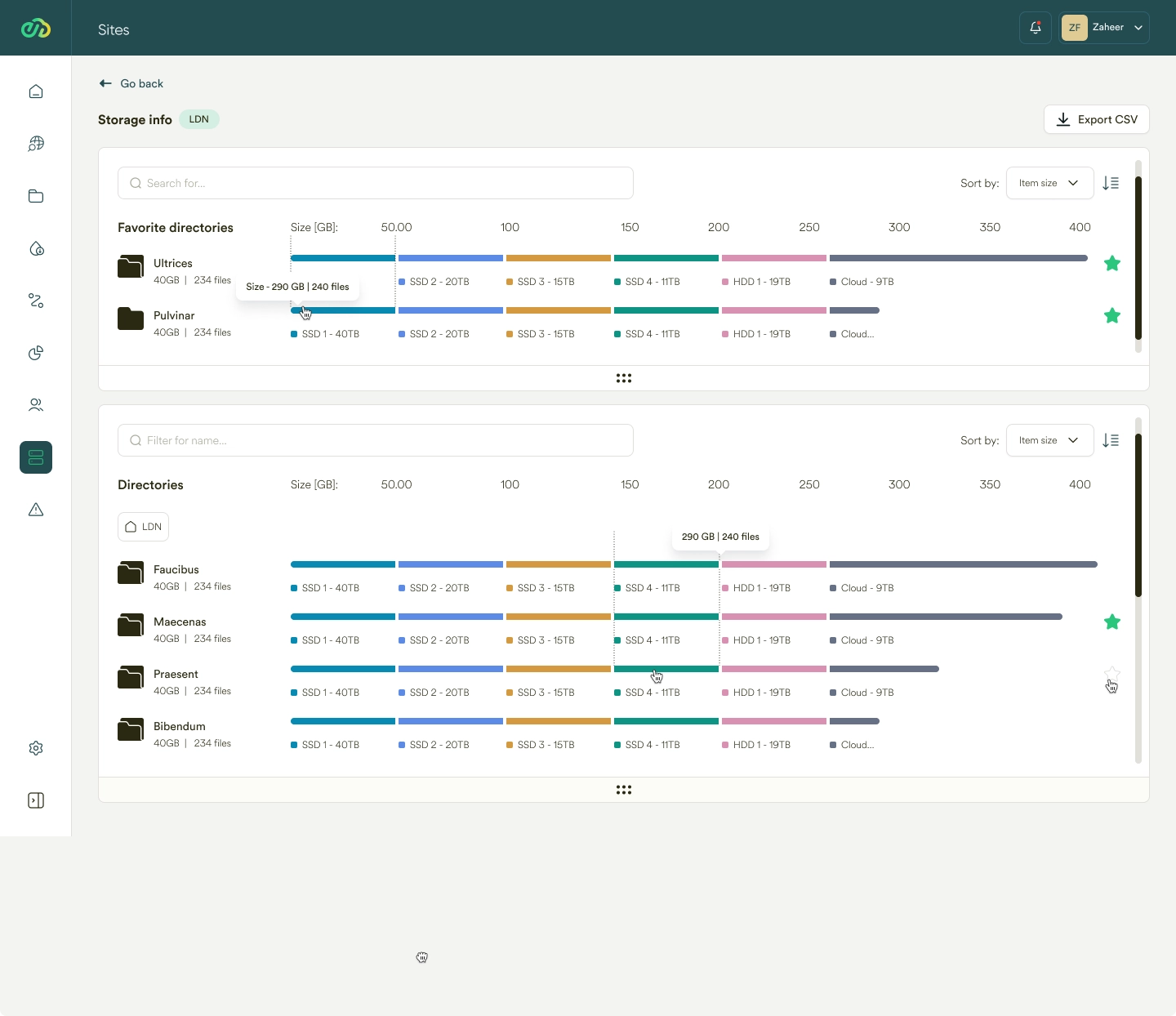
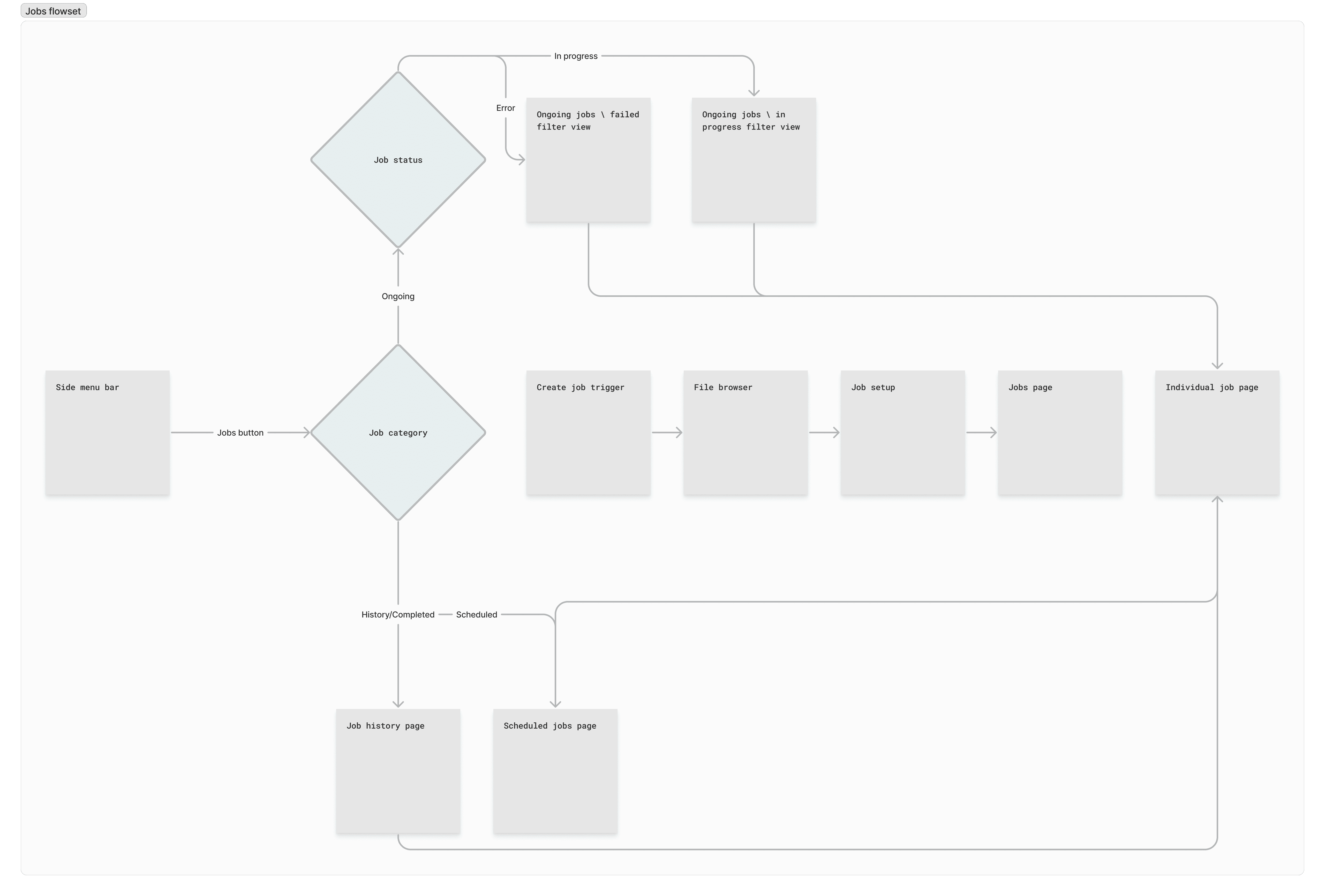
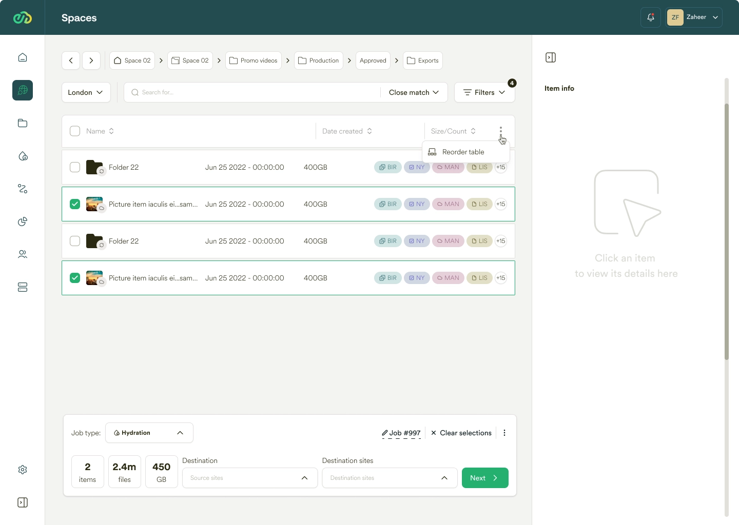
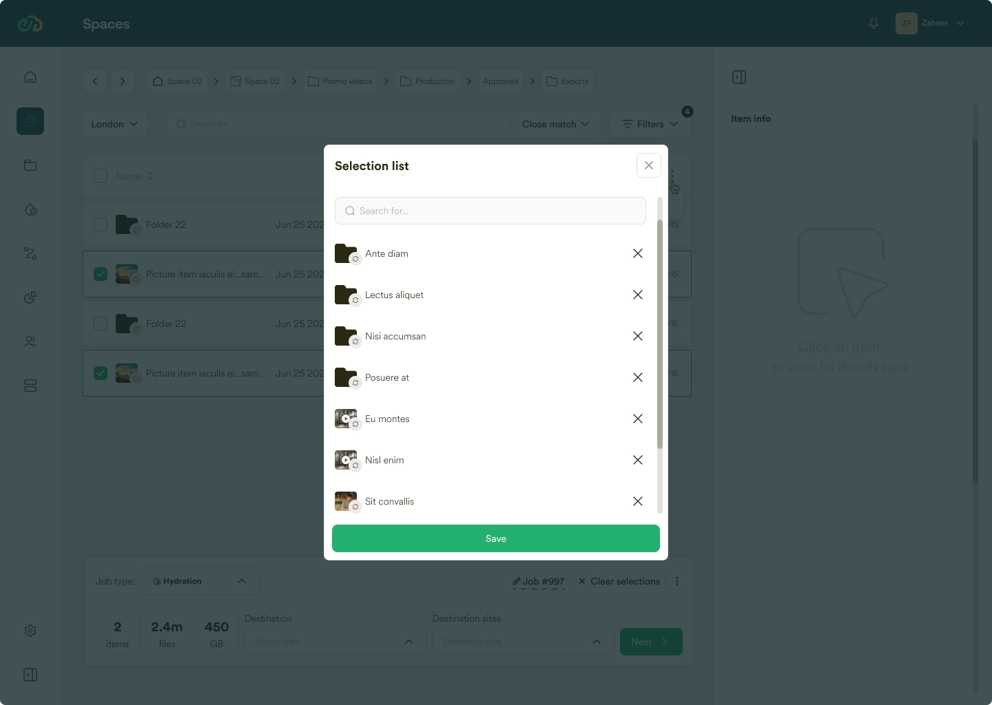
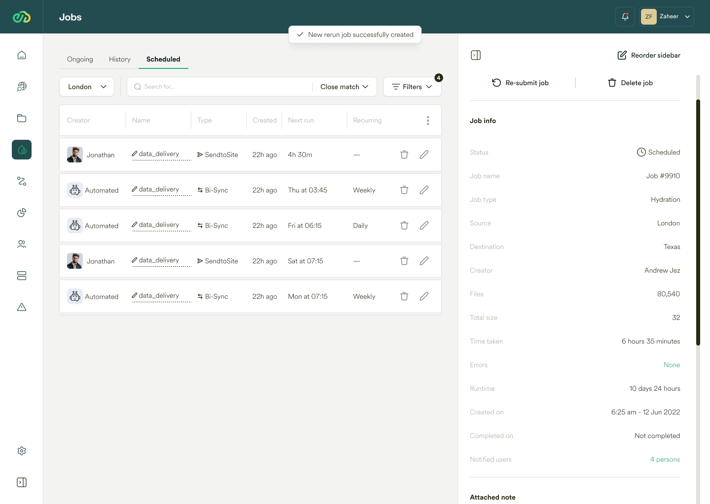
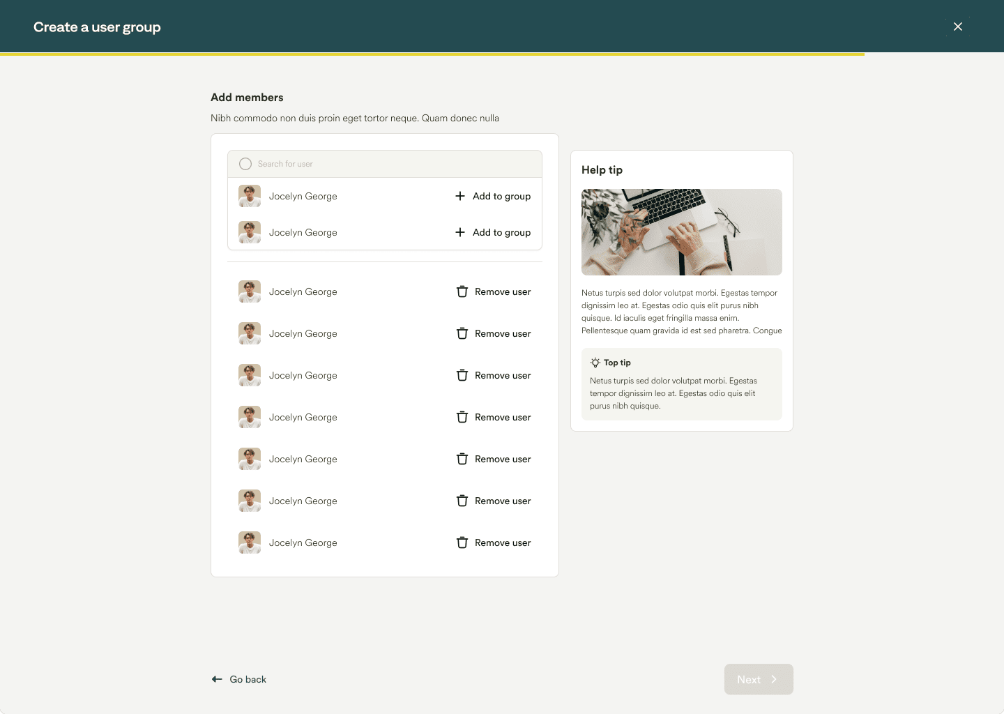
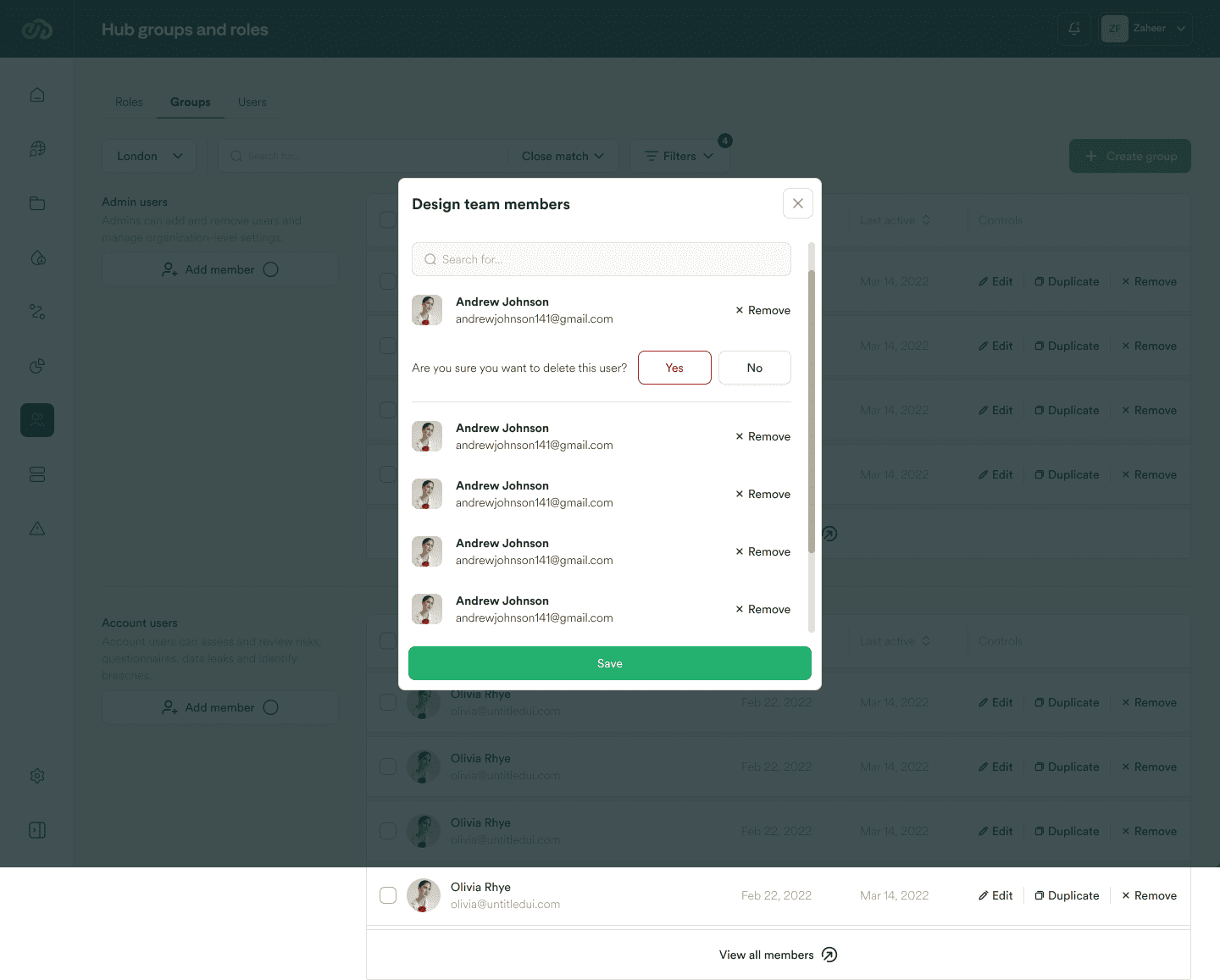
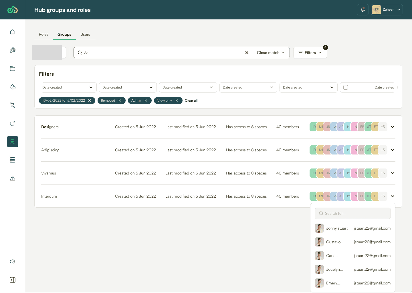
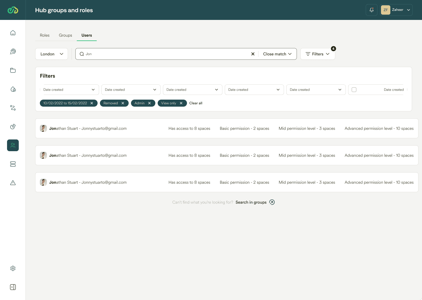
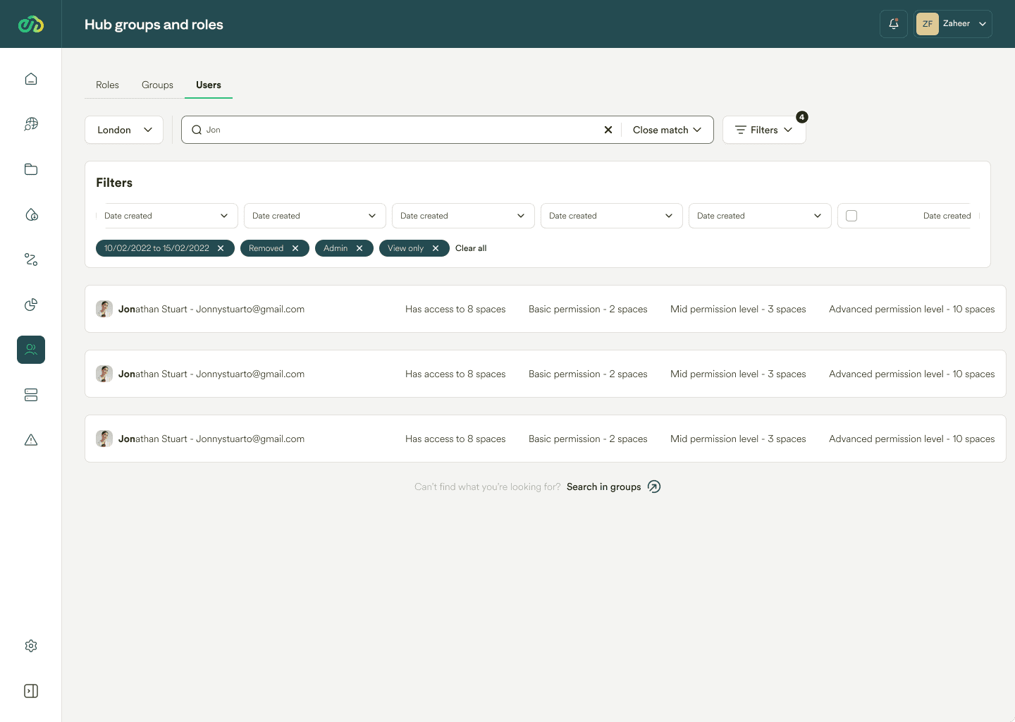
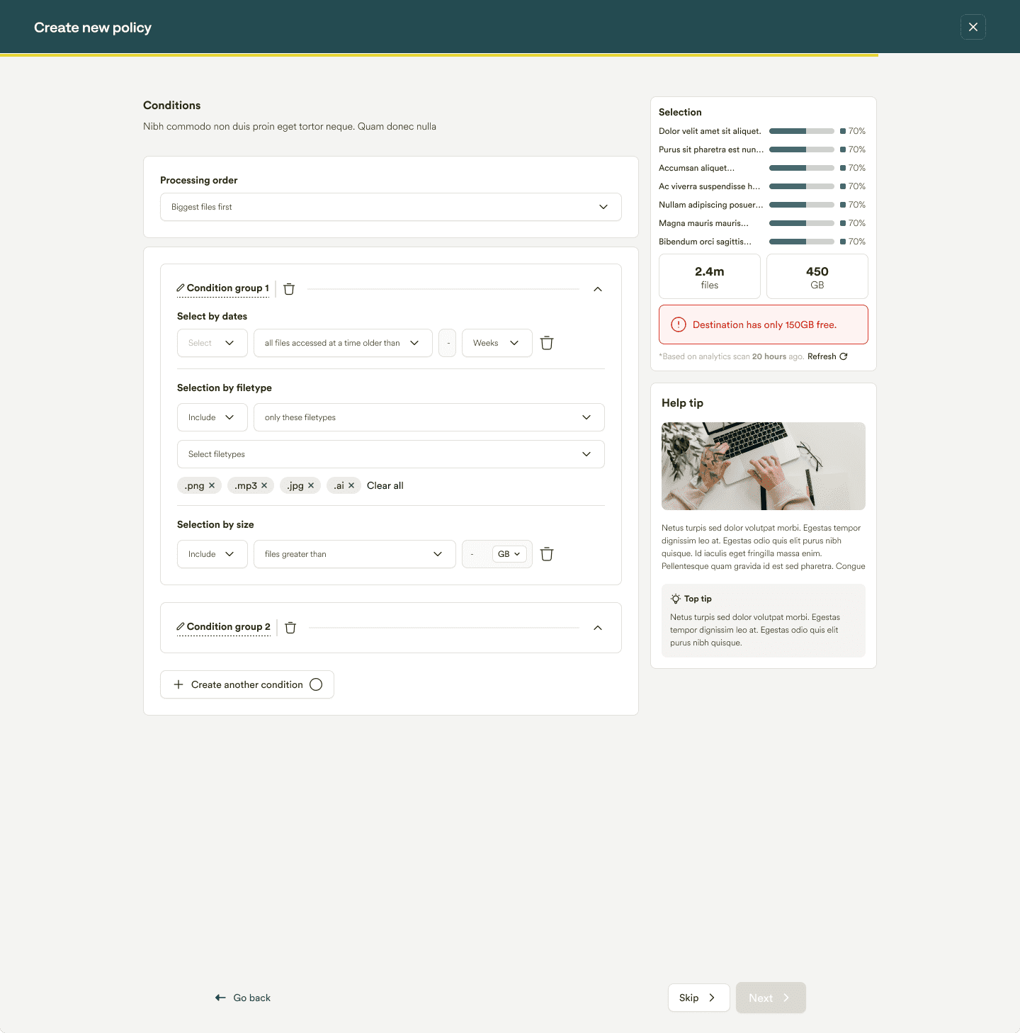
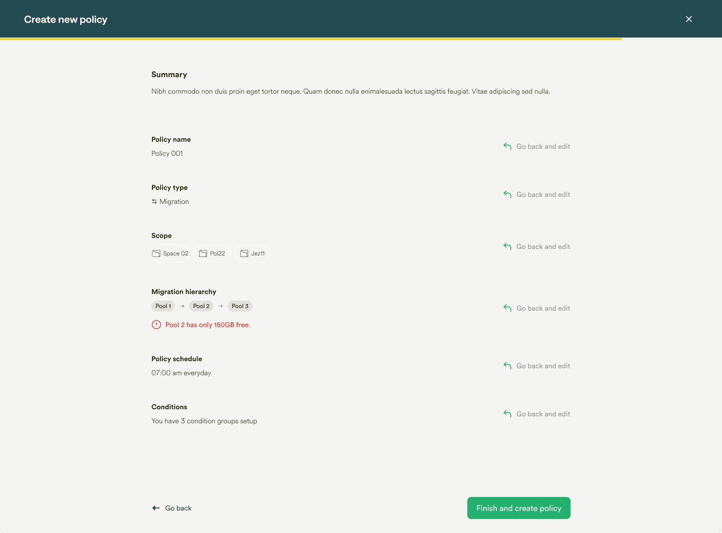
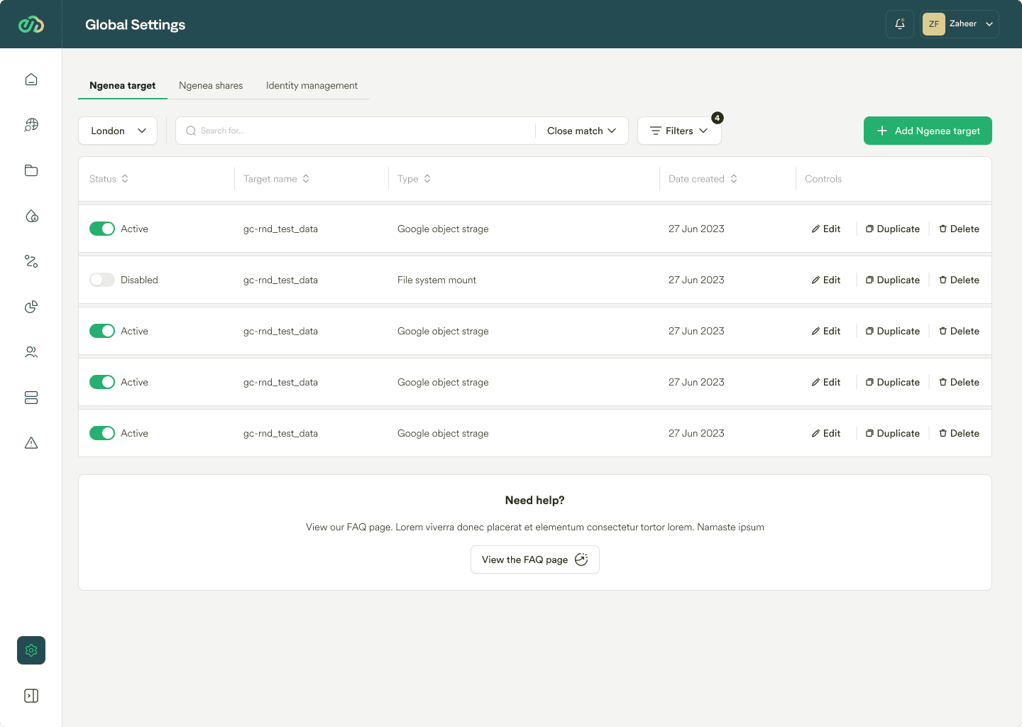
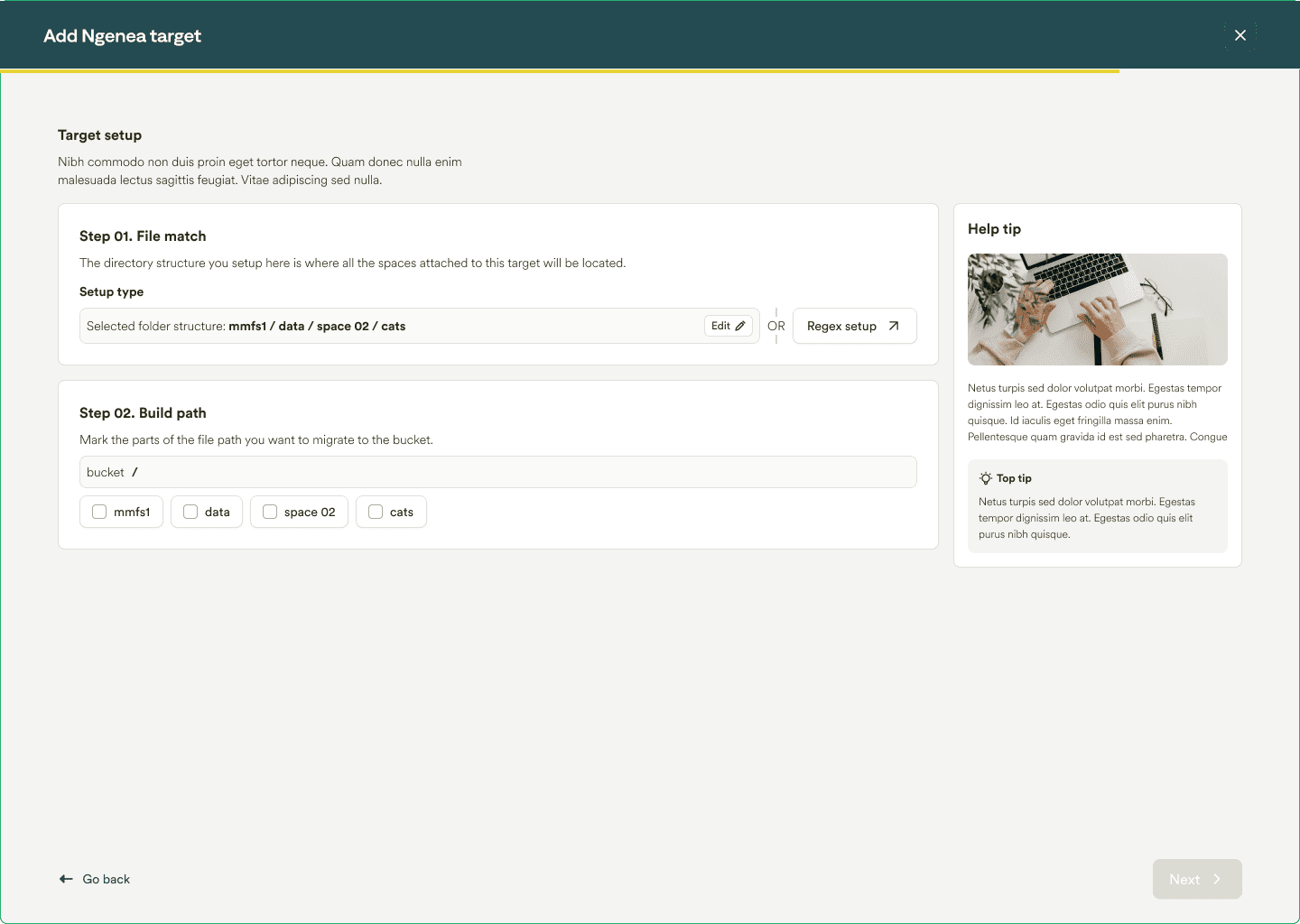
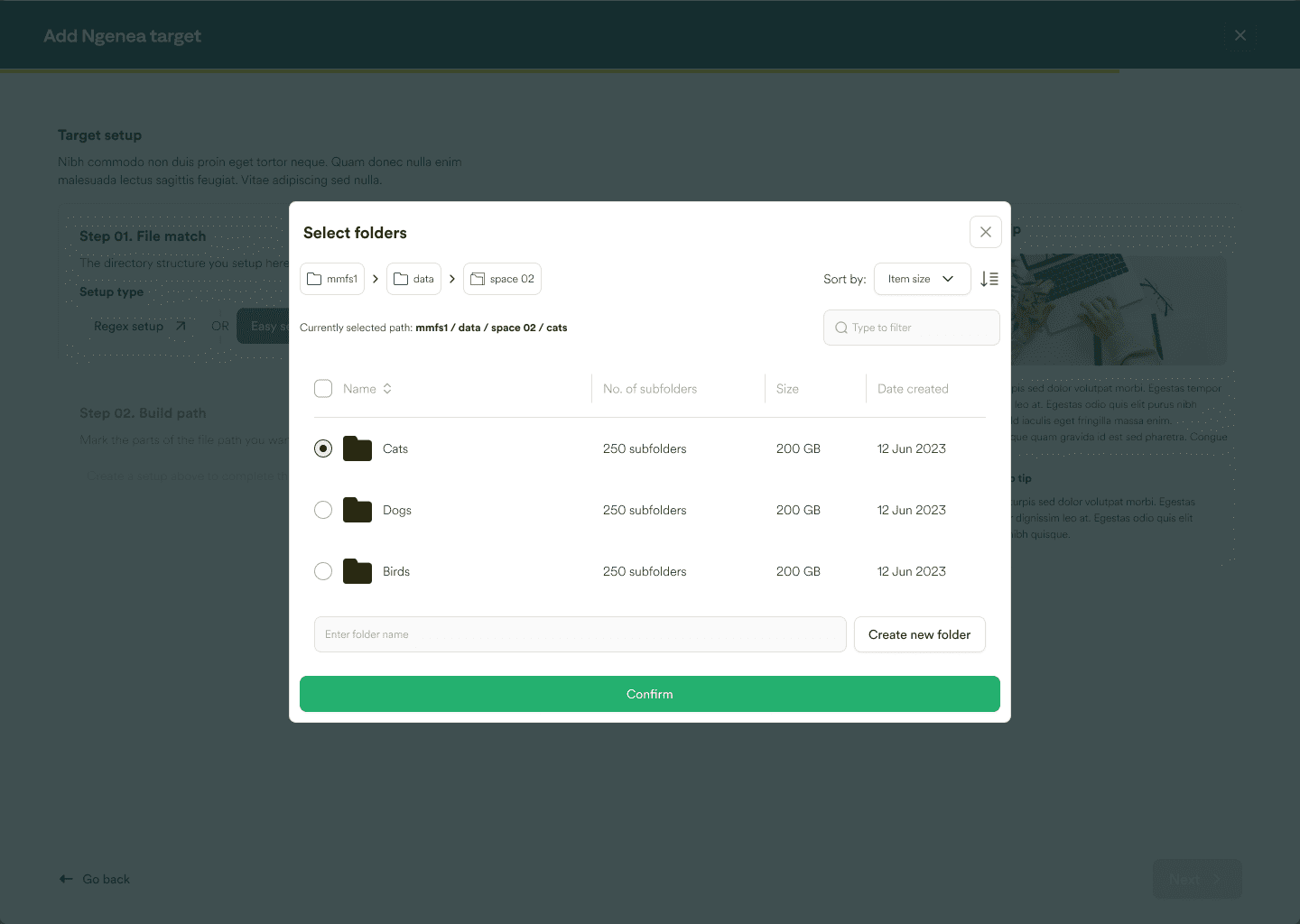
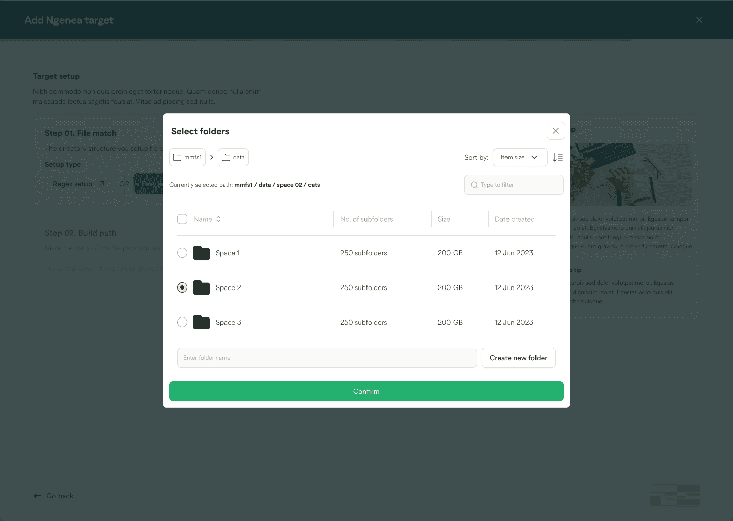
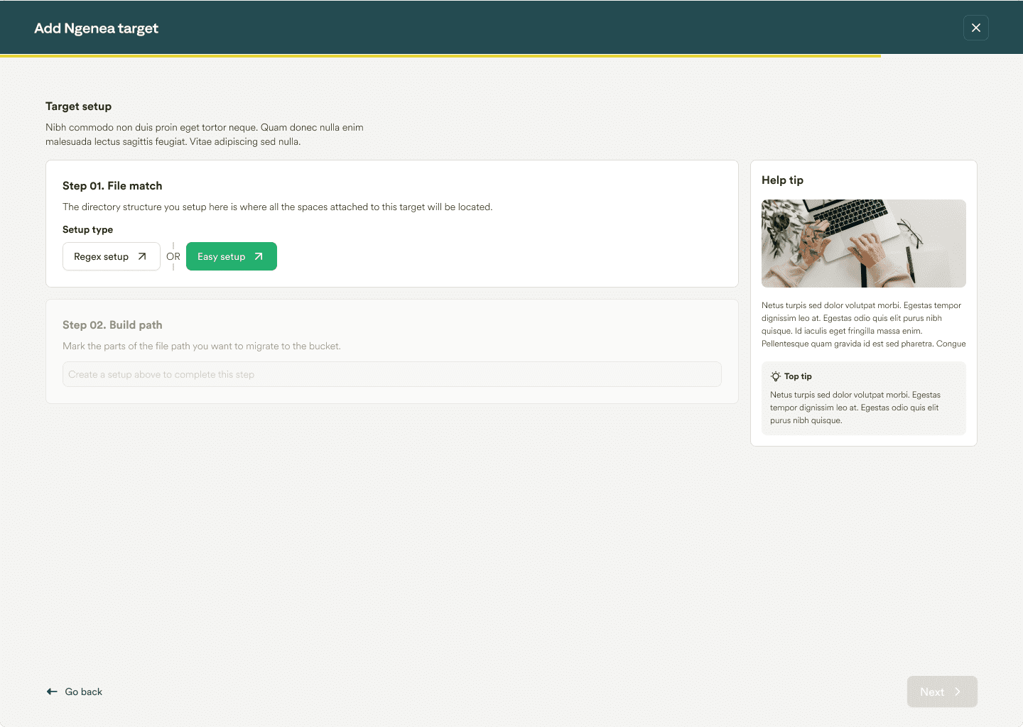
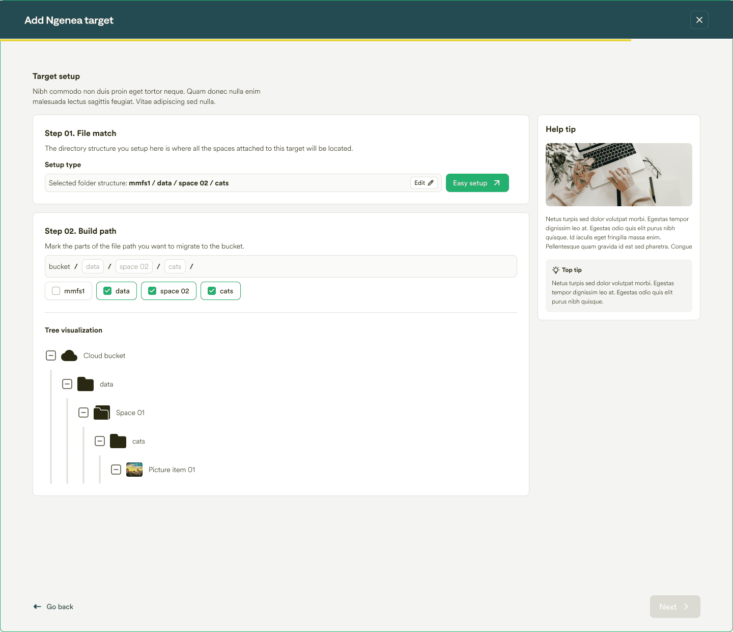
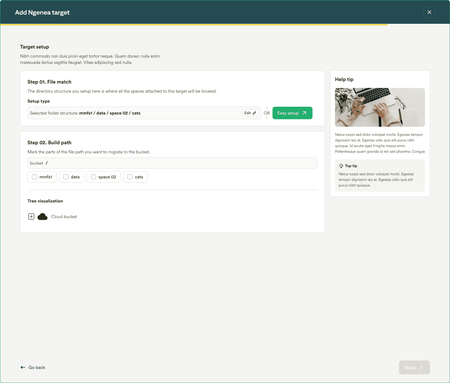
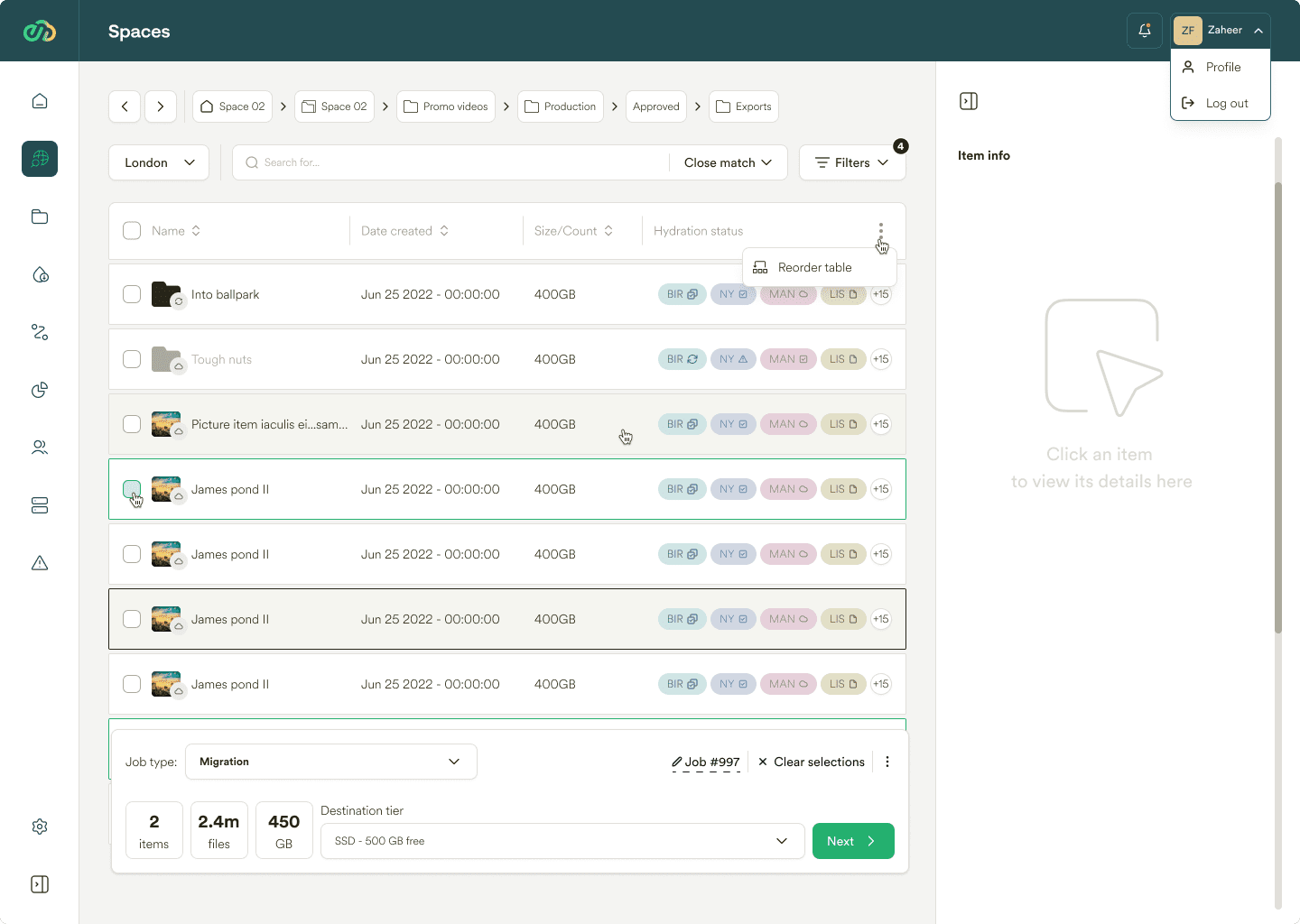
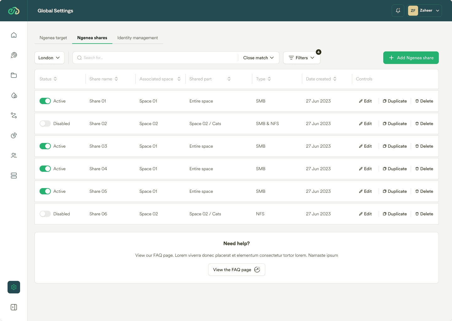
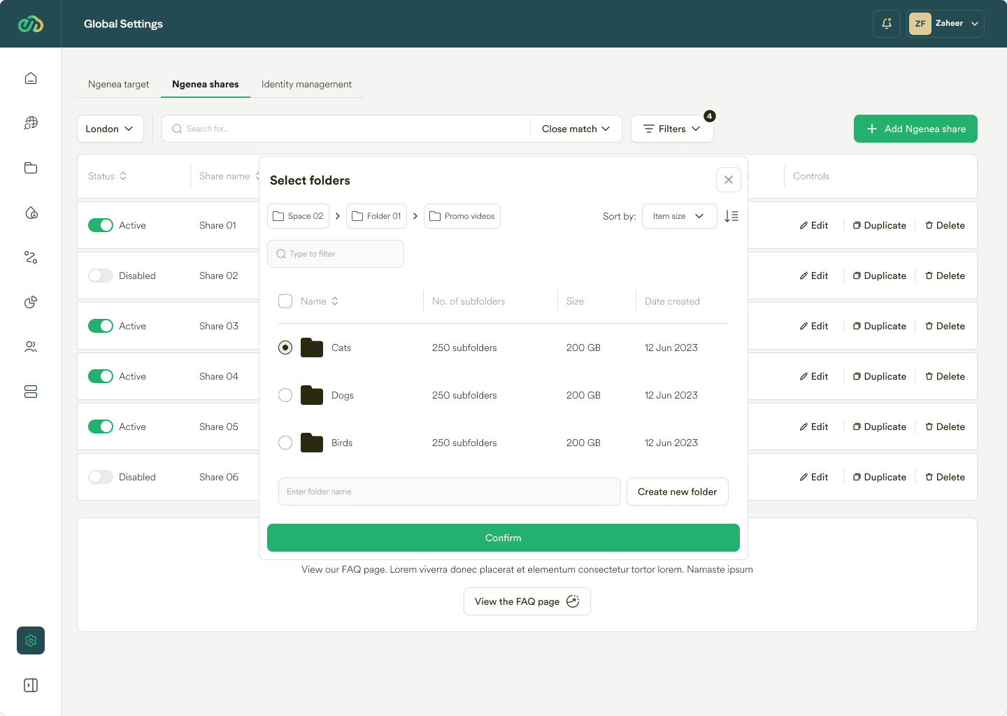
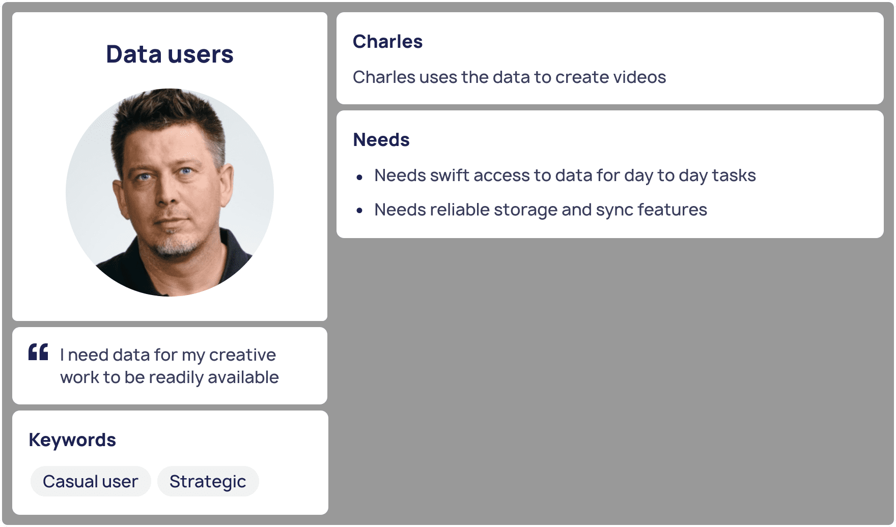
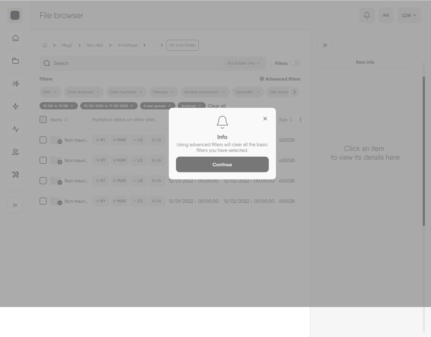
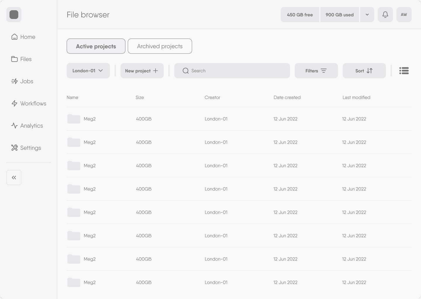
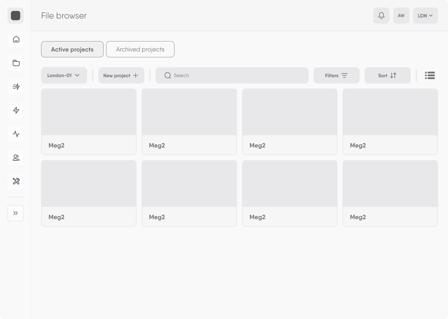
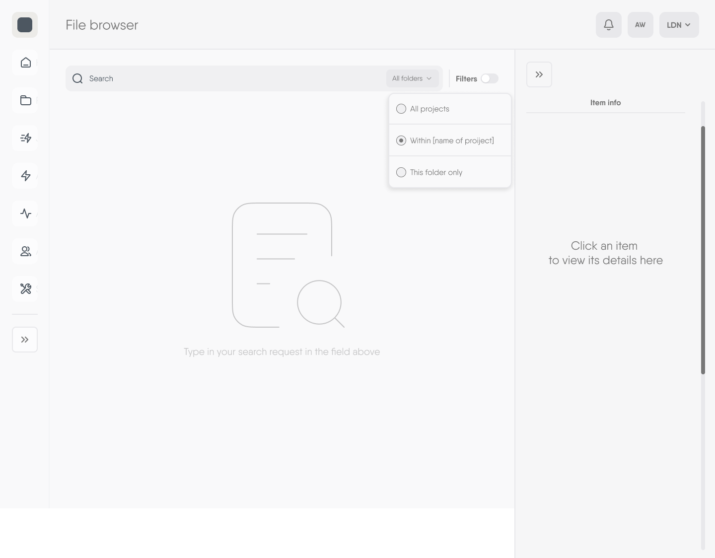
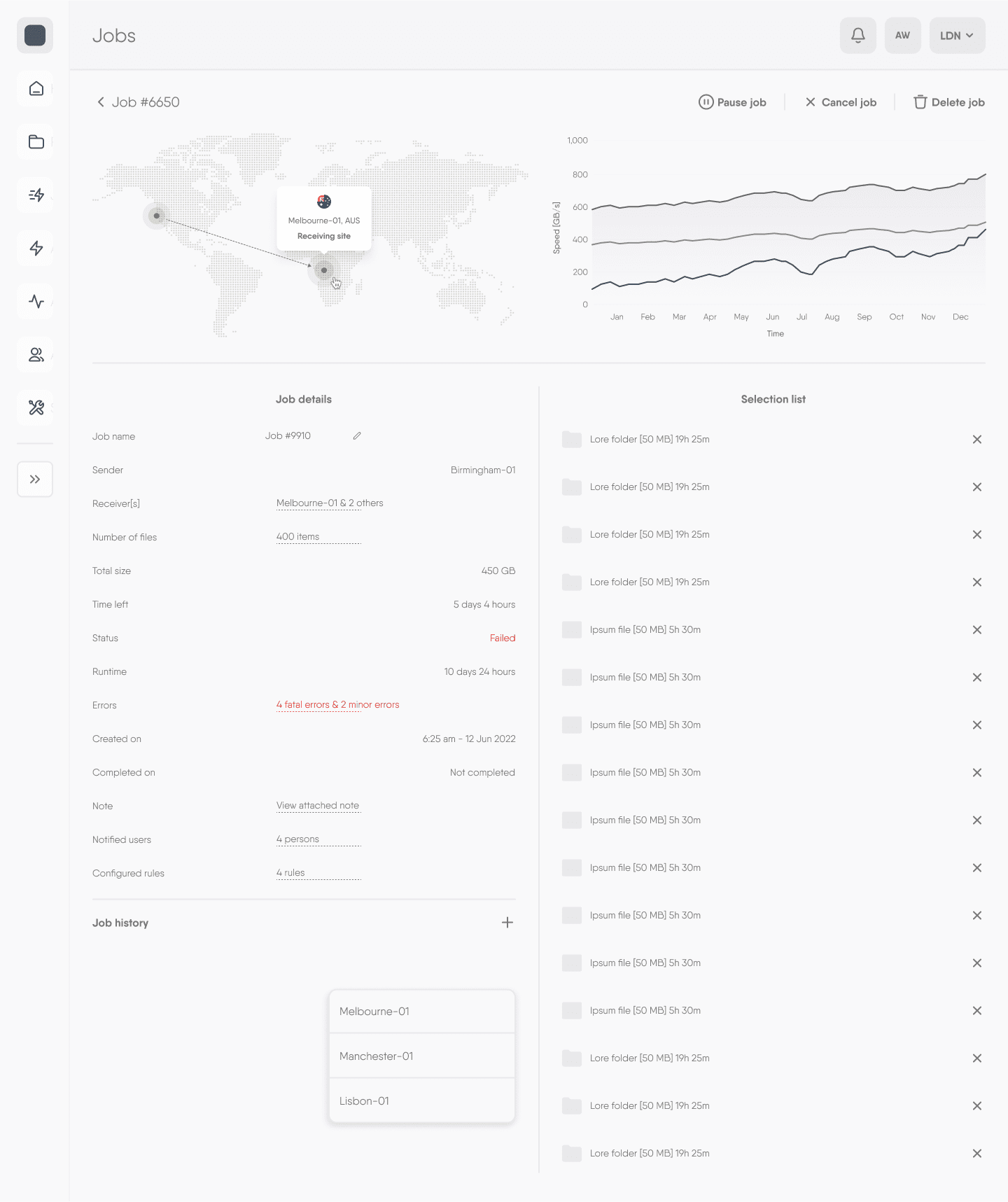
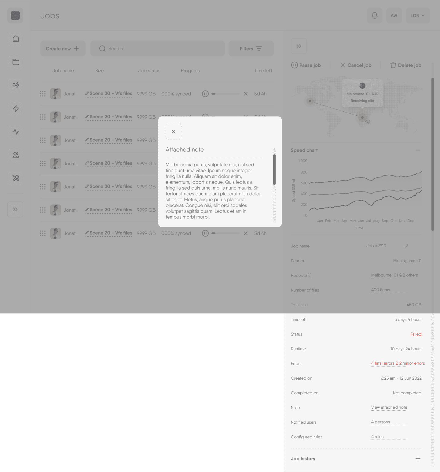
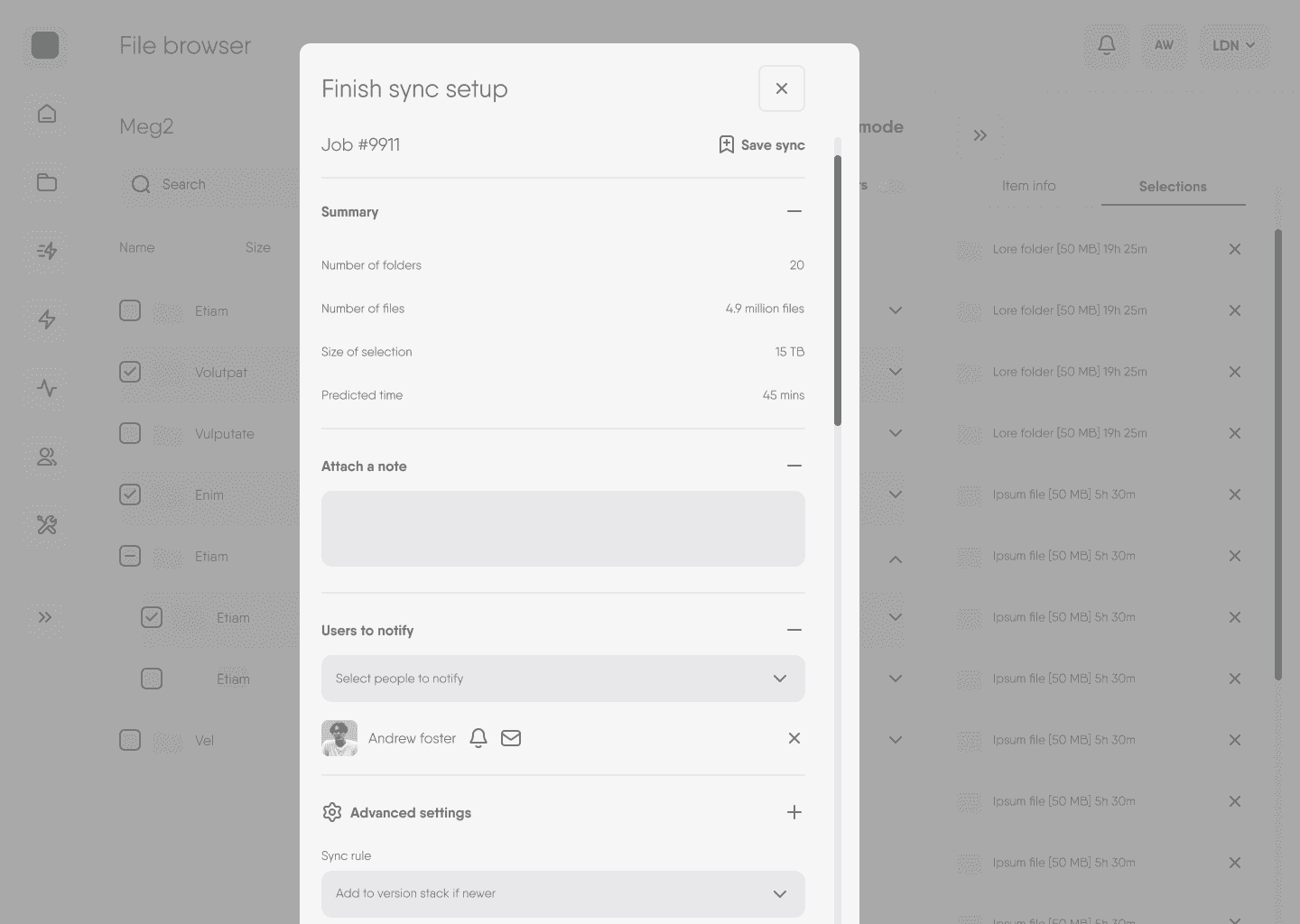
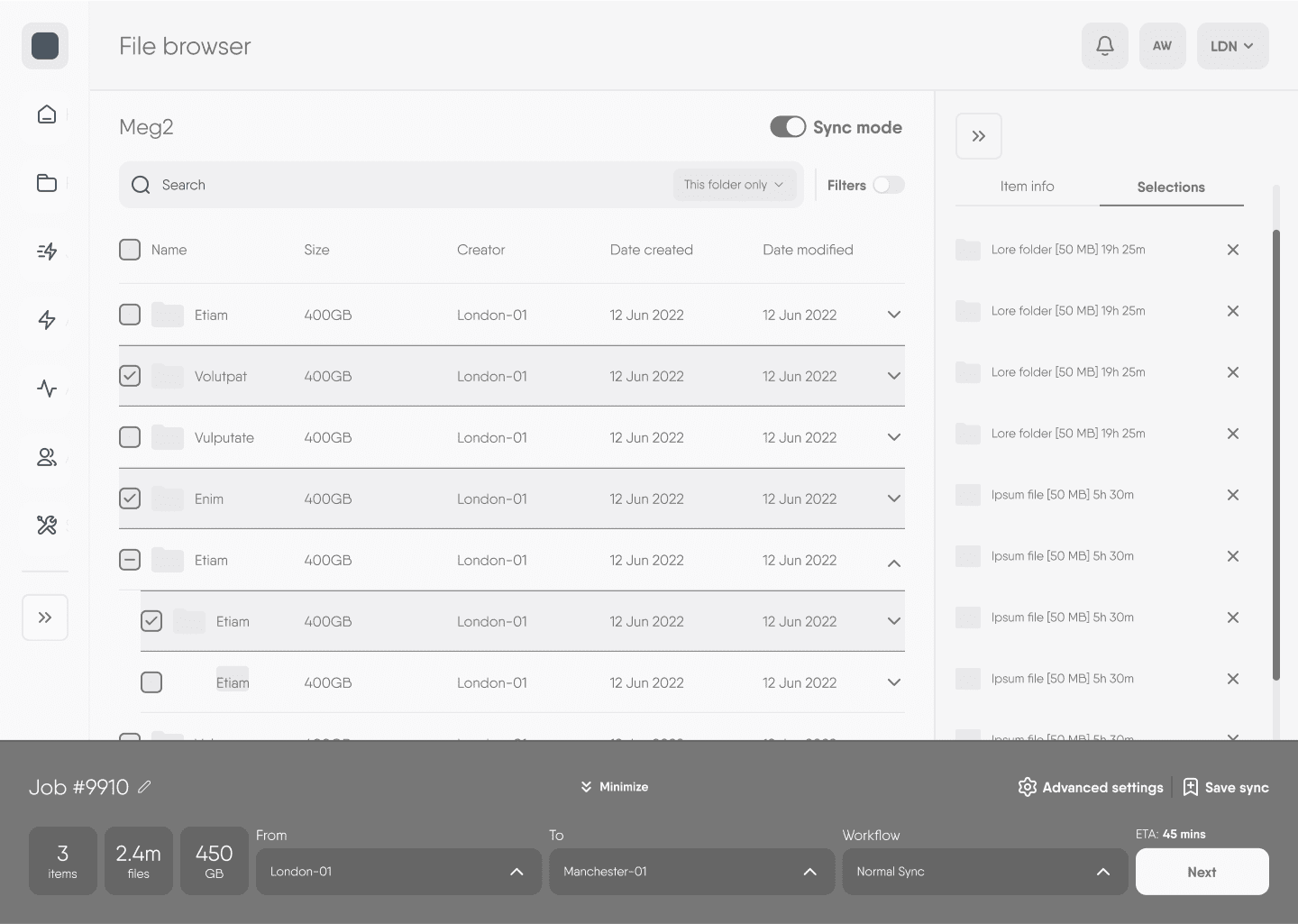
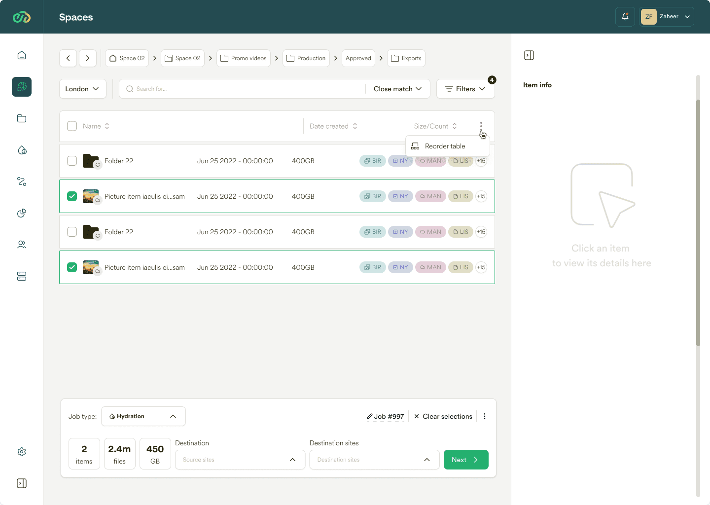
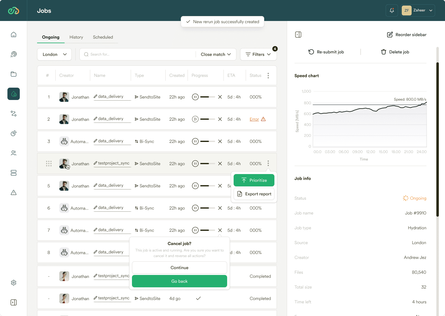
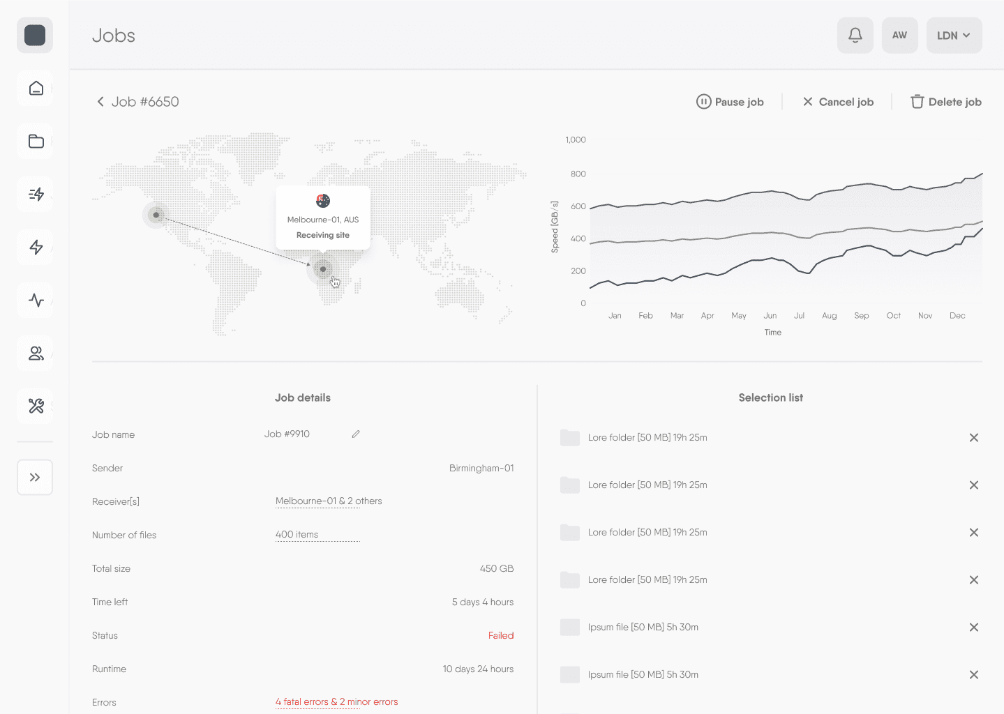
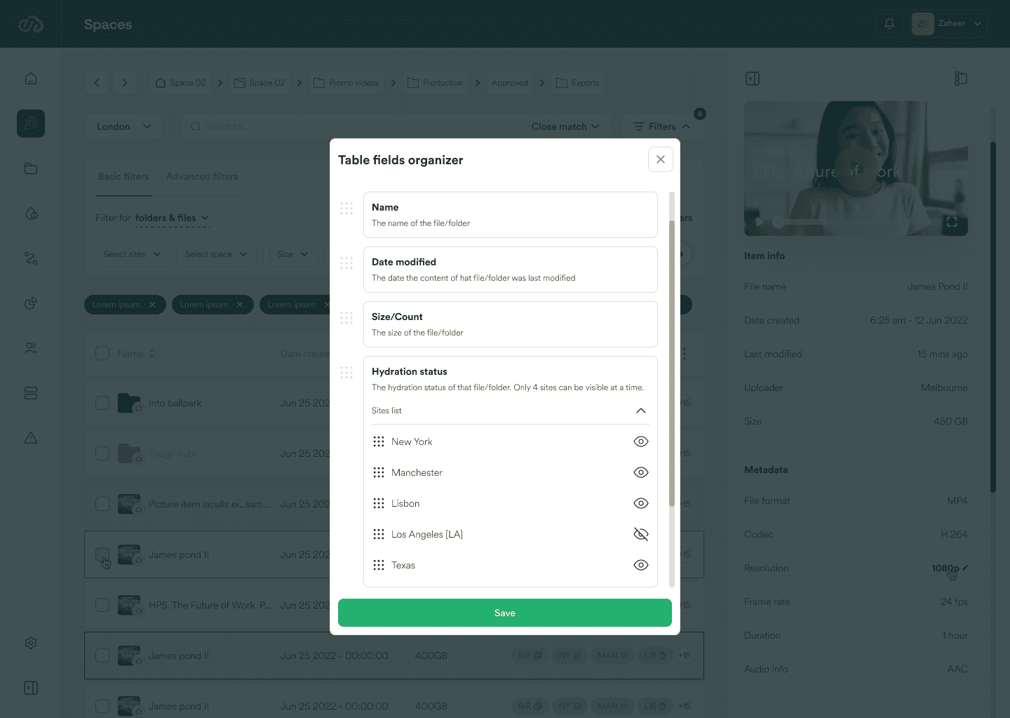
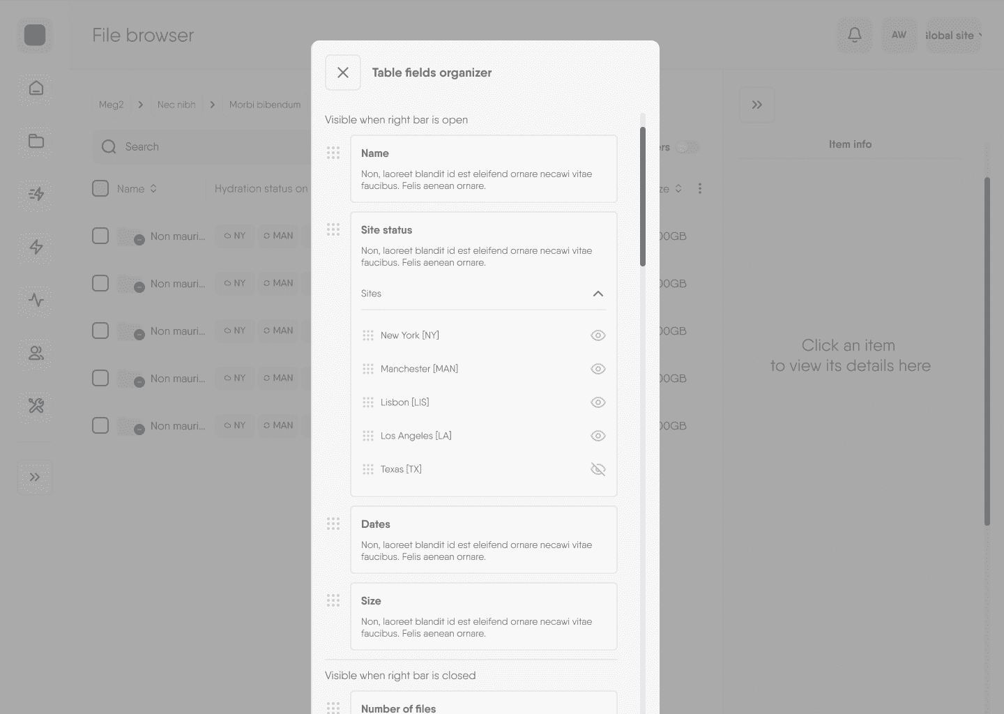
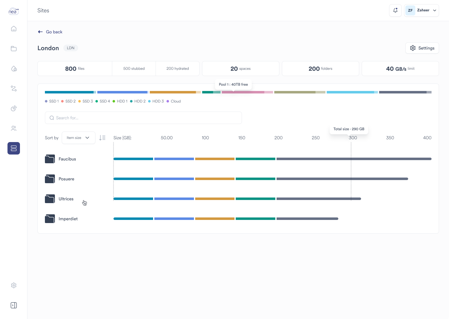
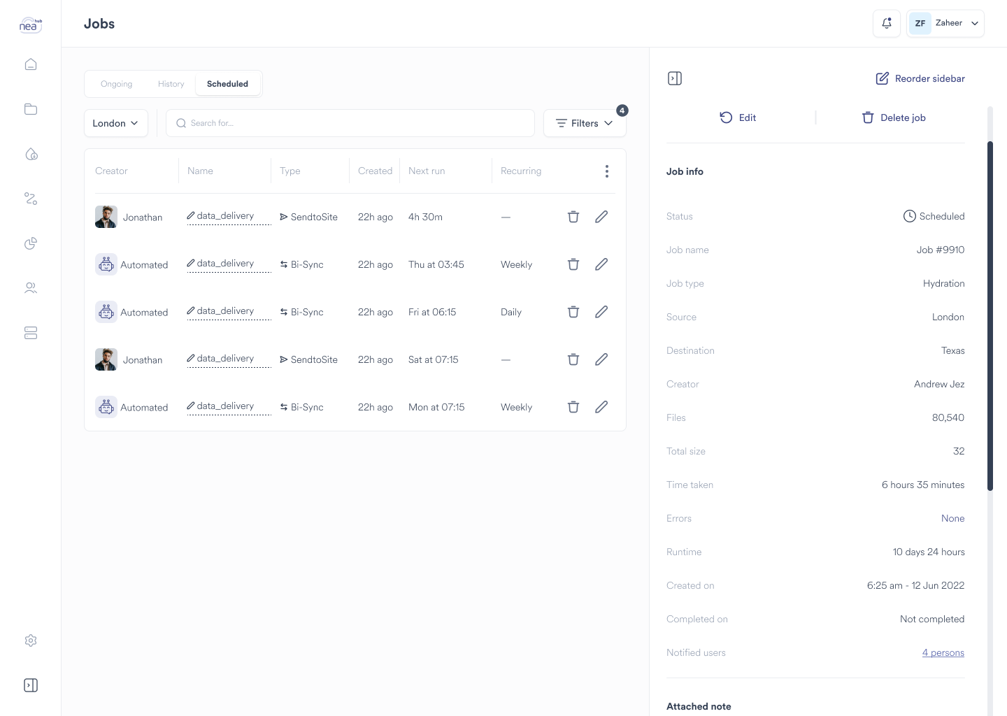
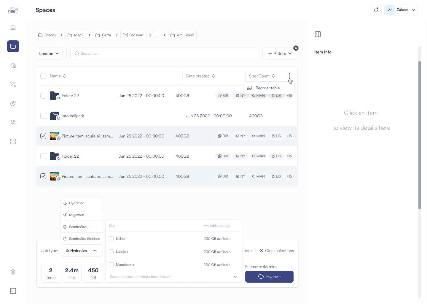
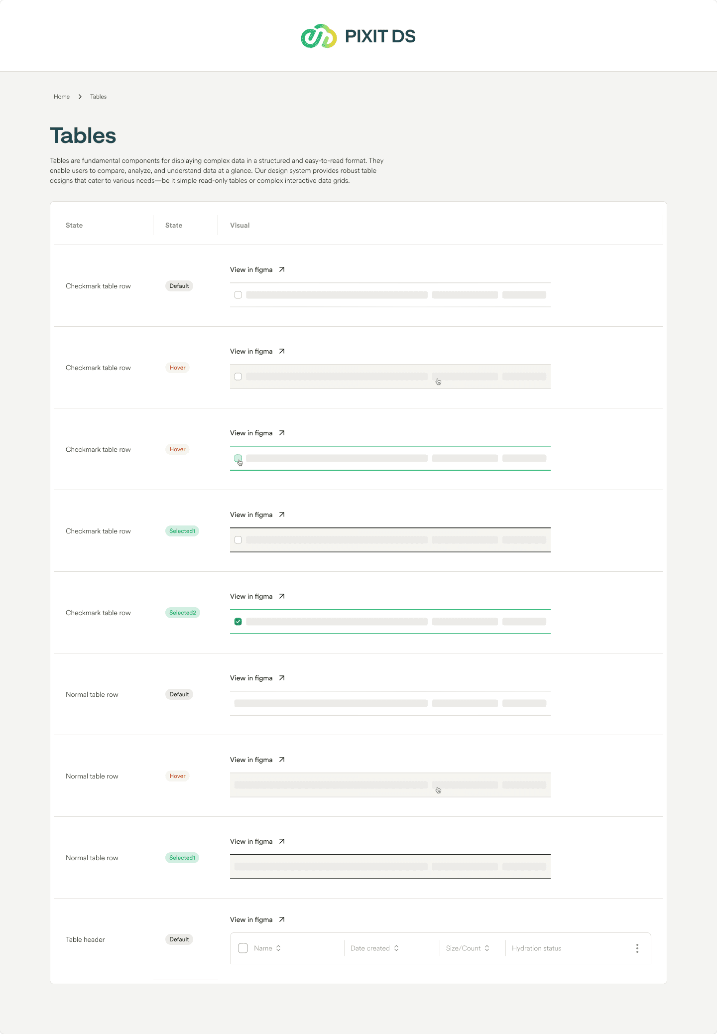
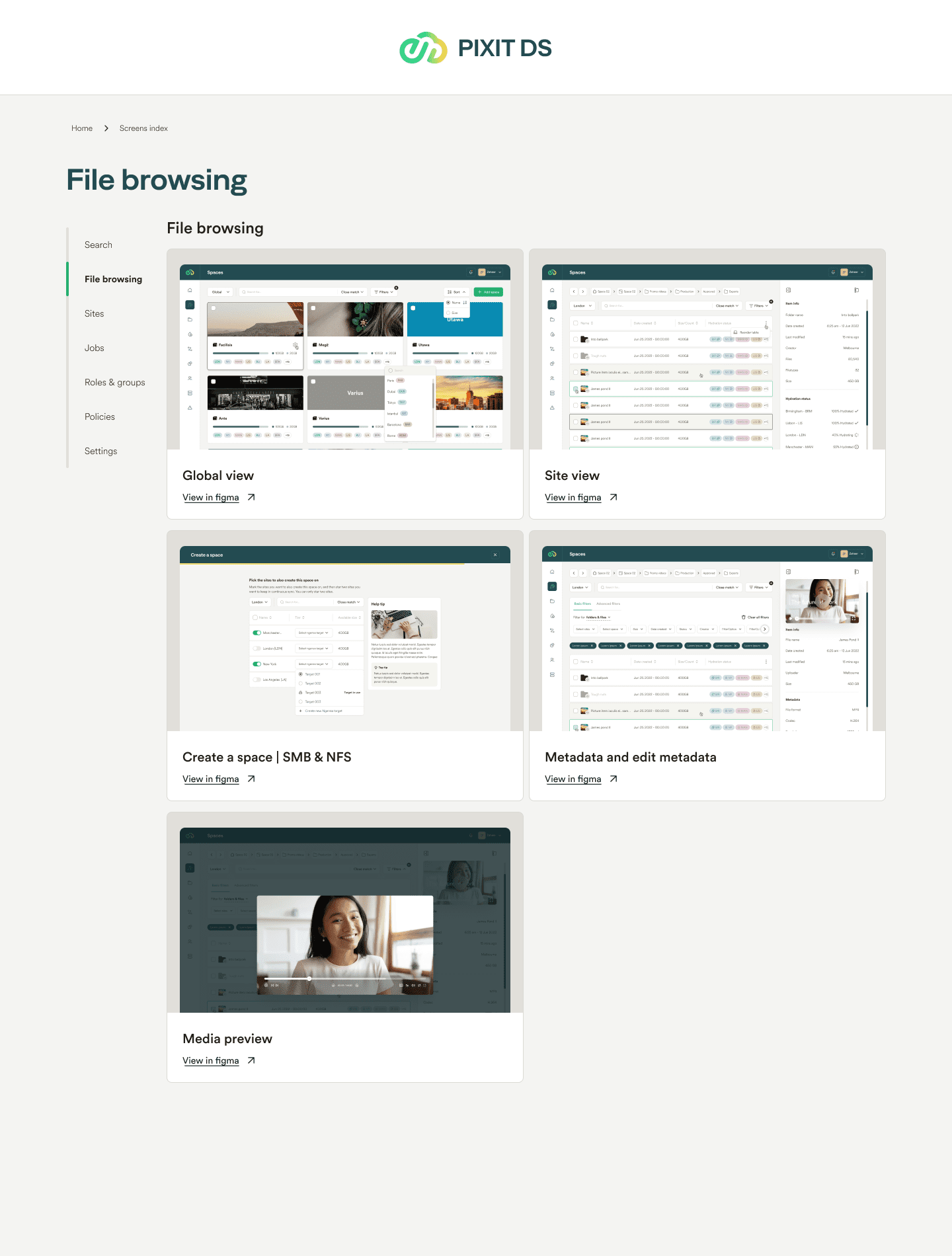
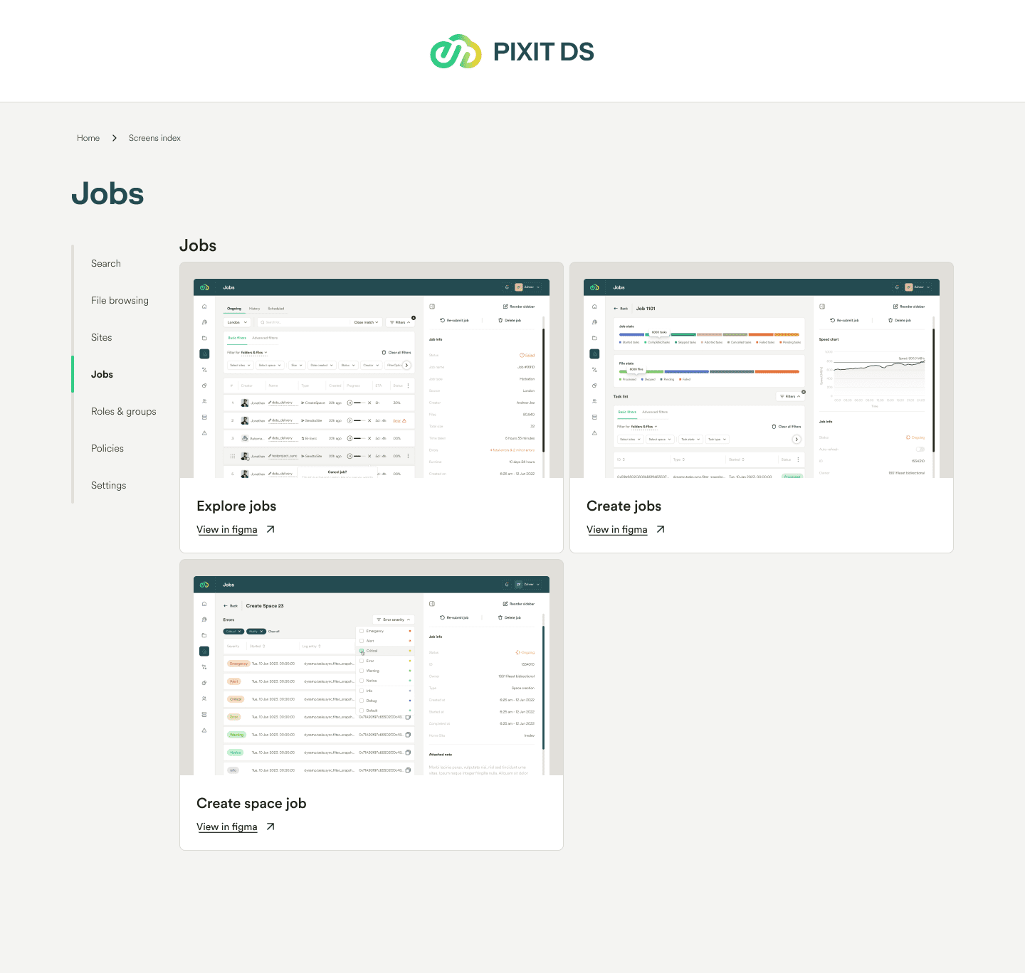
Users face challenges in locating and managing files efficiently. There is a strong demand for improved search functionalities, including advanced filtering, handling of partial information, and customizable search options. Simplifying file management and organization, providing clear visibility on file statuses, and enabling bulk actions are crucial for enhancing user productivity and reducing frustration.

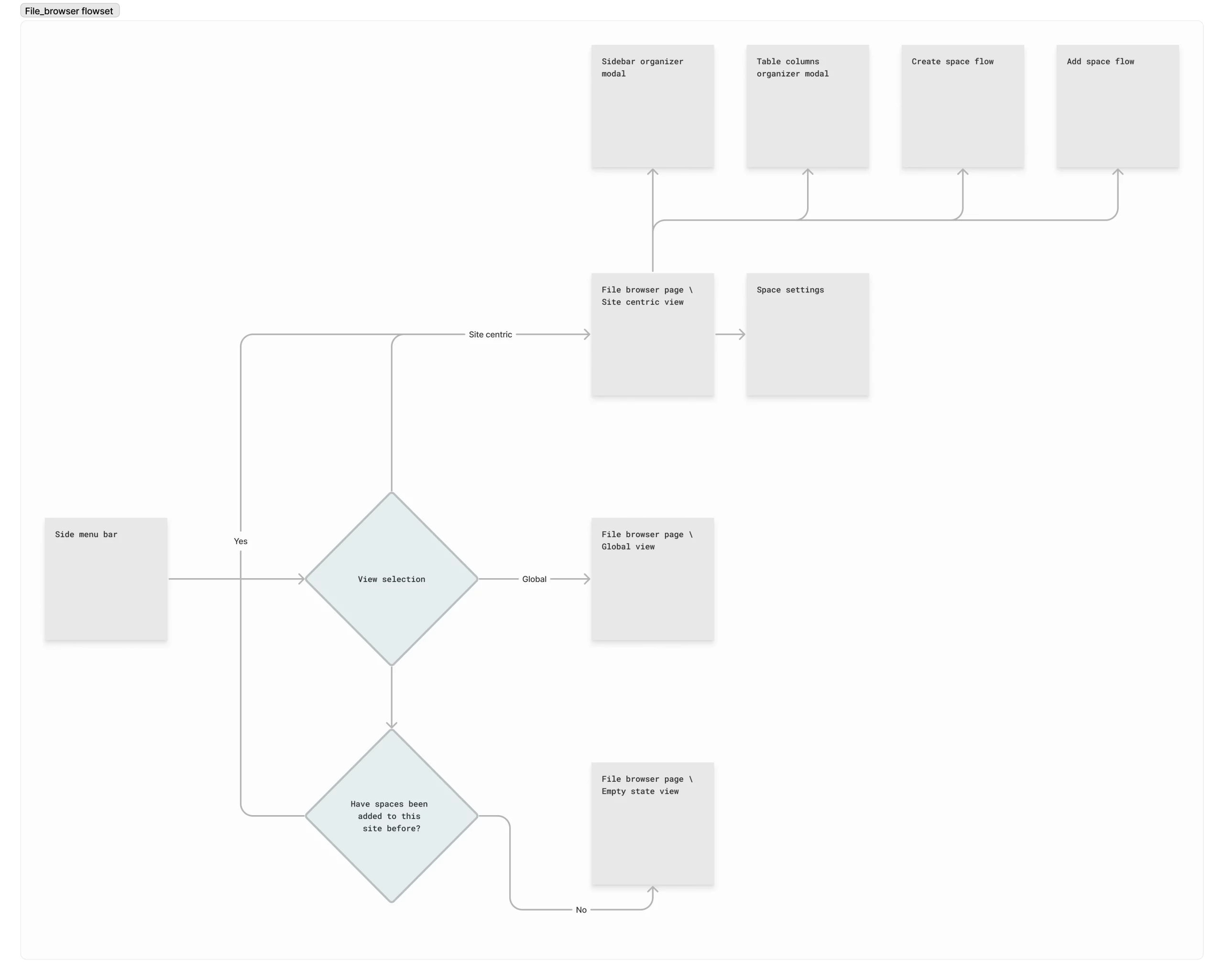
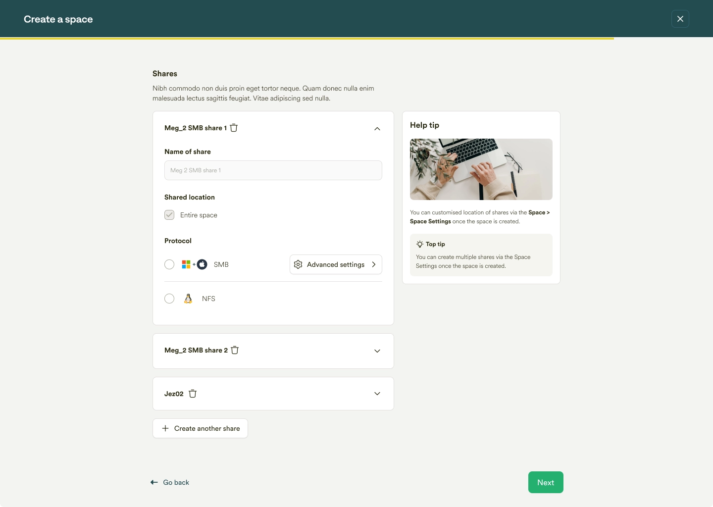
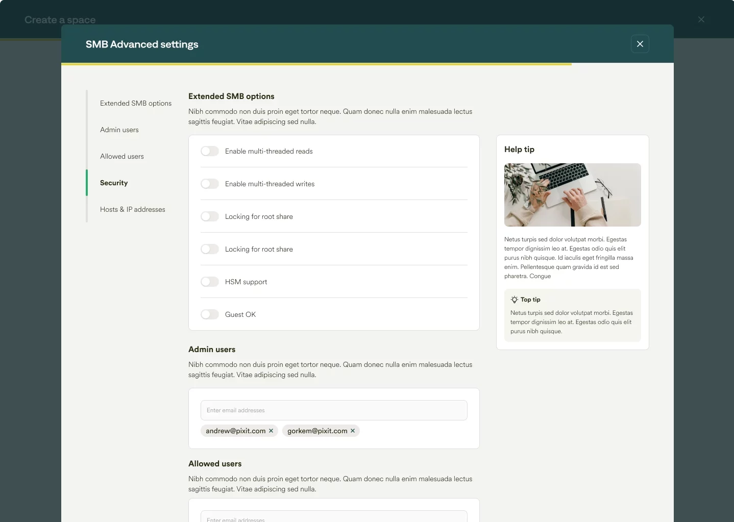
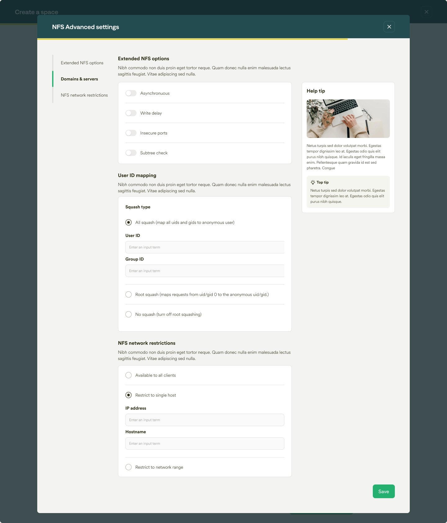
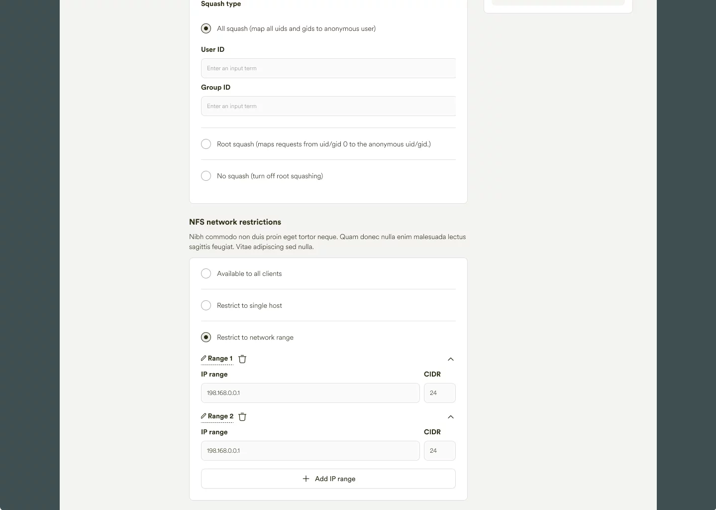
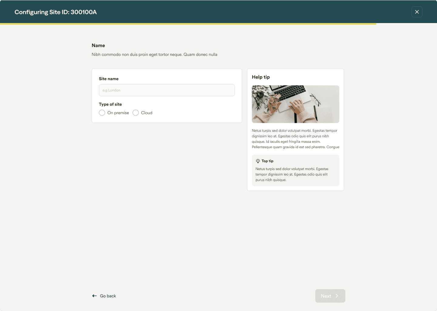
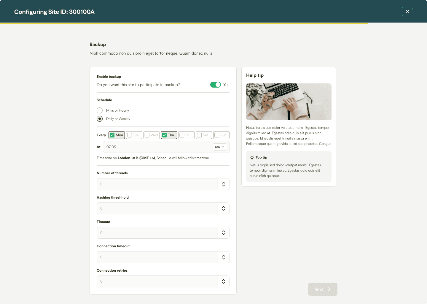
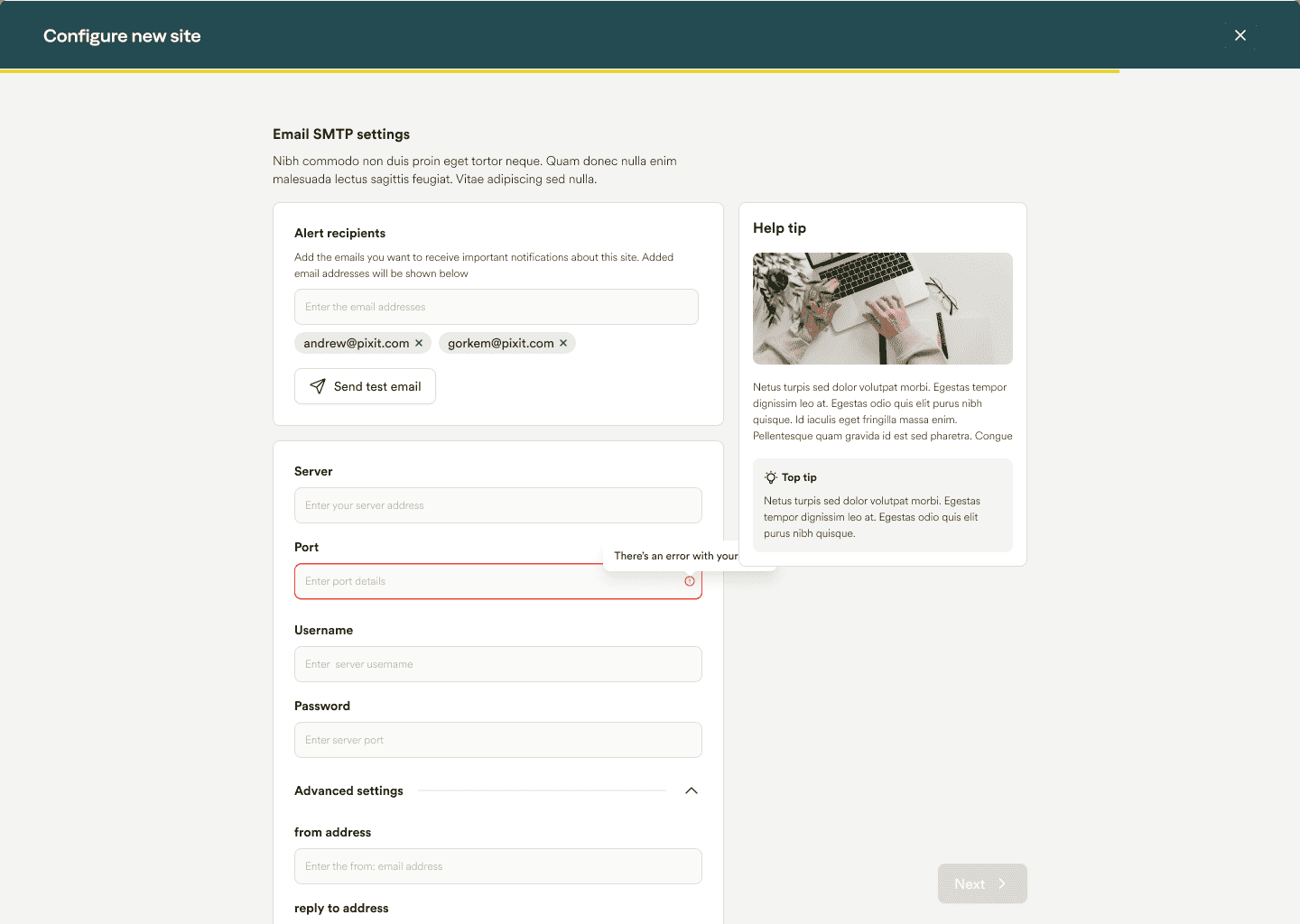
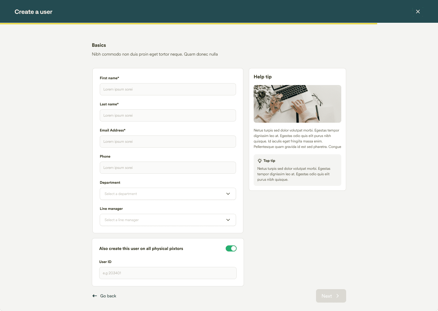
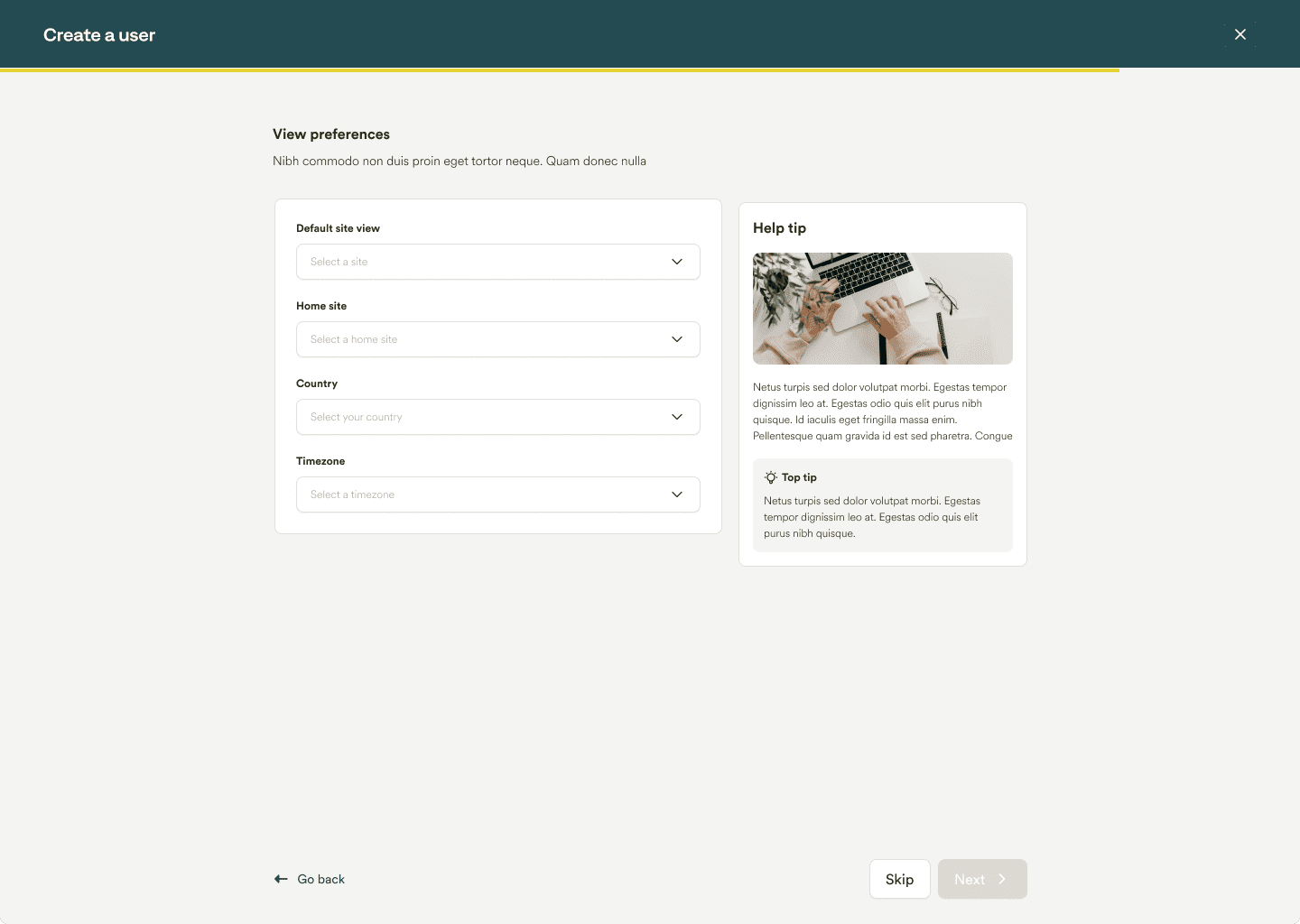
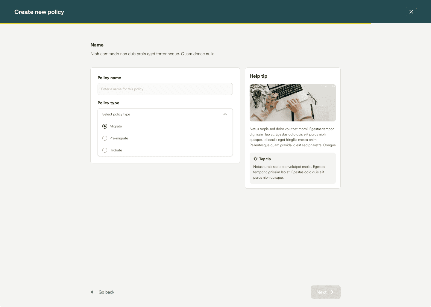
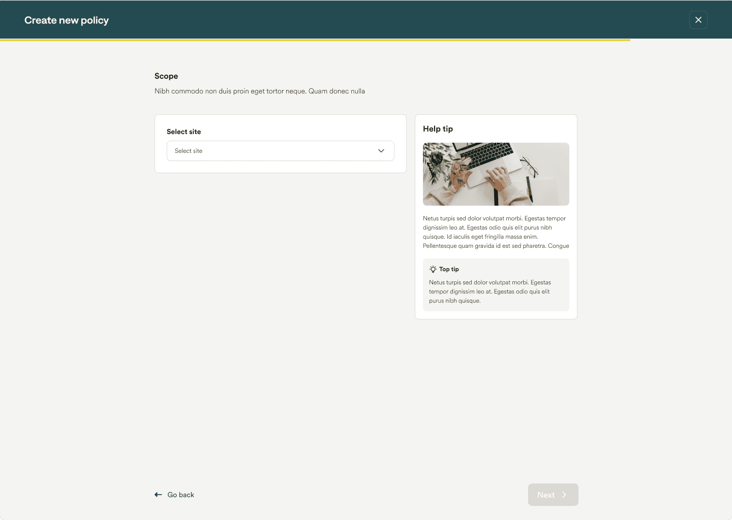
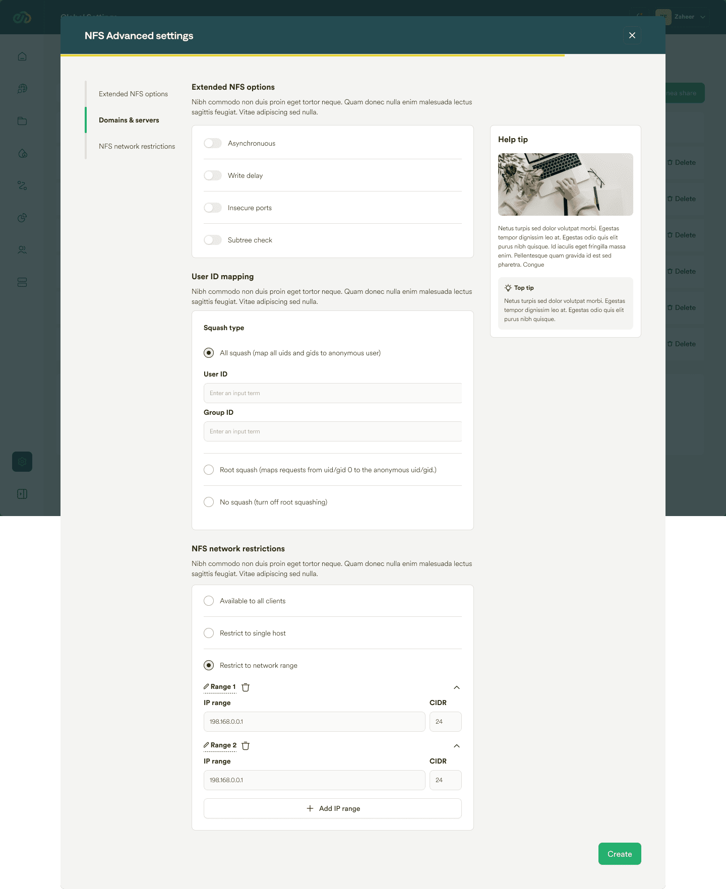
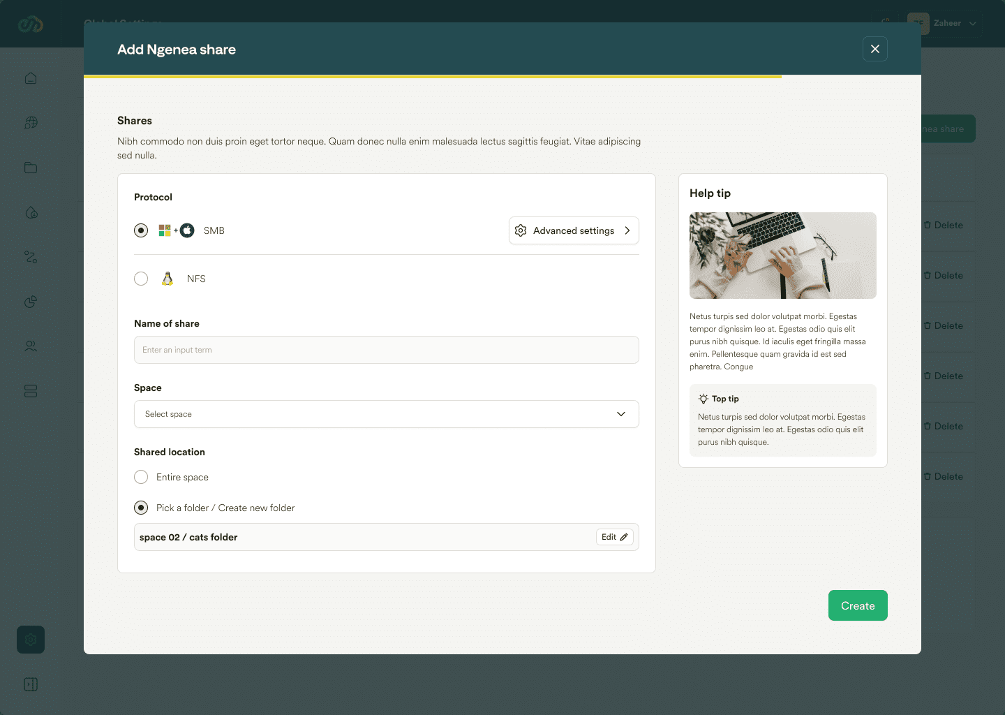
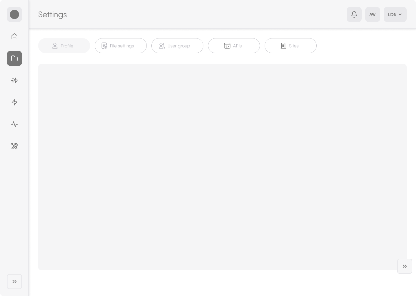
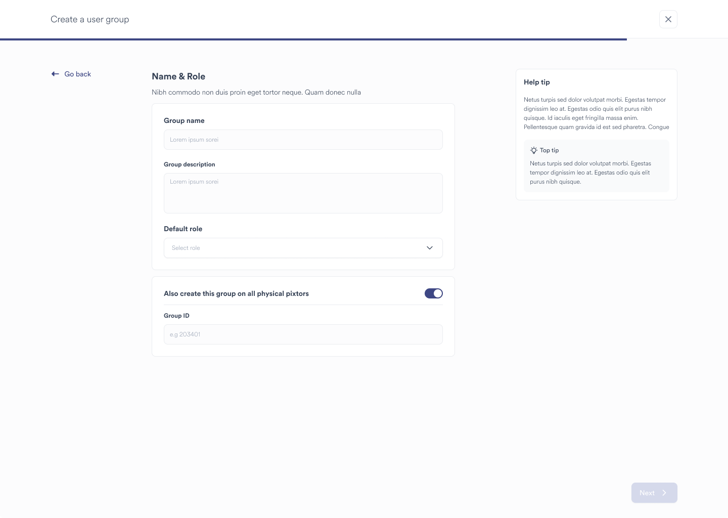
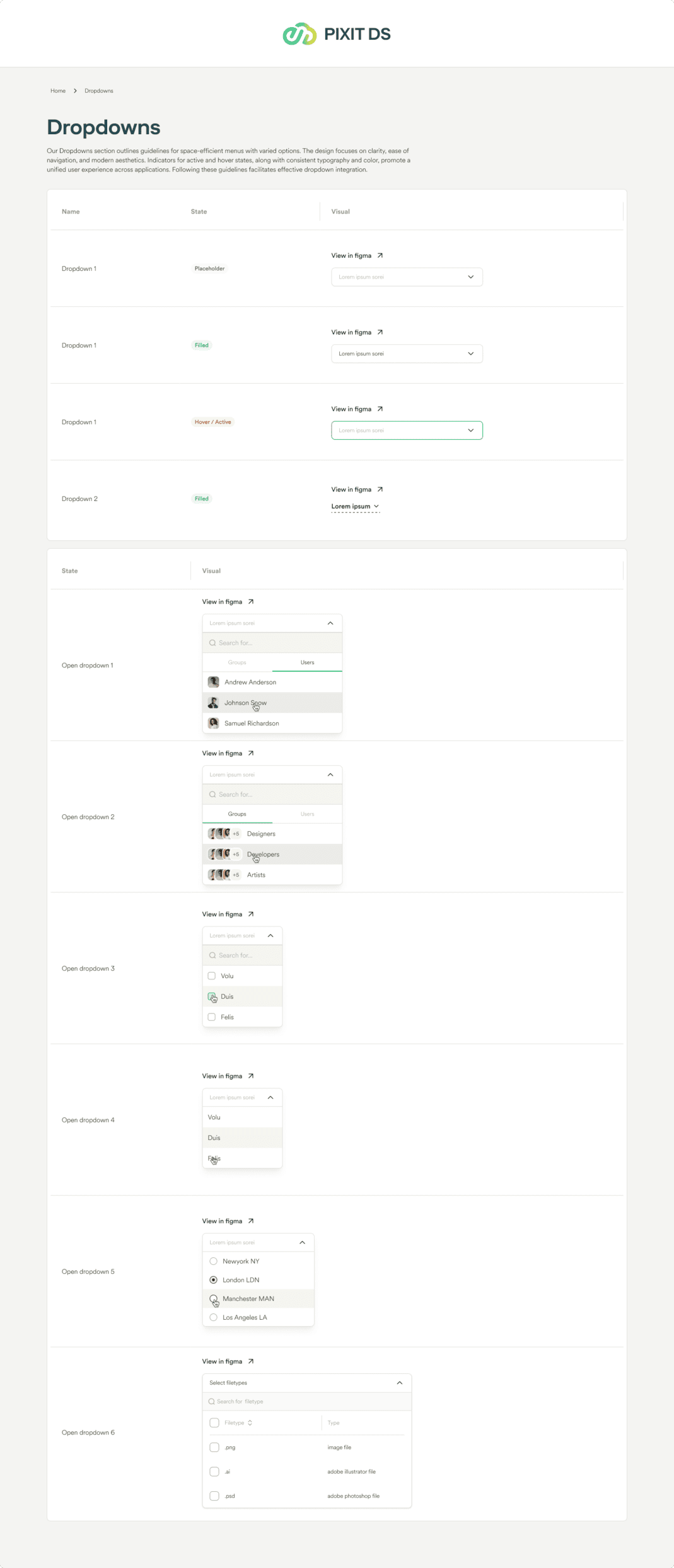
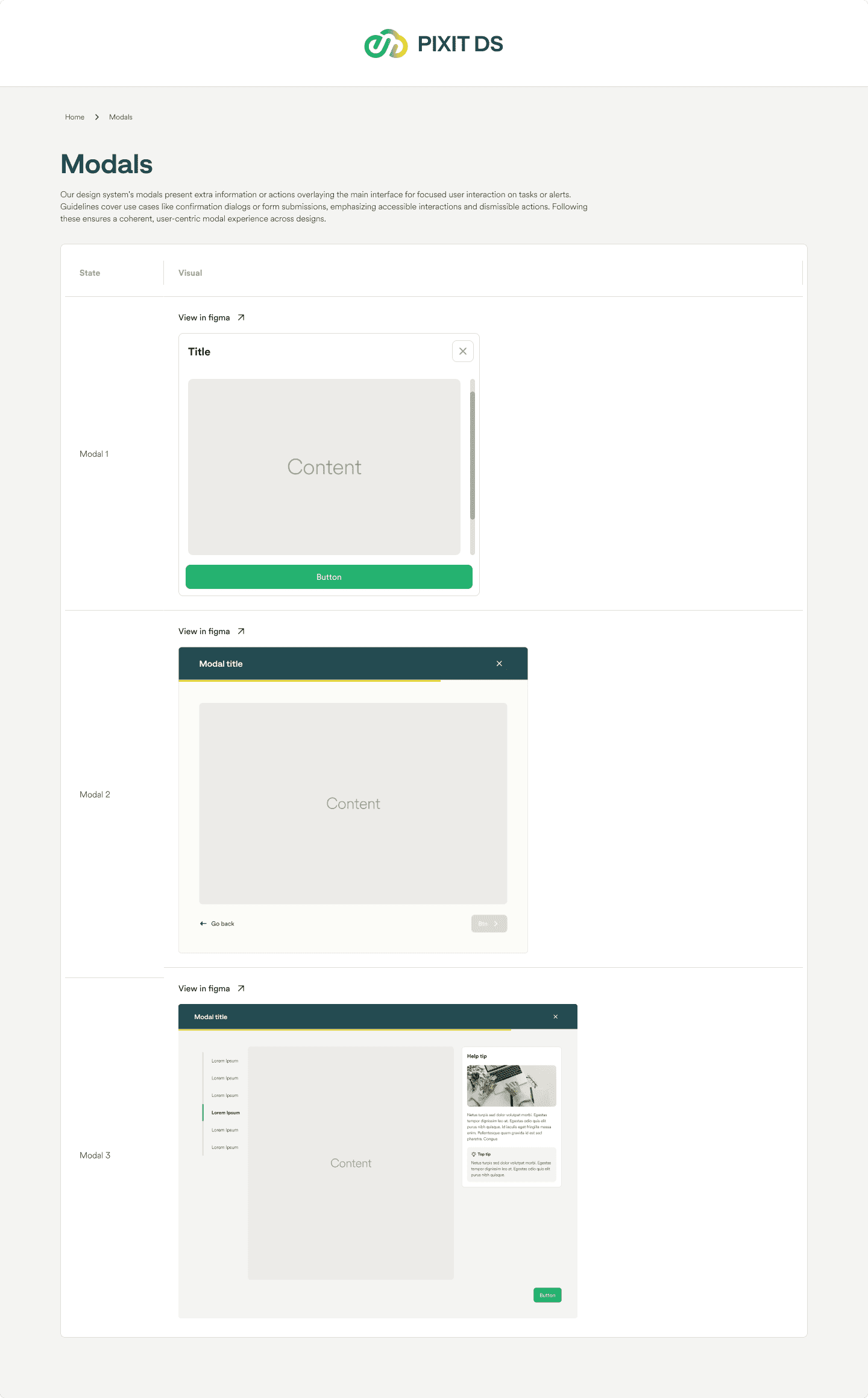
2. User Interface and Experience:
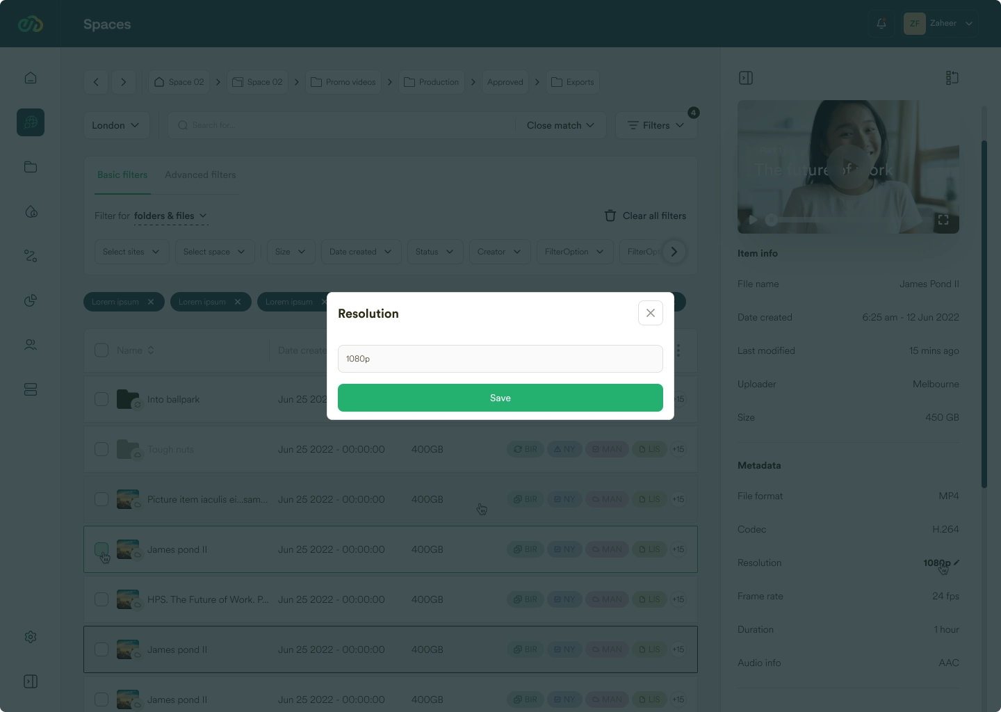
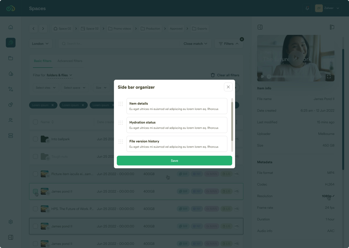
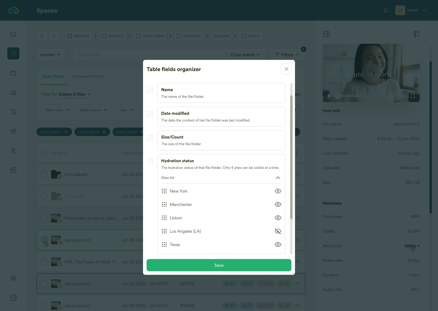
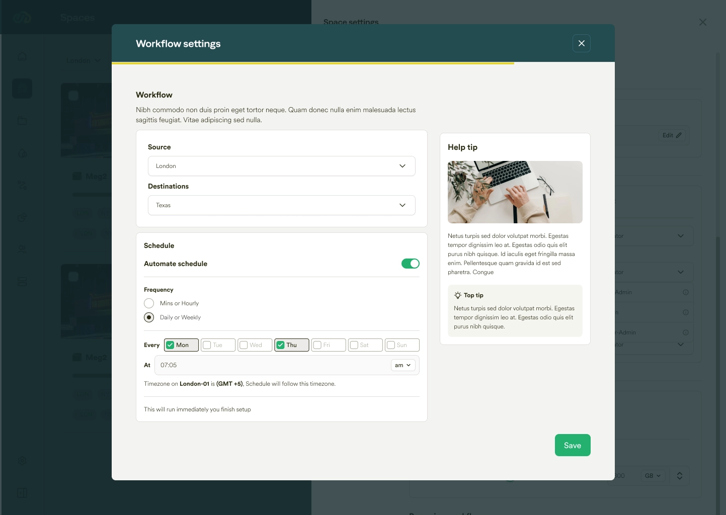
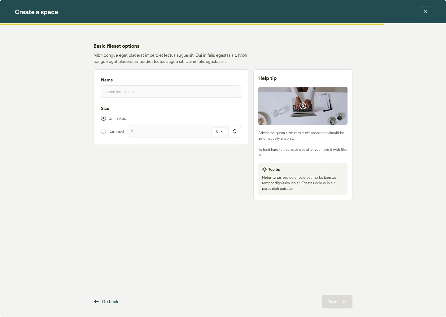
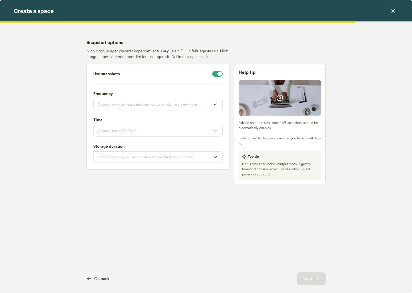
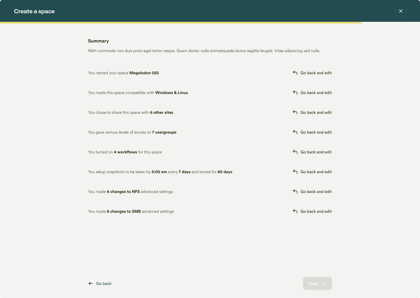
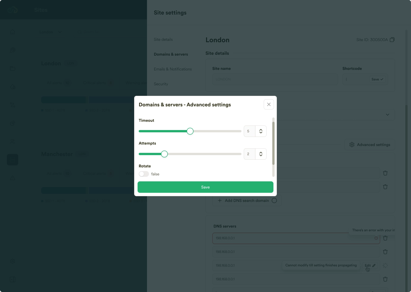
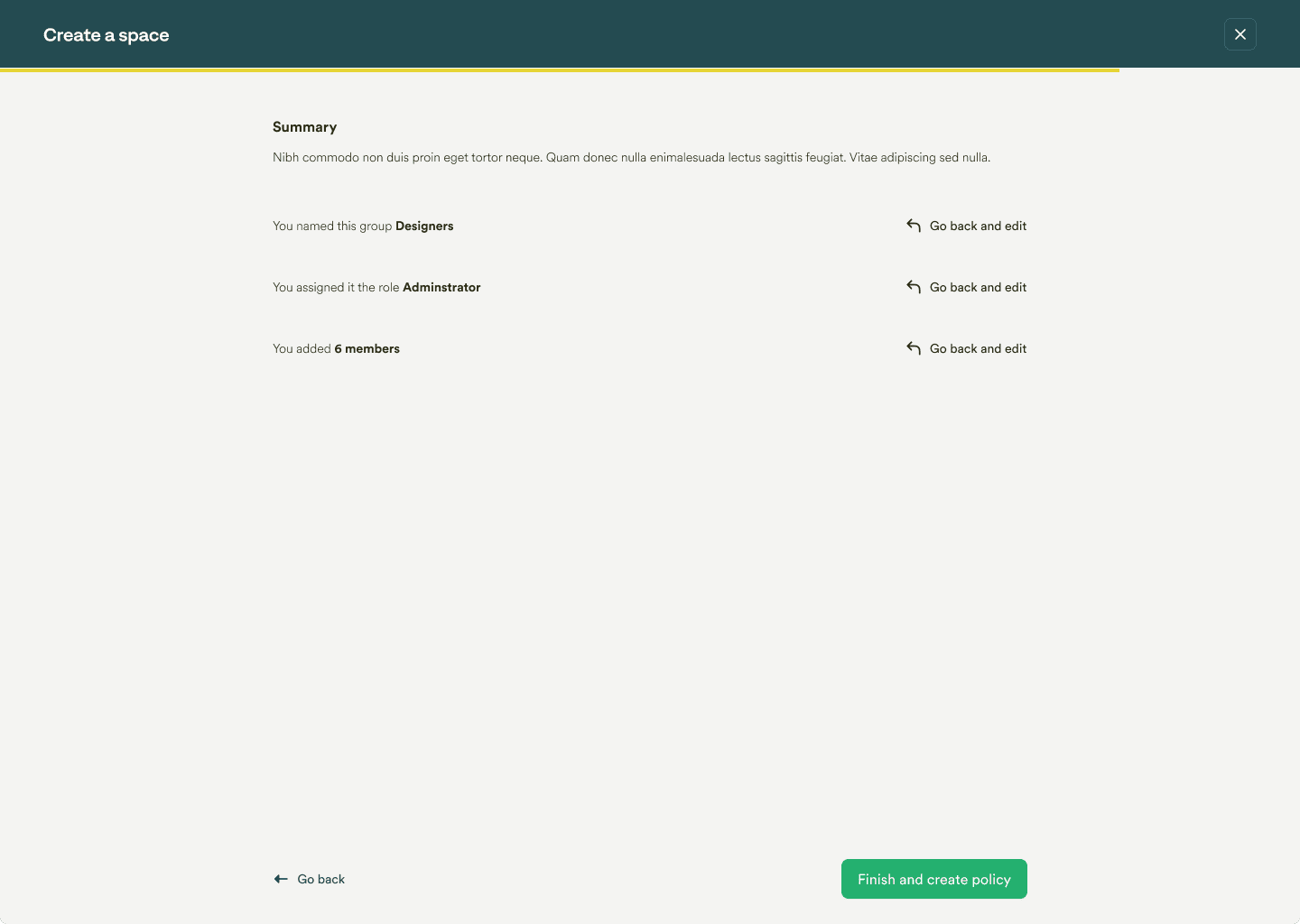
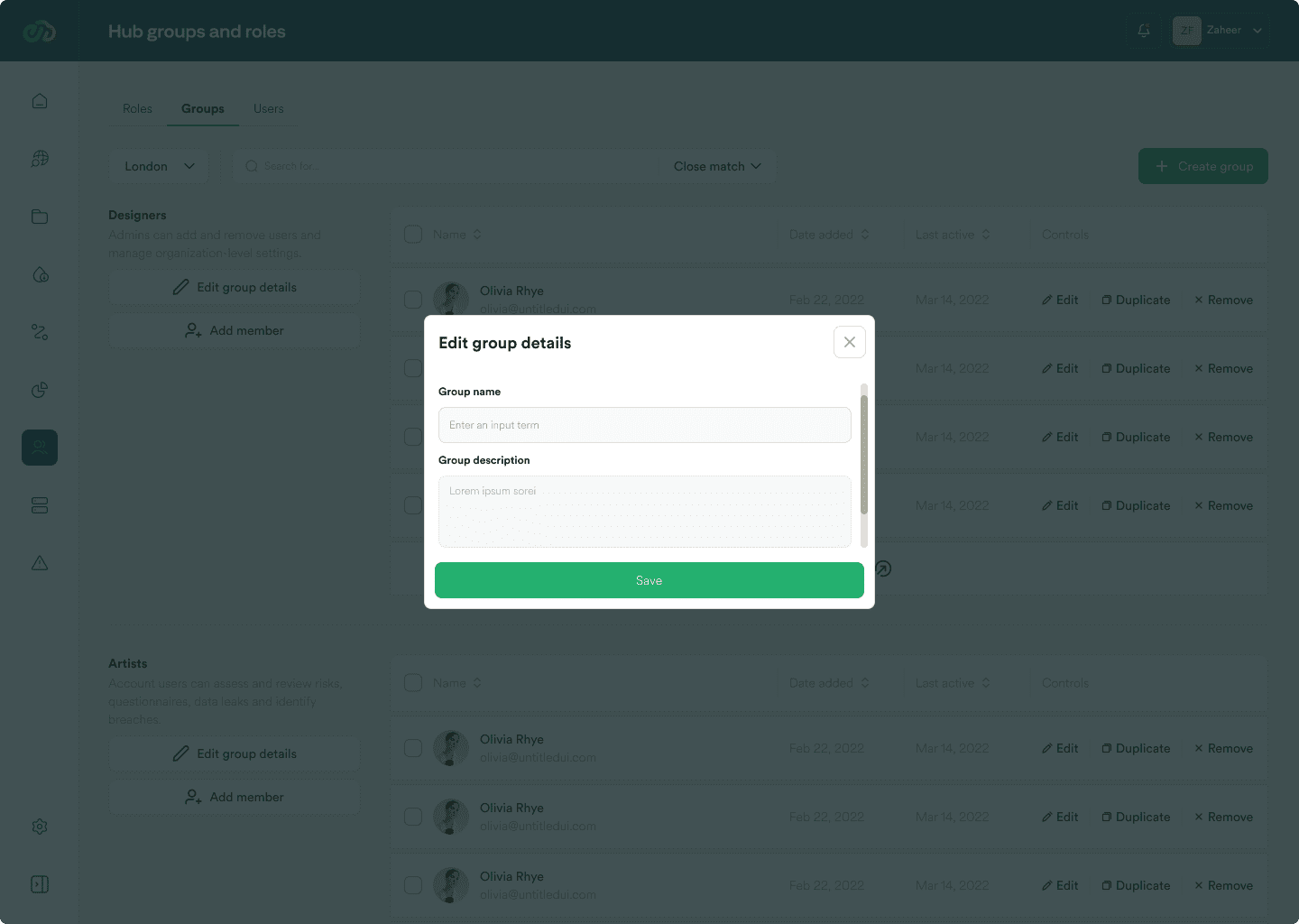
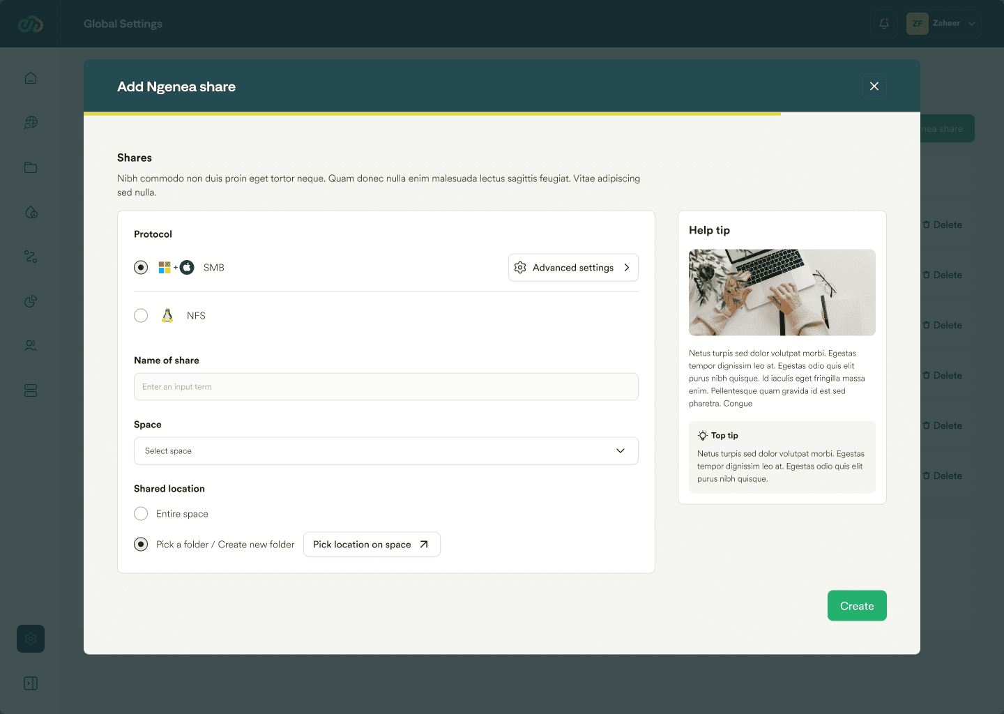
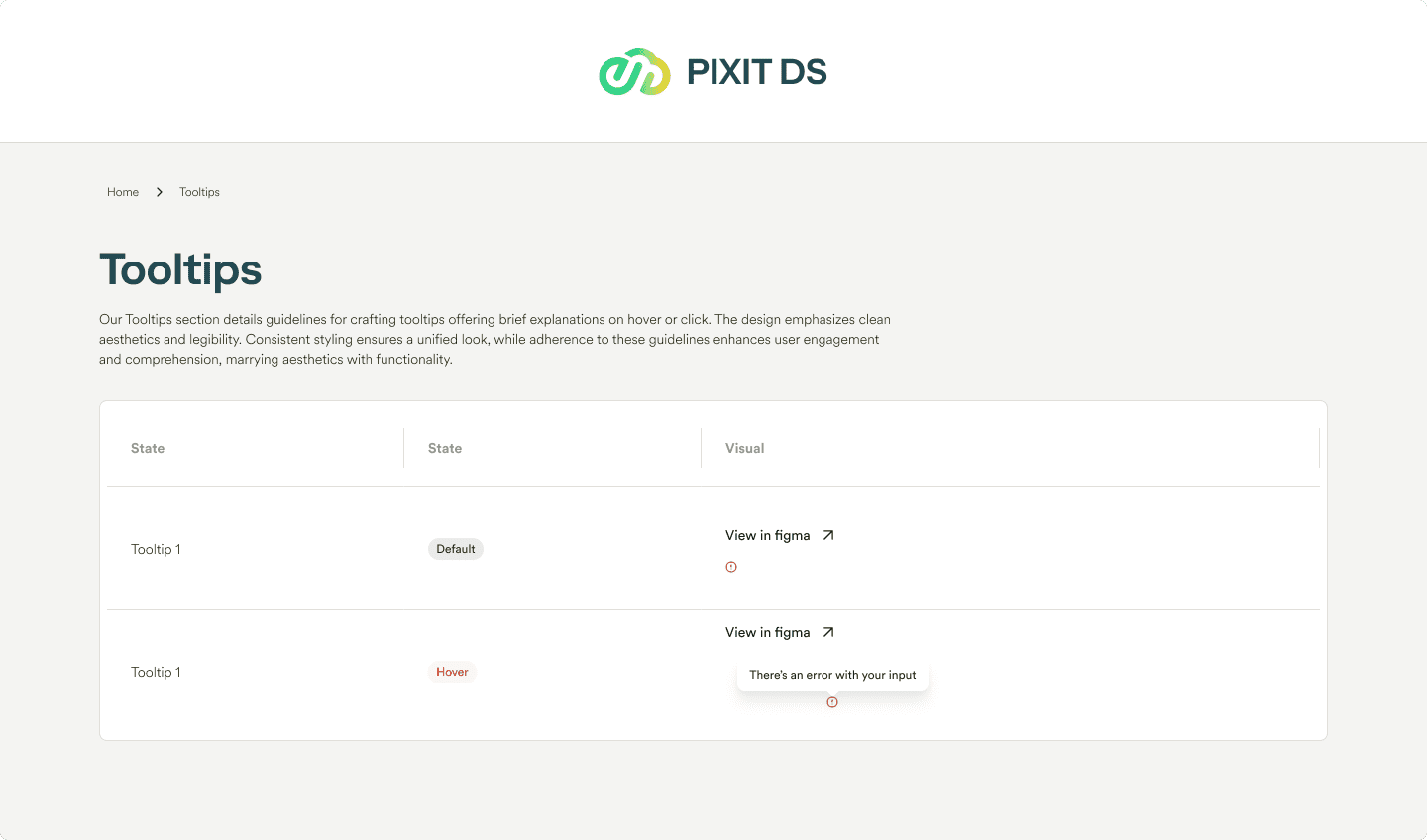
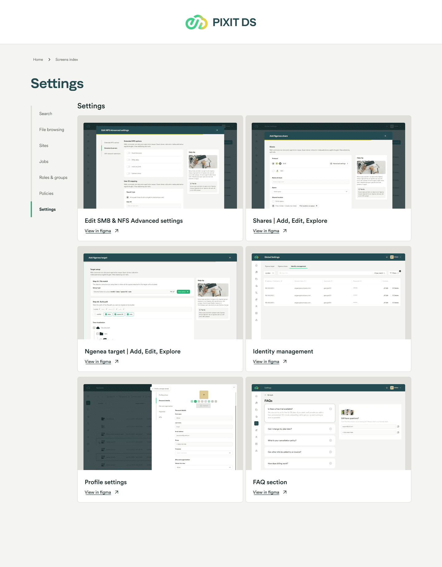
A need for user-friendly and intuitive interfaces is evident. Users seek simplified navigation, clear guidance, and customizable UI options to facilitate easier interaction with systems. This includes streamlining settings management, providing clear tooltips, and ensuring a responsive and adaptable interface.

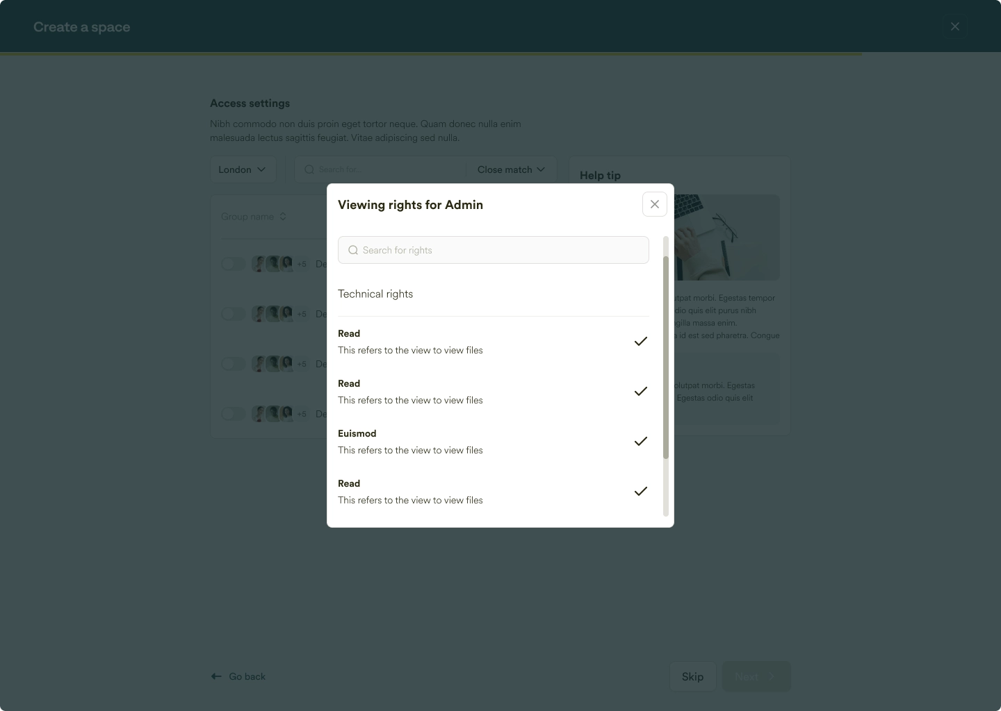
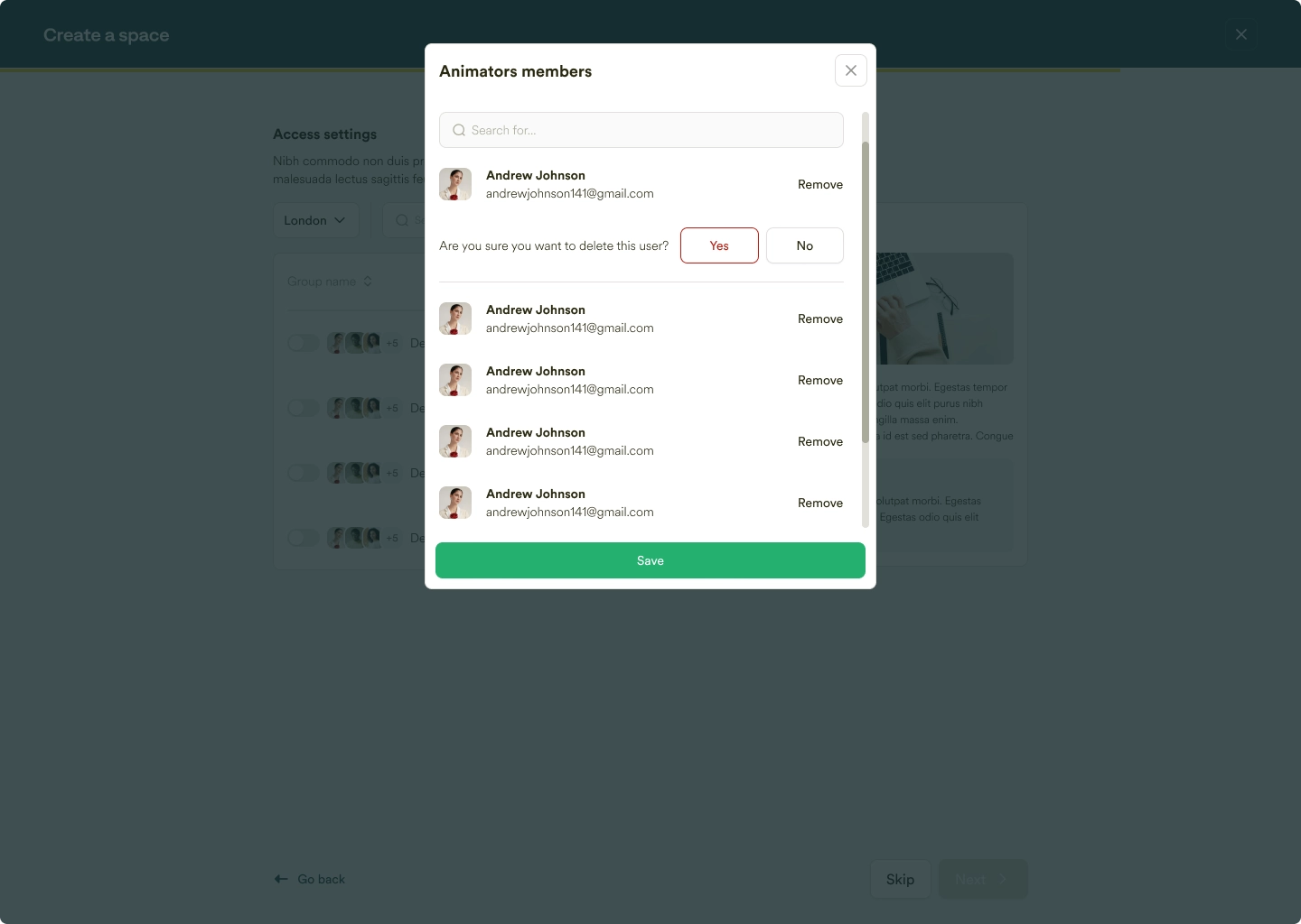
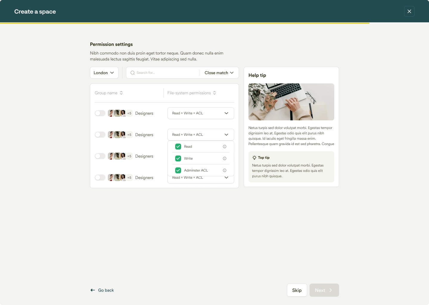
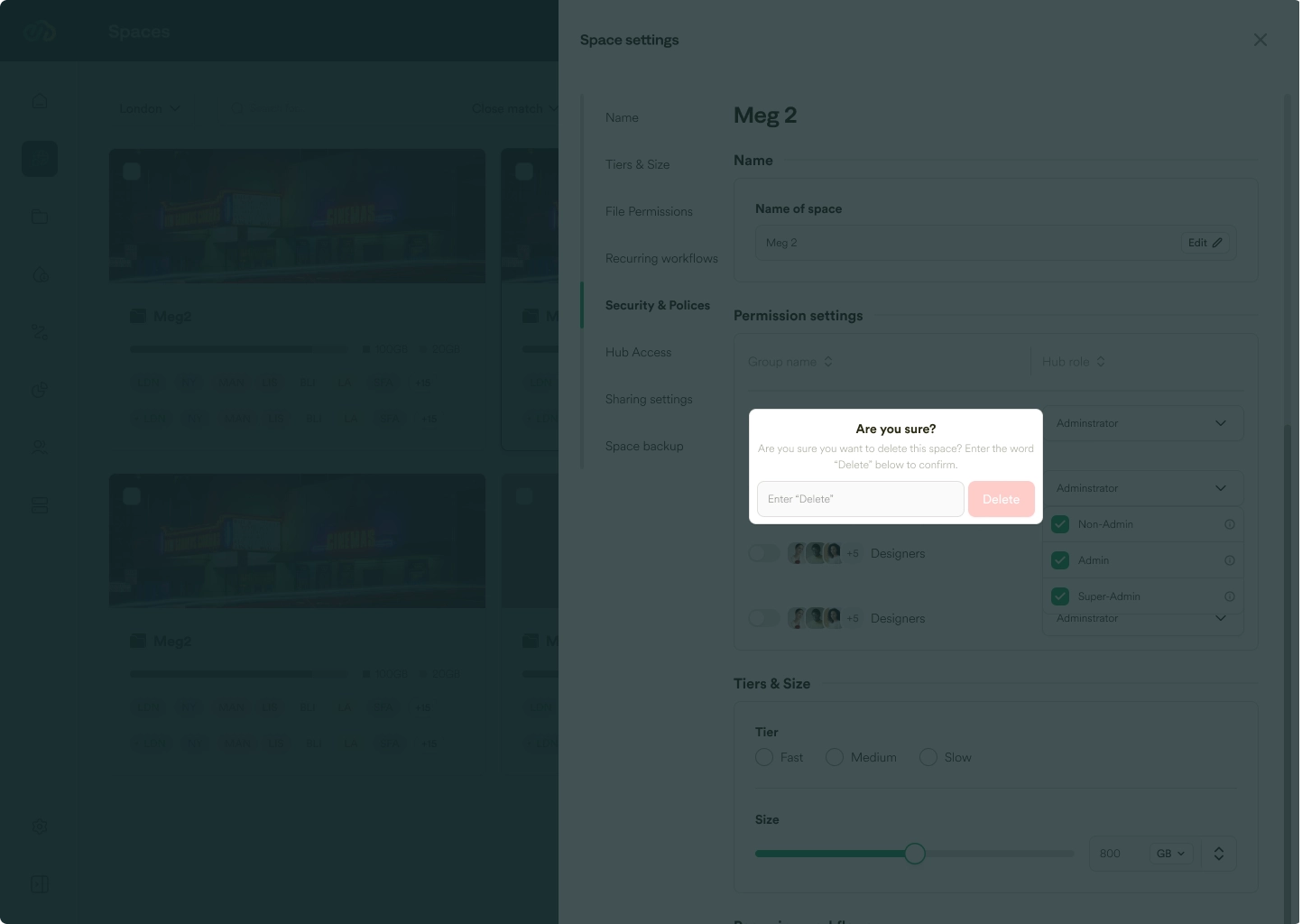
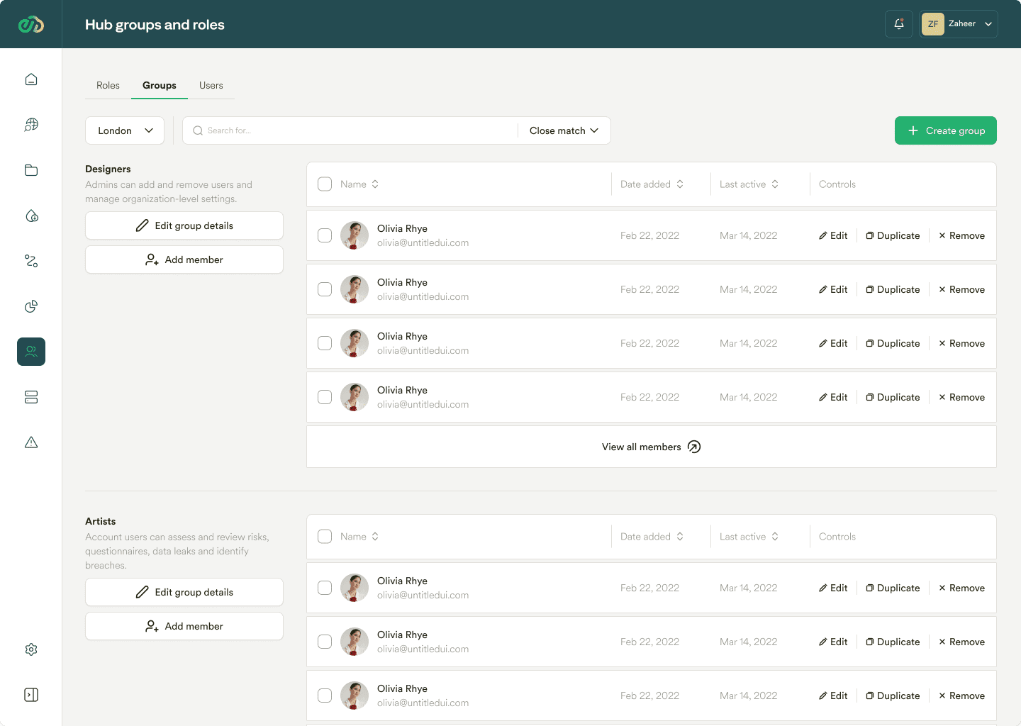
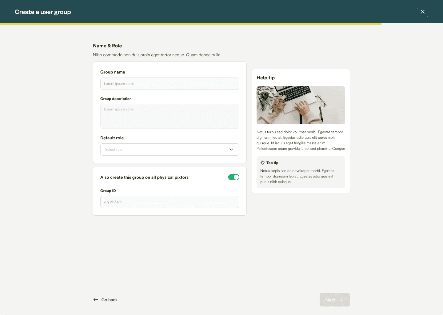
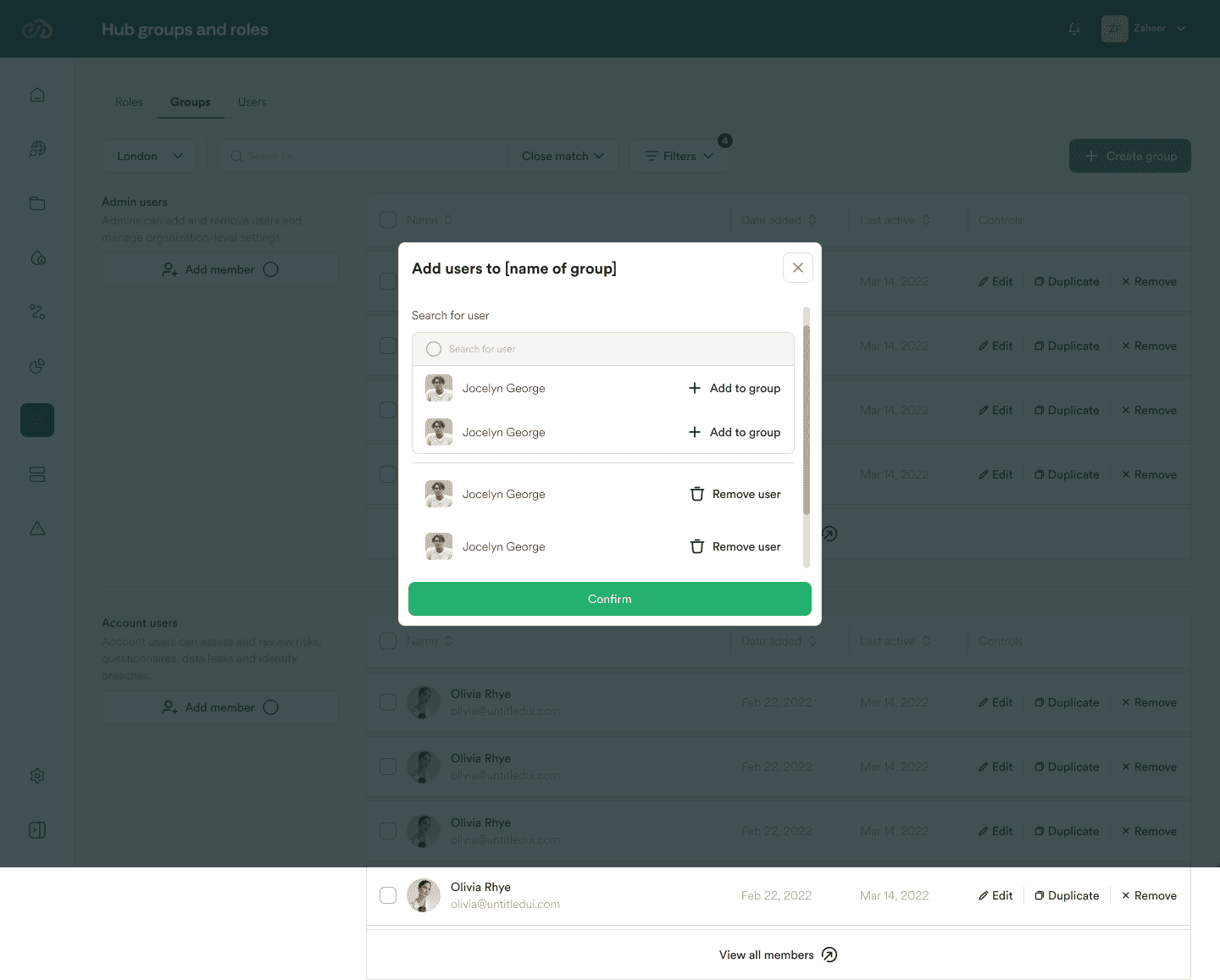
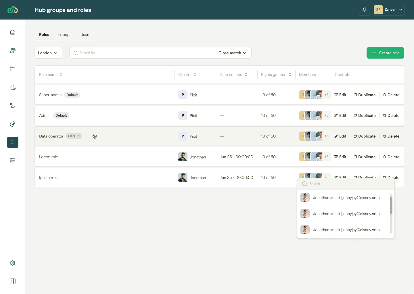
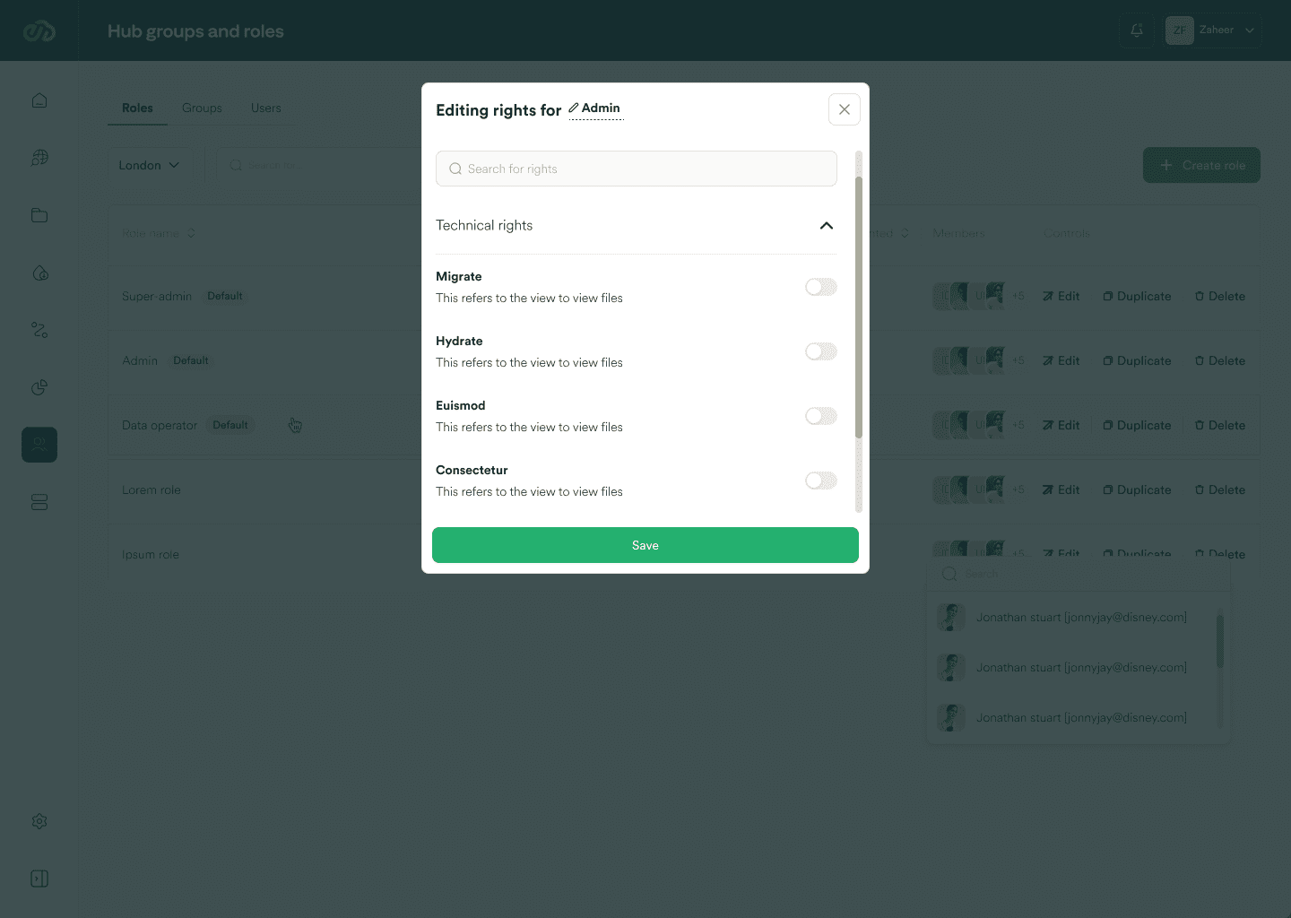
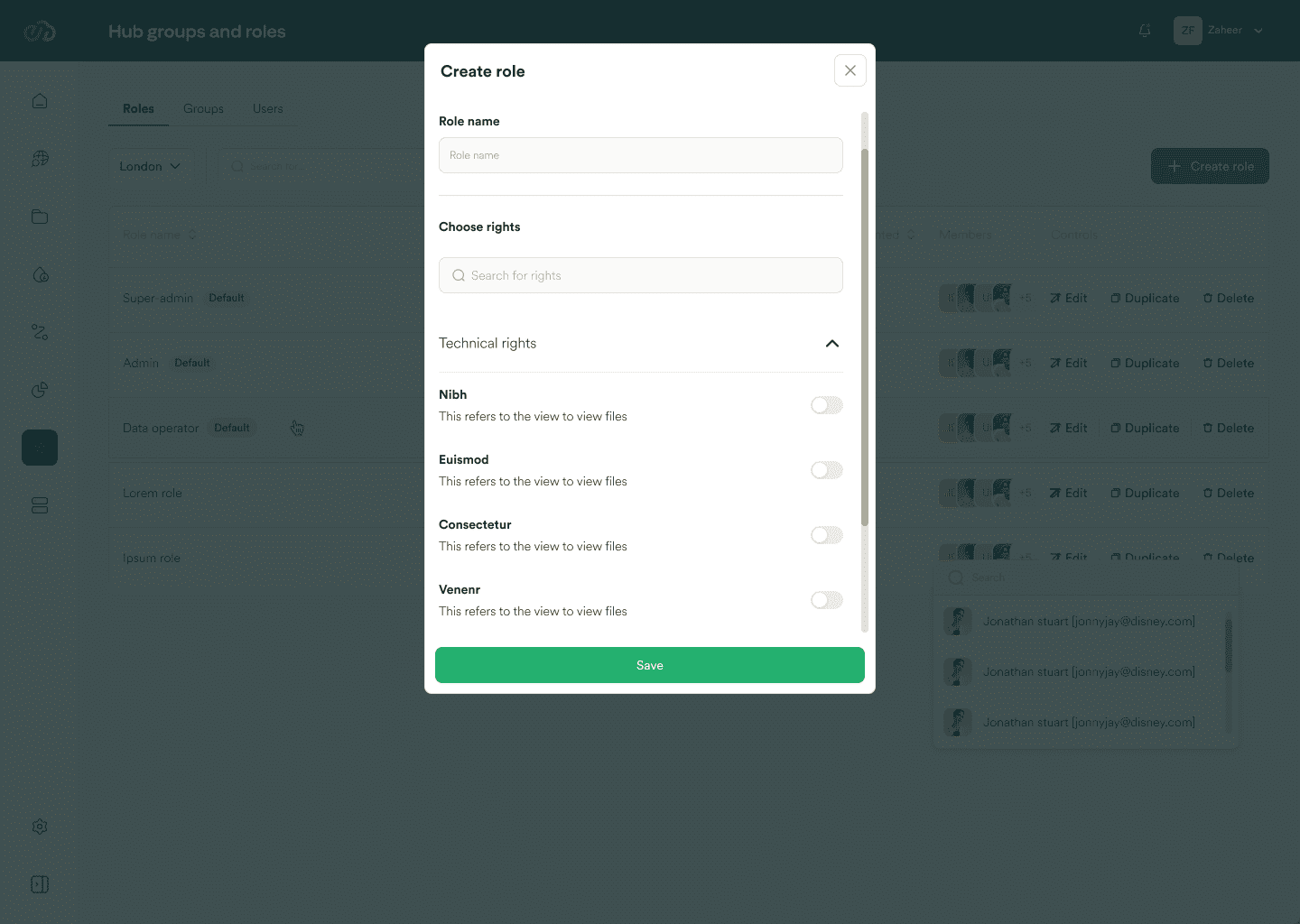
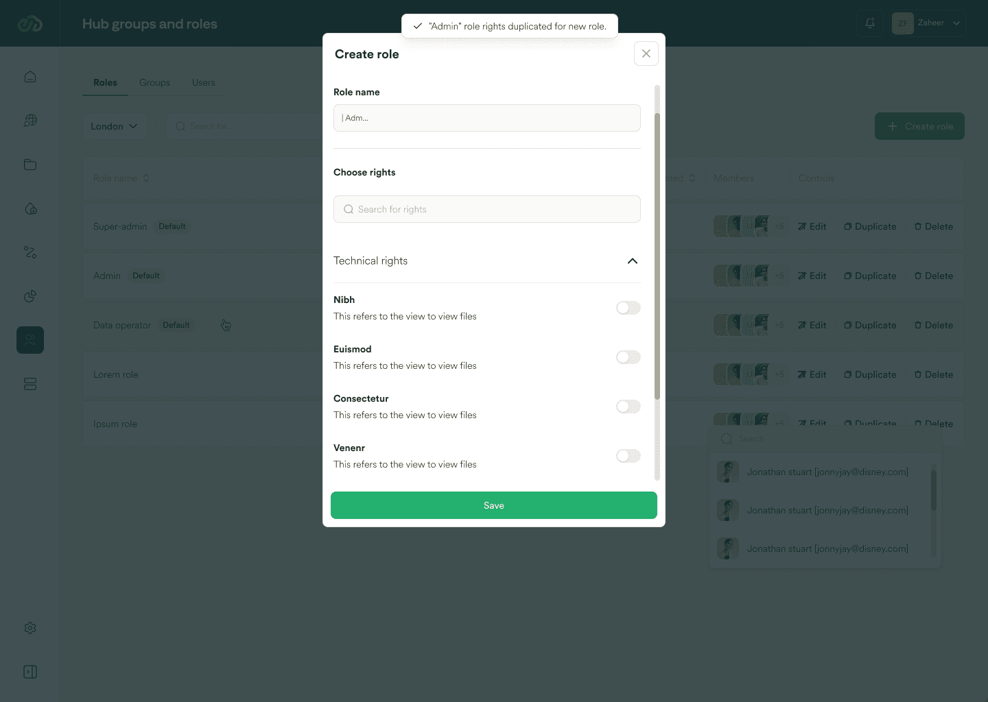
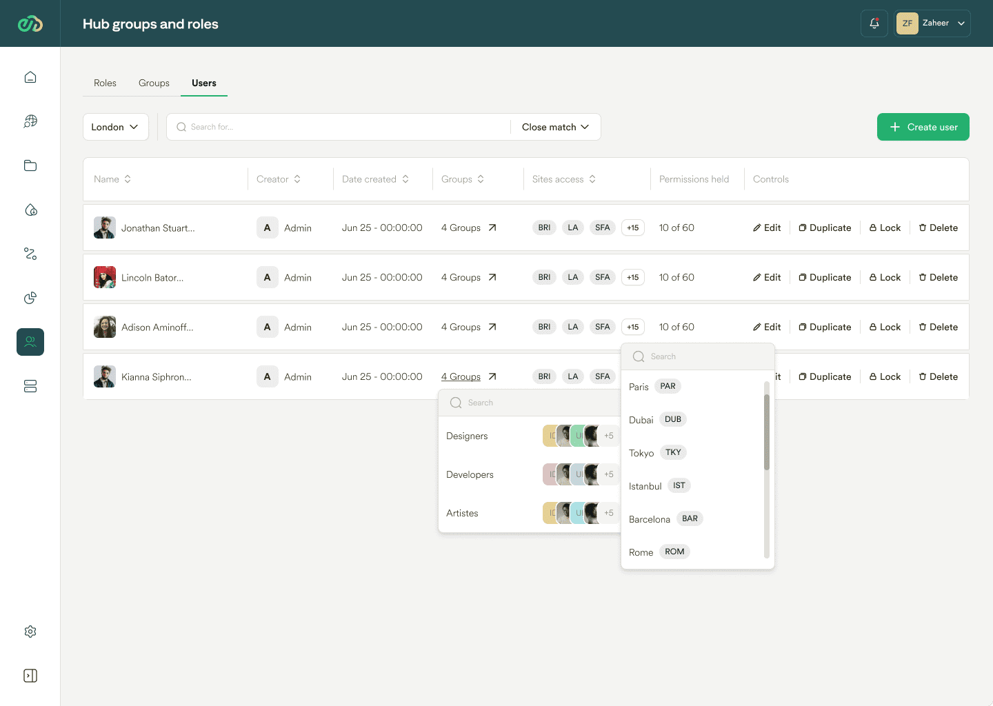
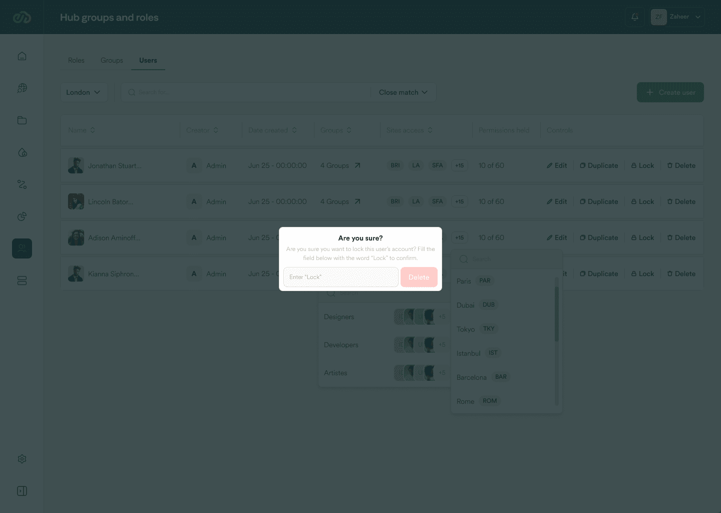
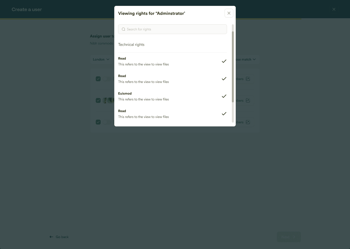
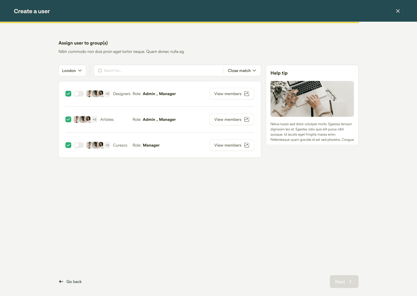
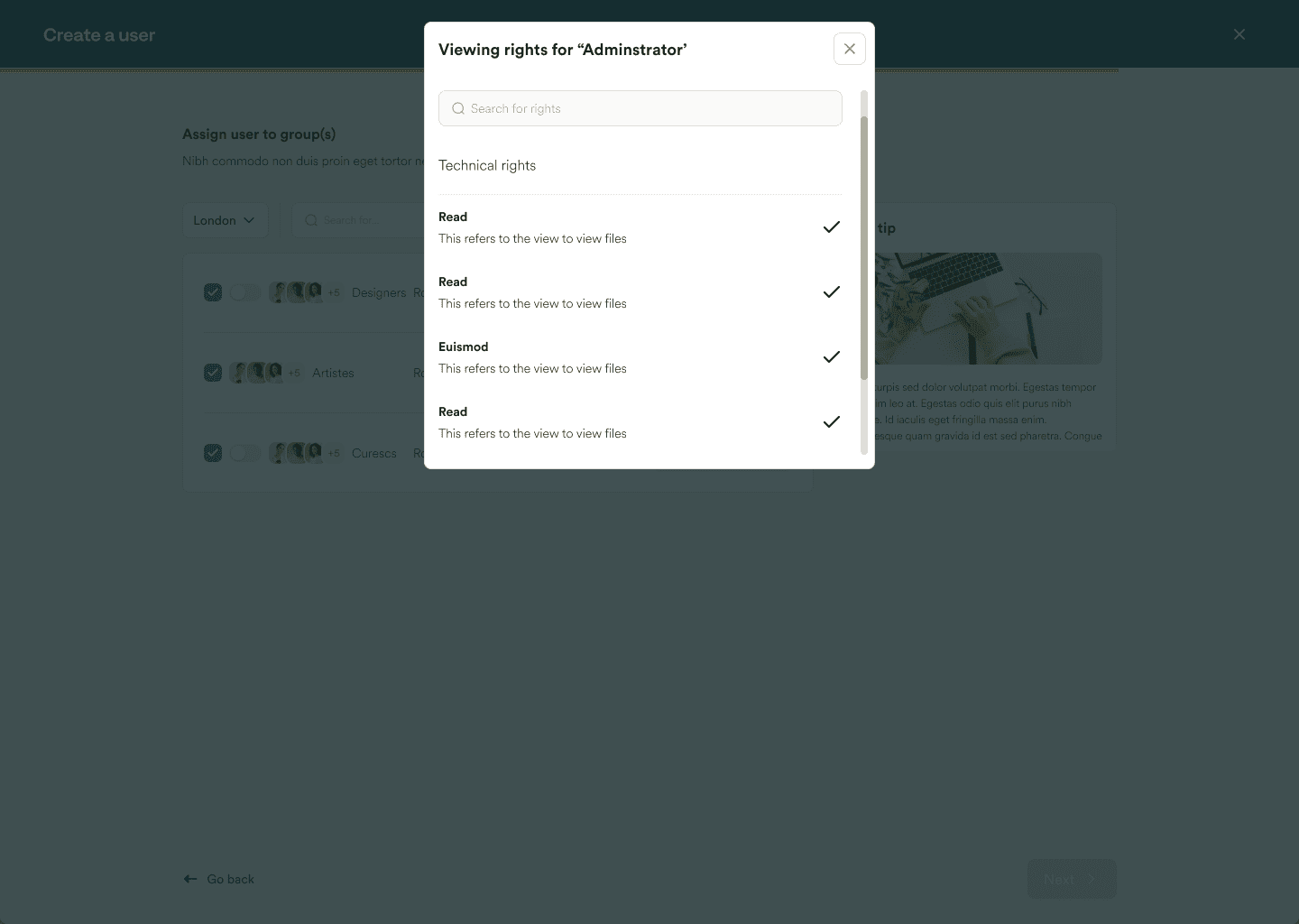
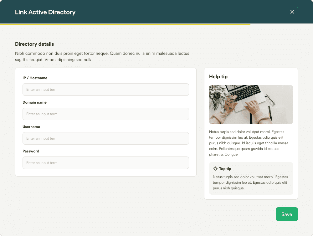
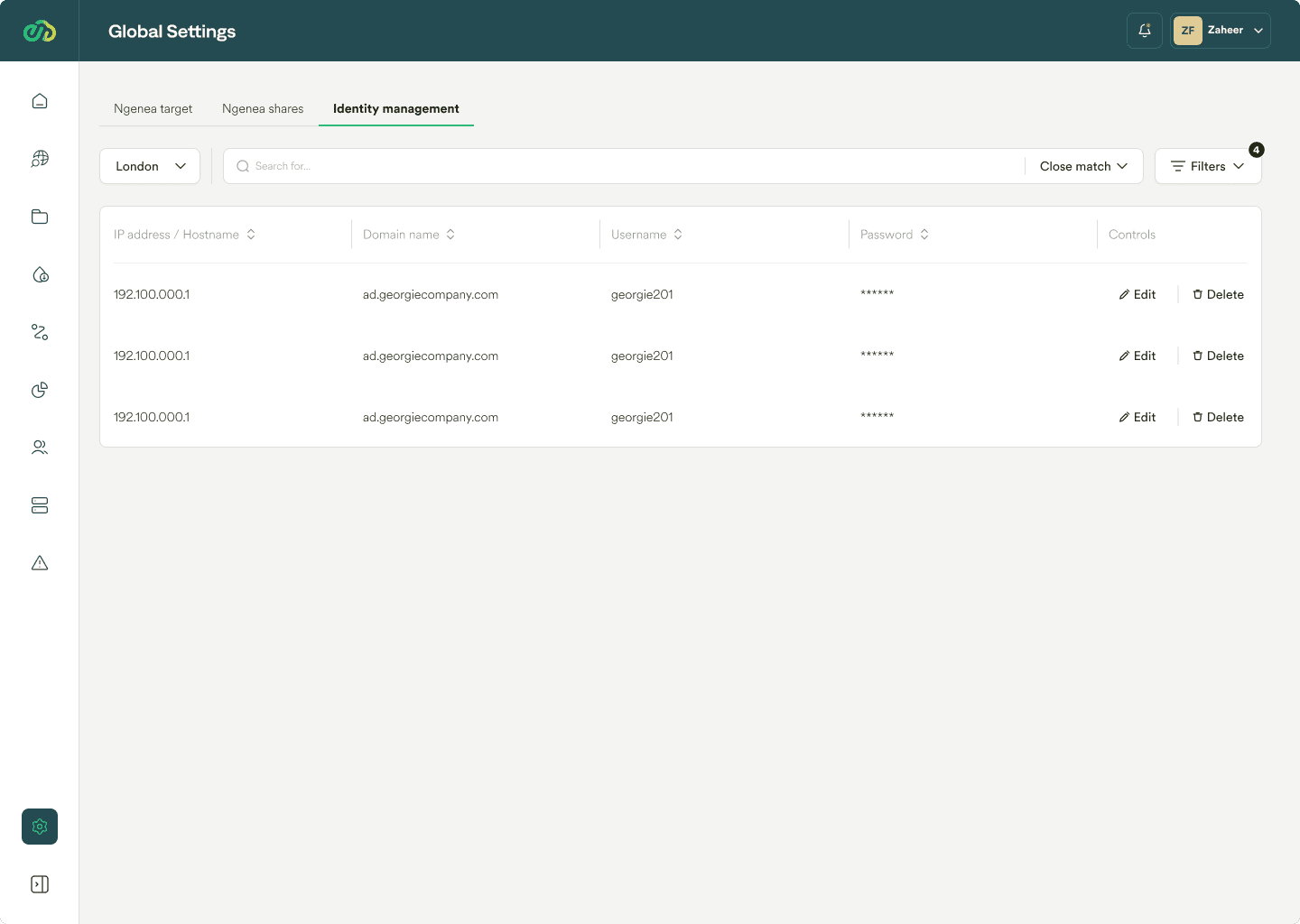
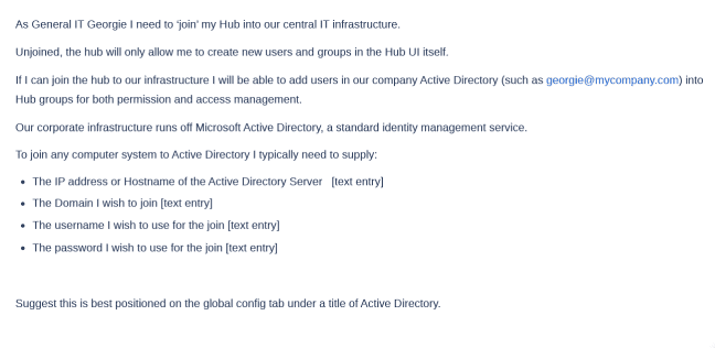
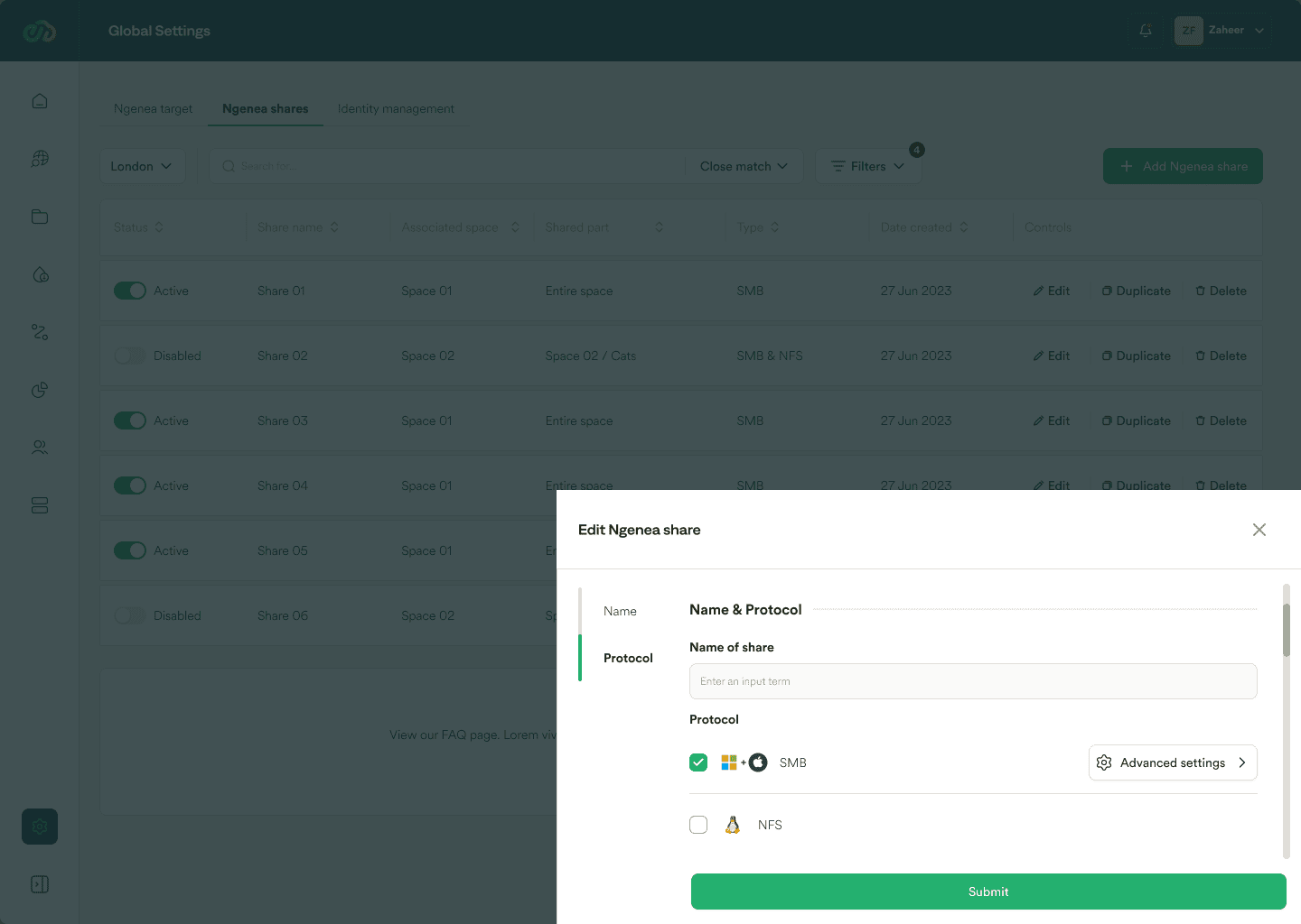
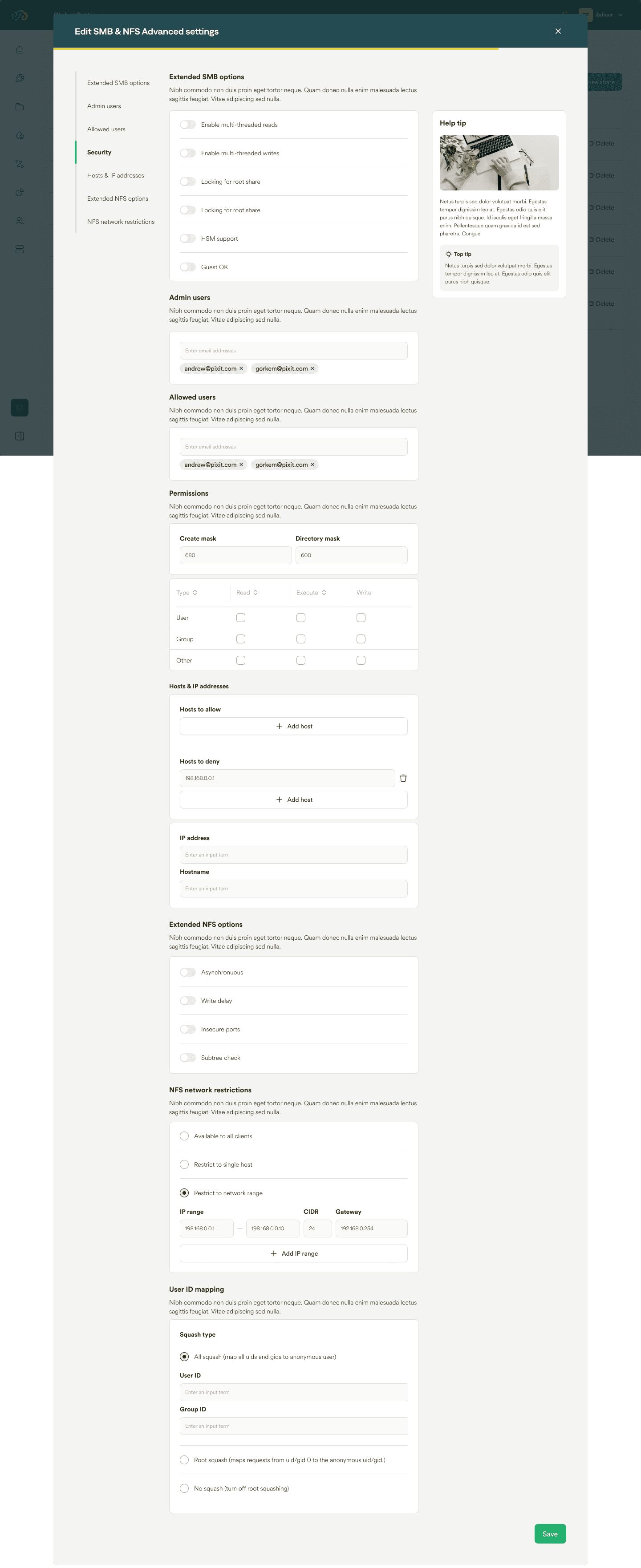
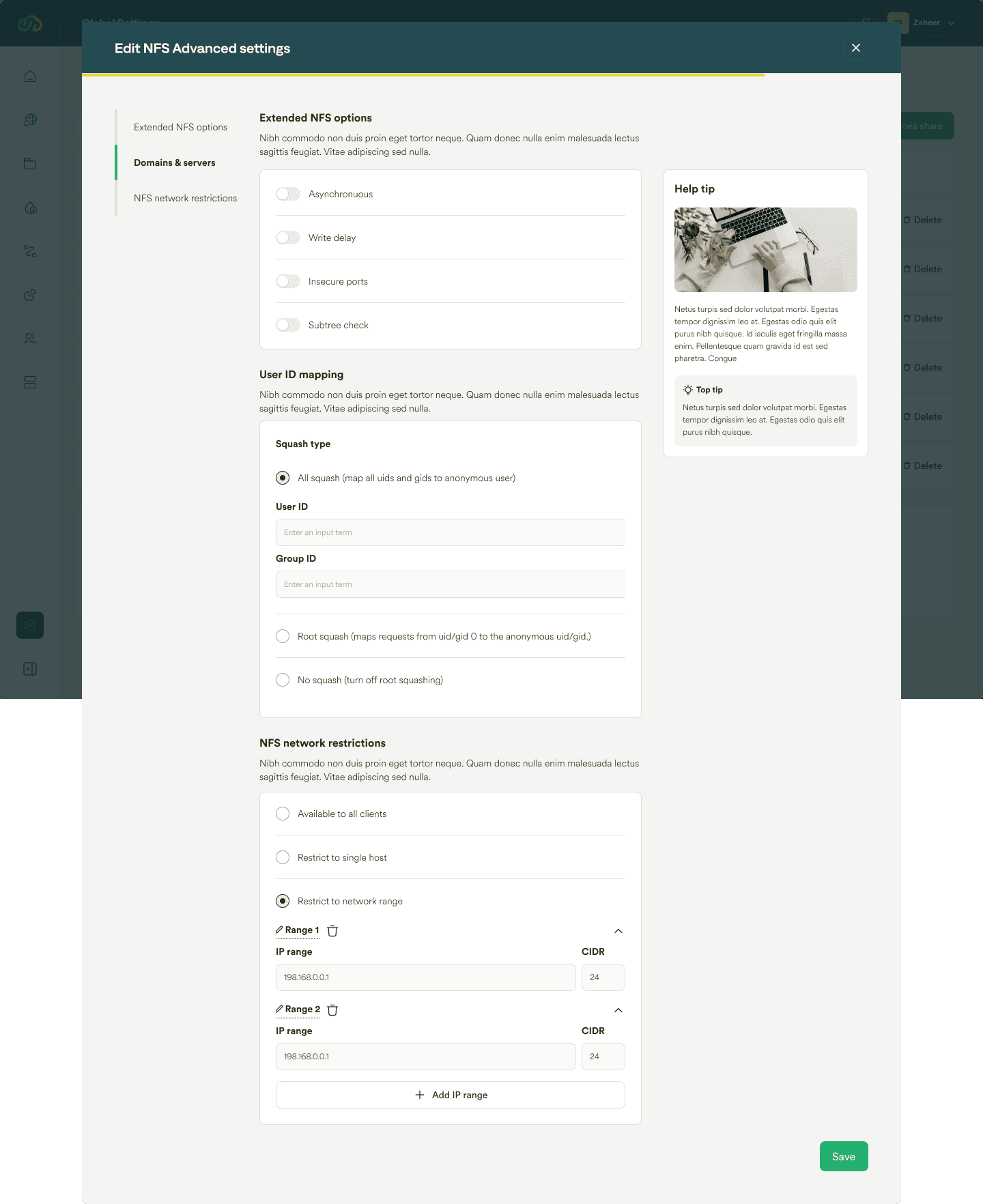
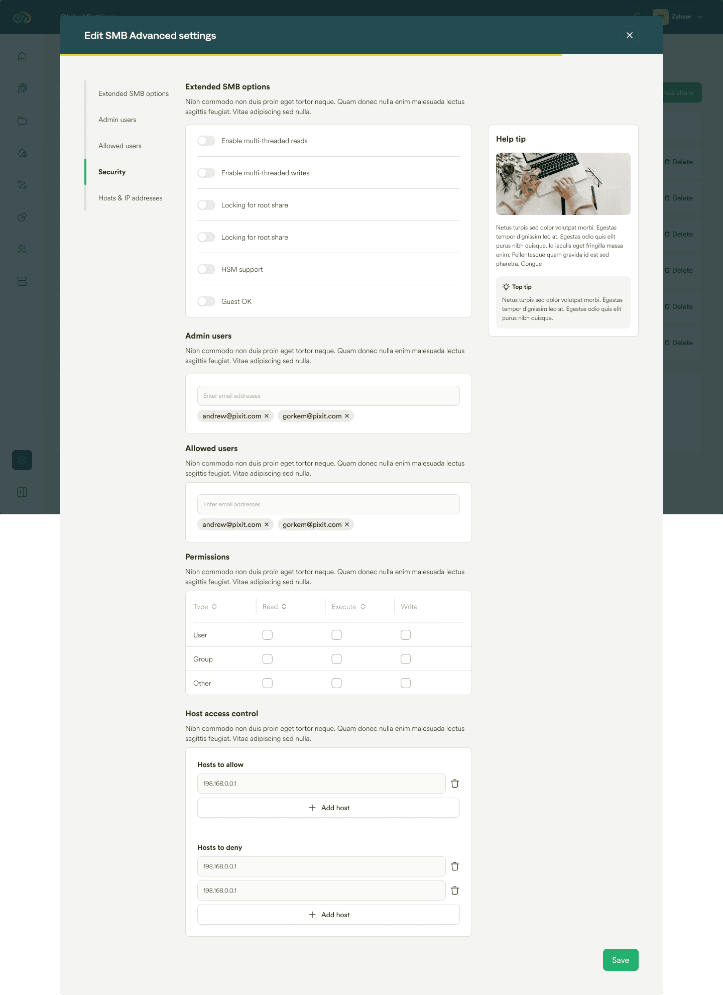
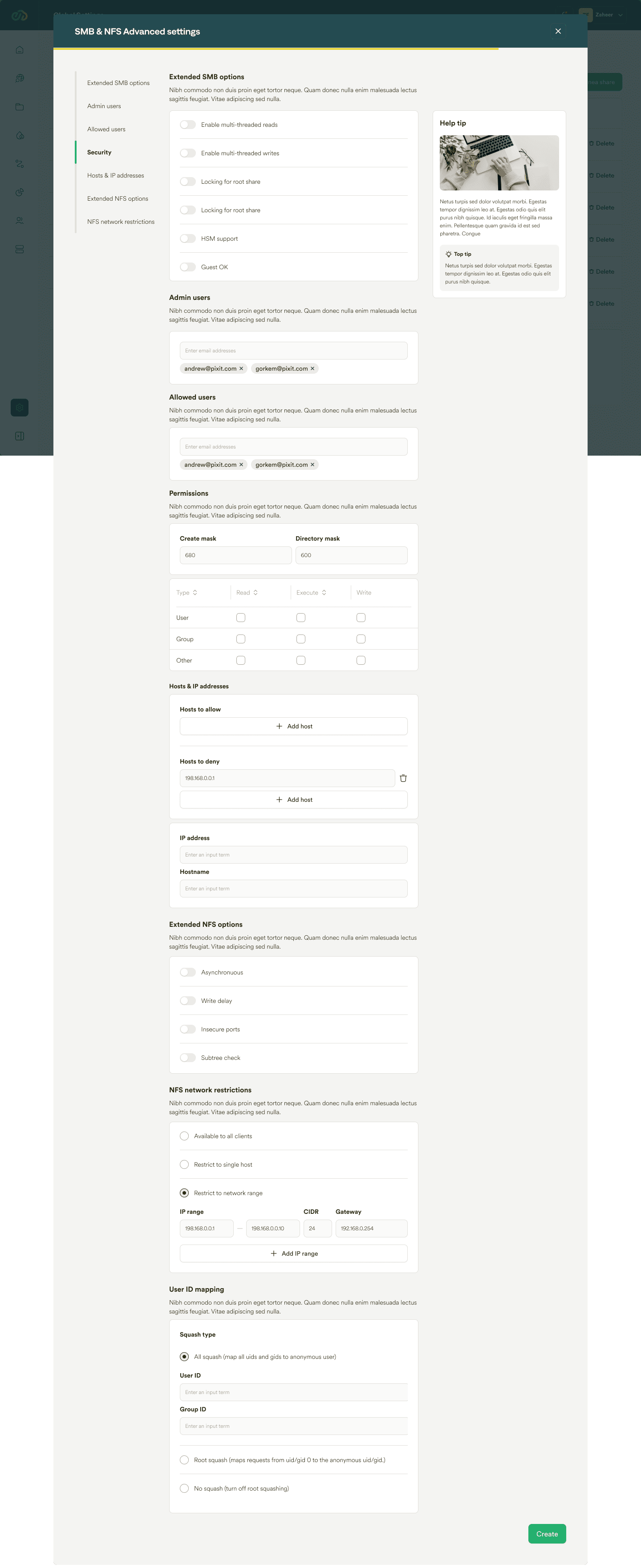
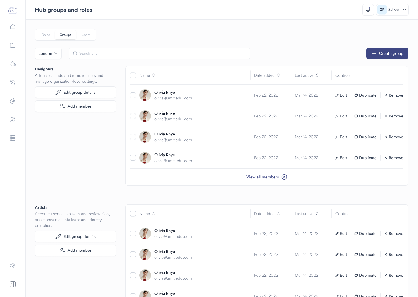
3. Security, Compliance, and Access Control:
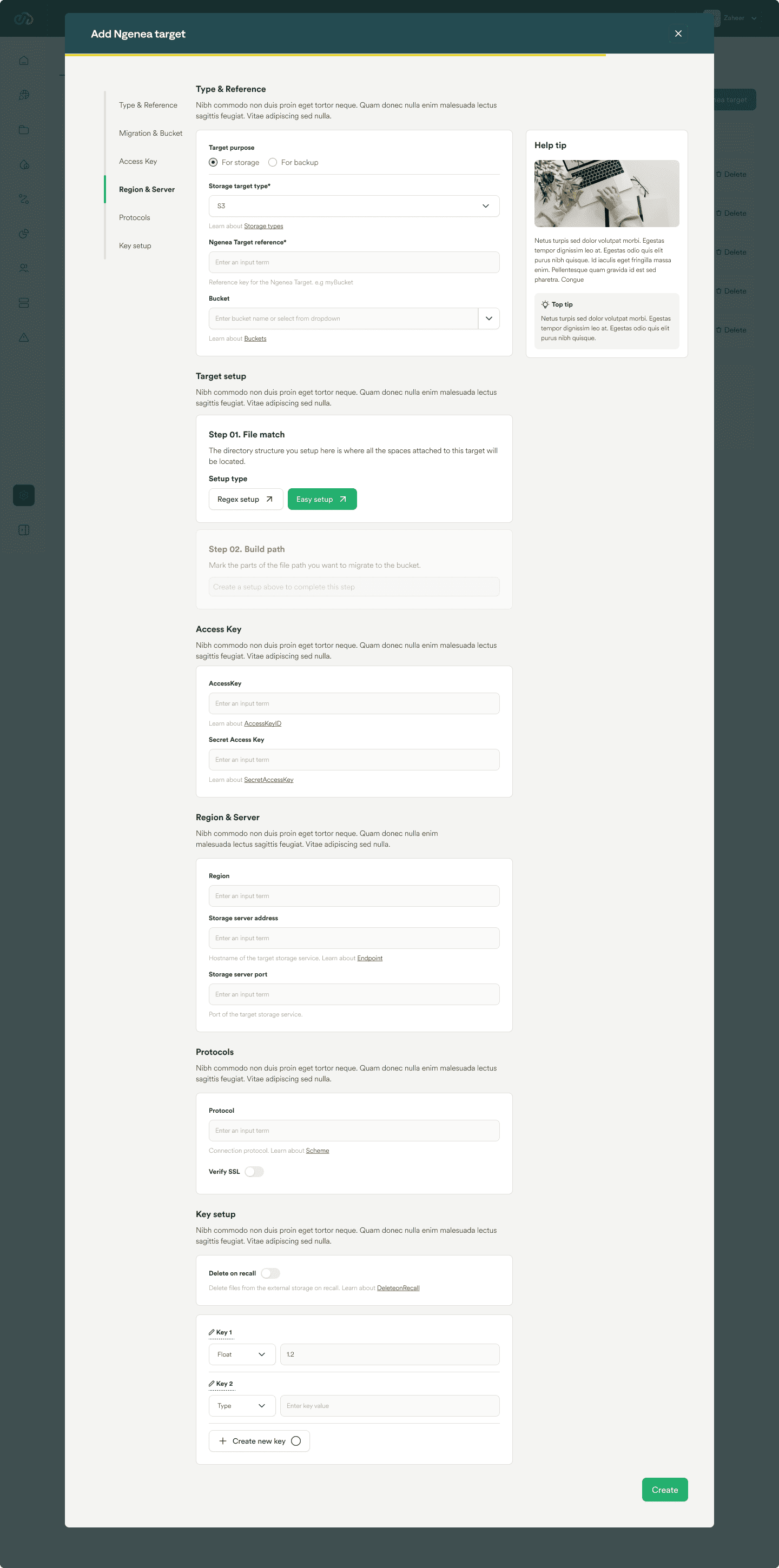
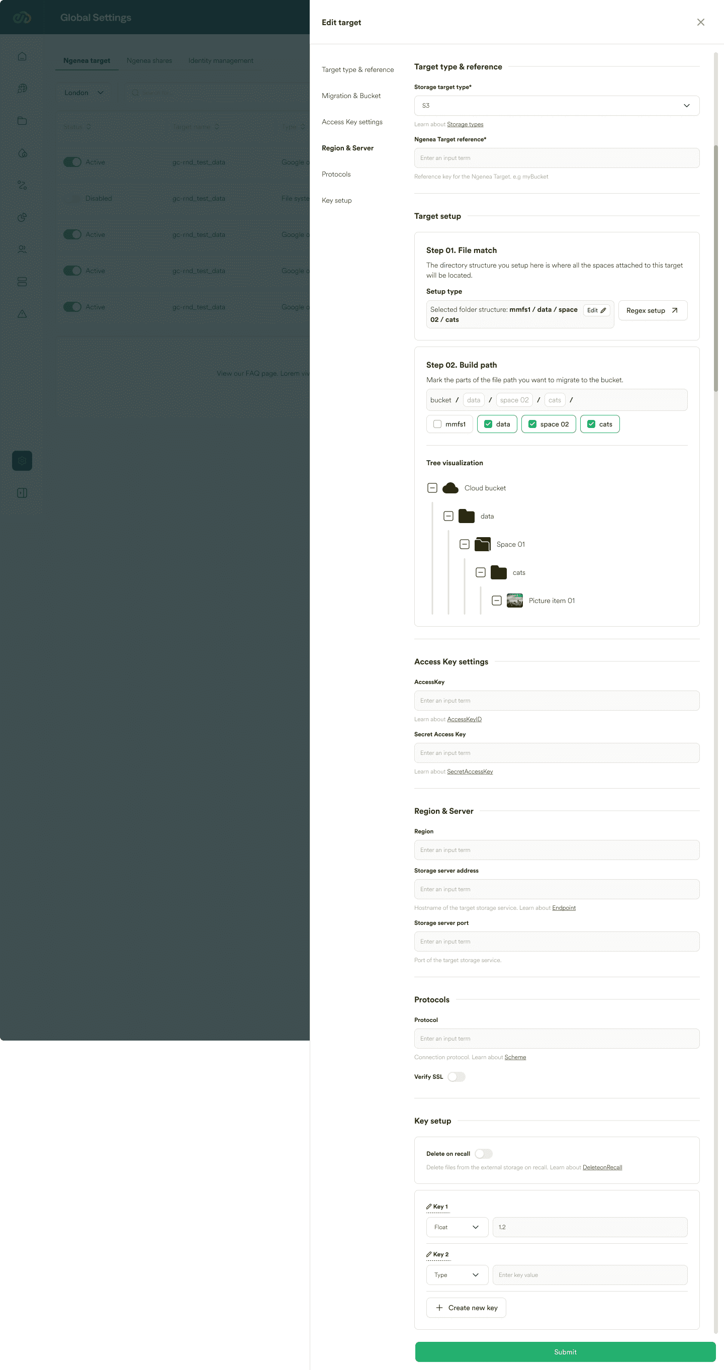
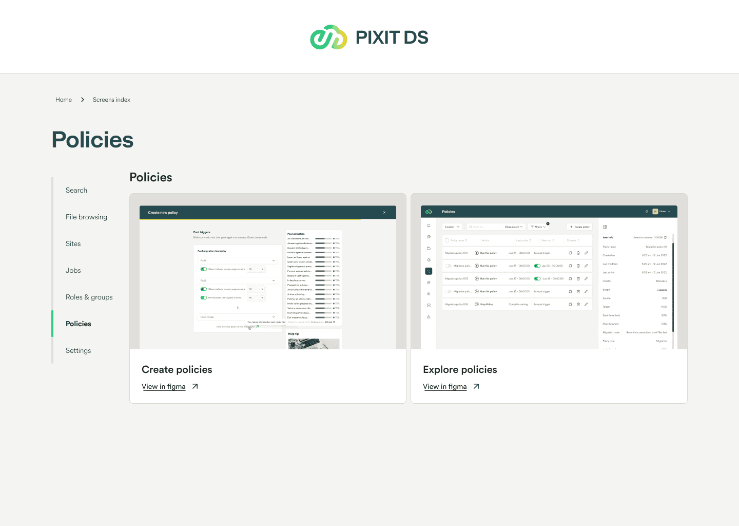
Concerns about data security, compliance with regional laws, and efficient access management are prominent. Users desire robust security measures, transparent data transfer processes, role-based access controls, and features that align with legal requirements to enhance trust and control over data.

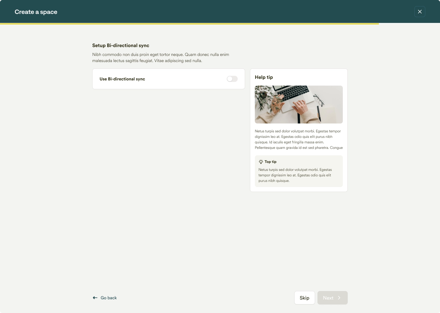
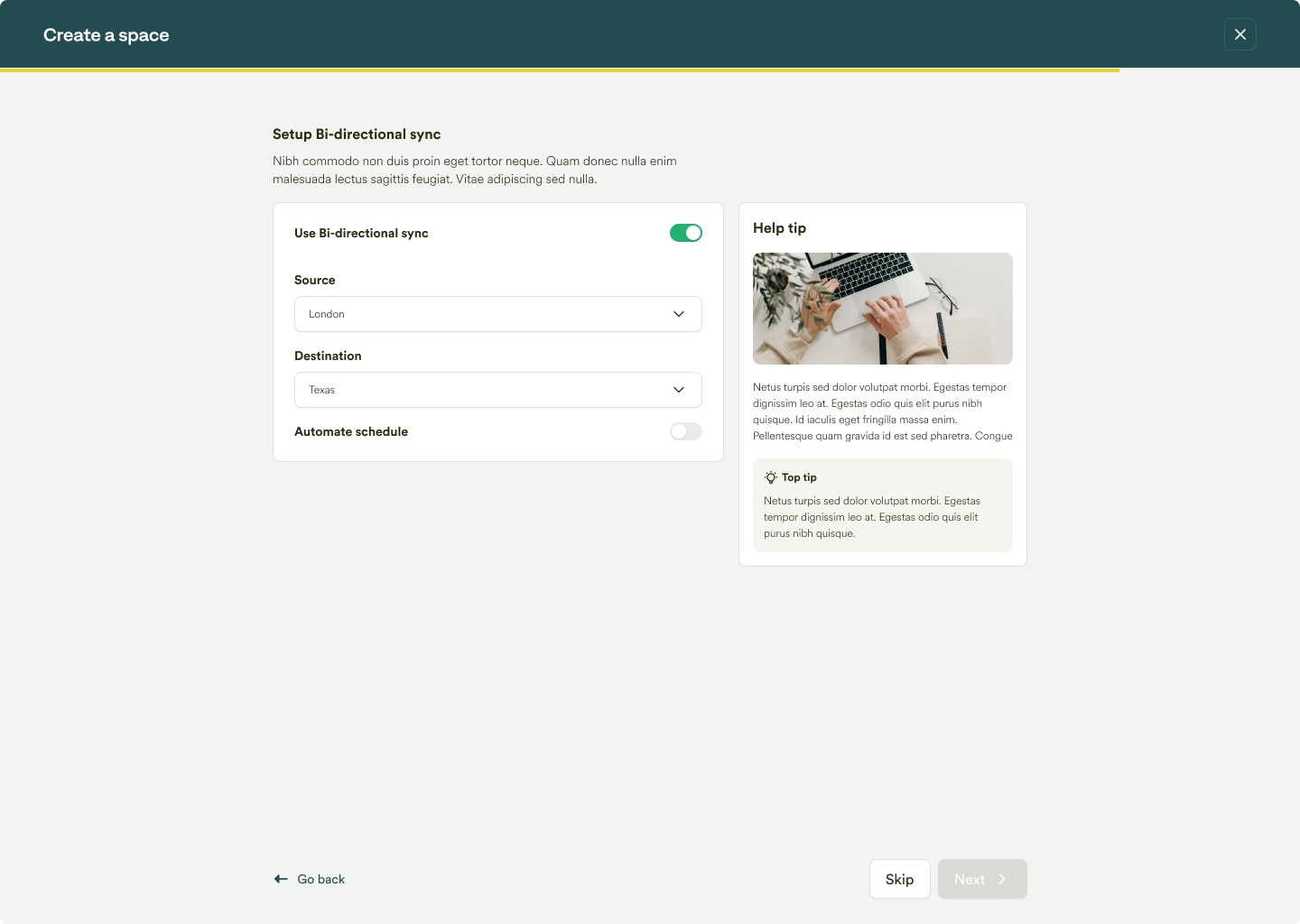
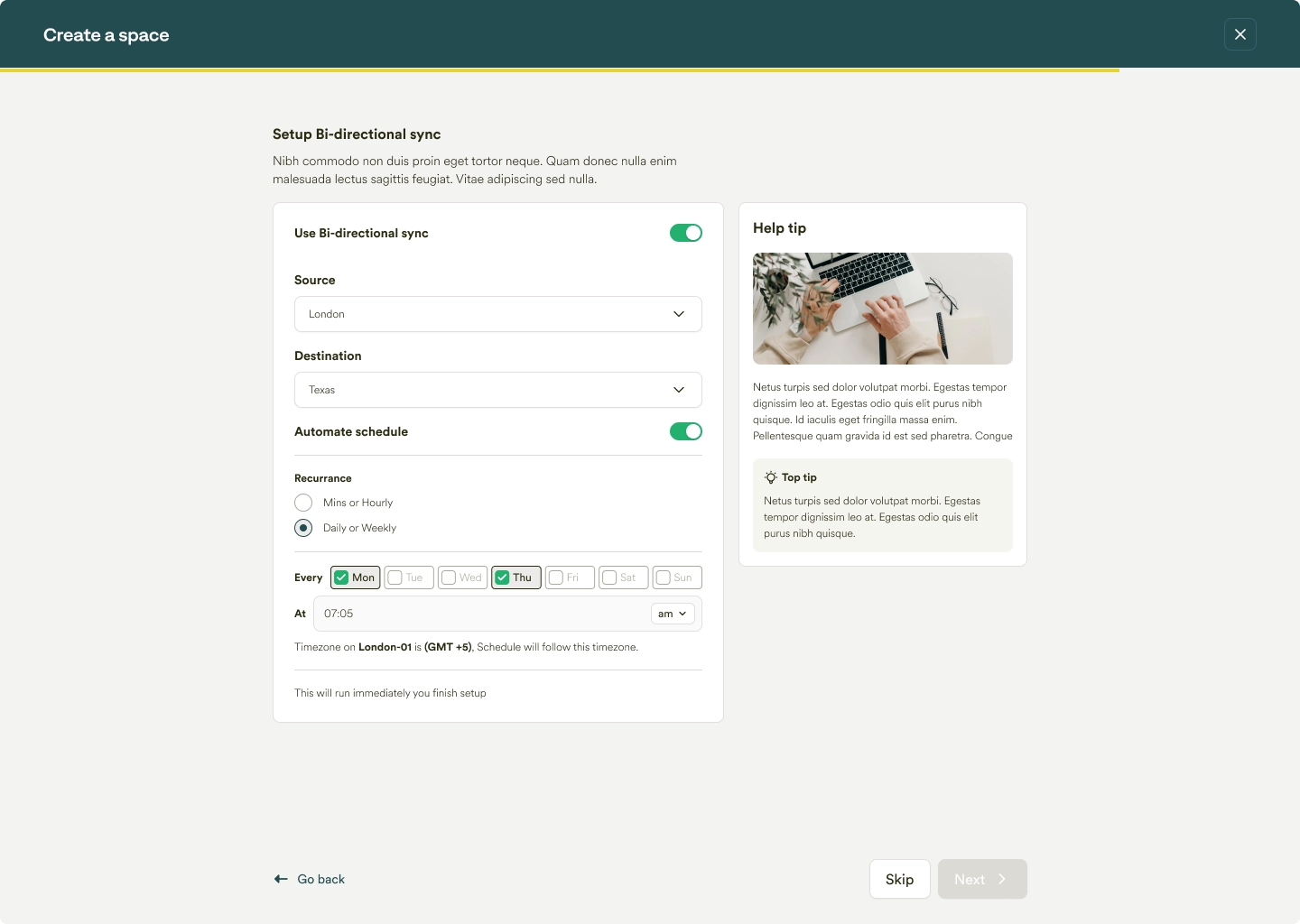
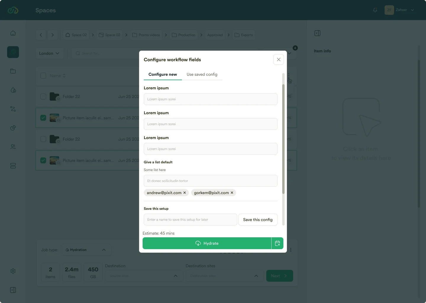
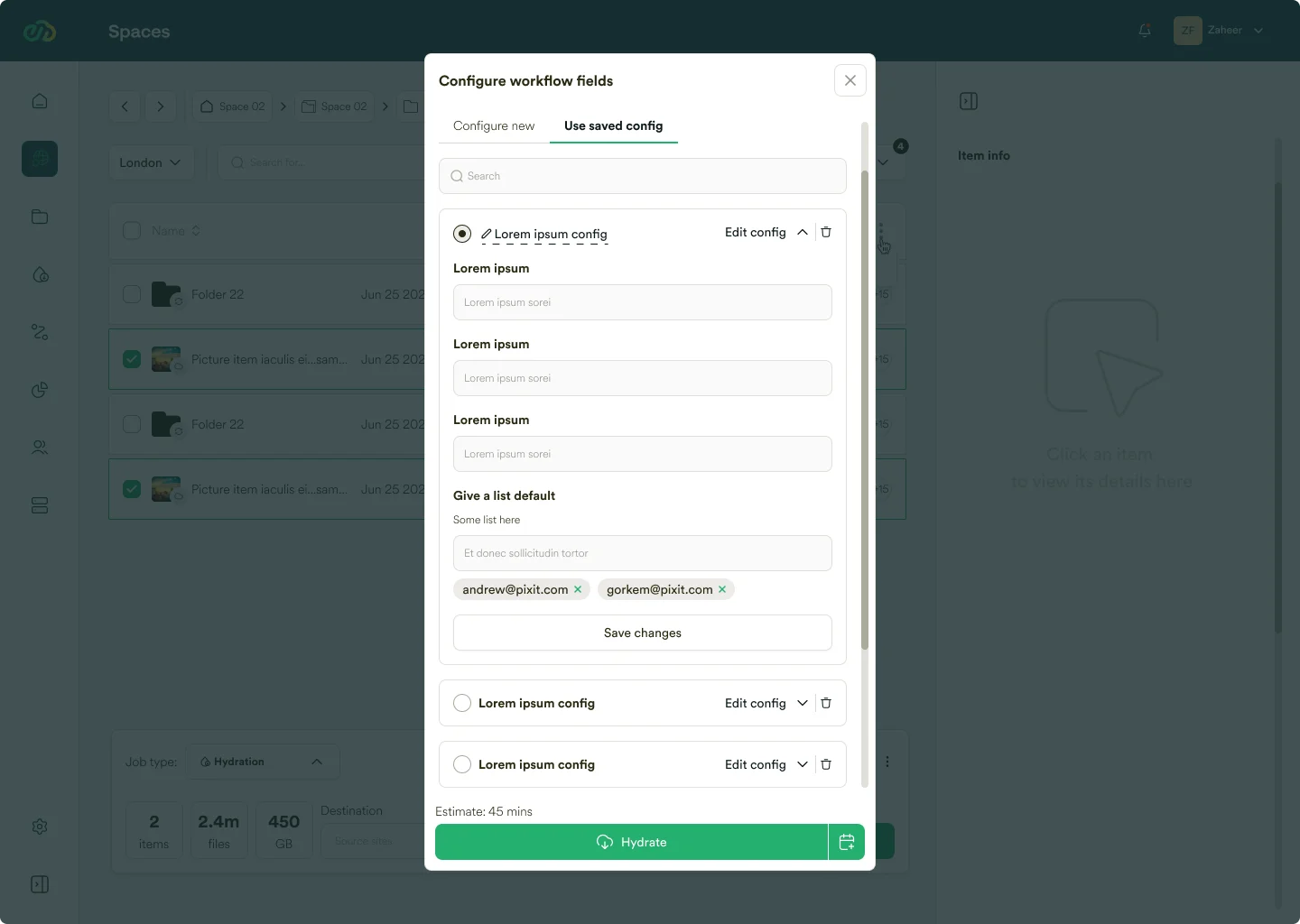
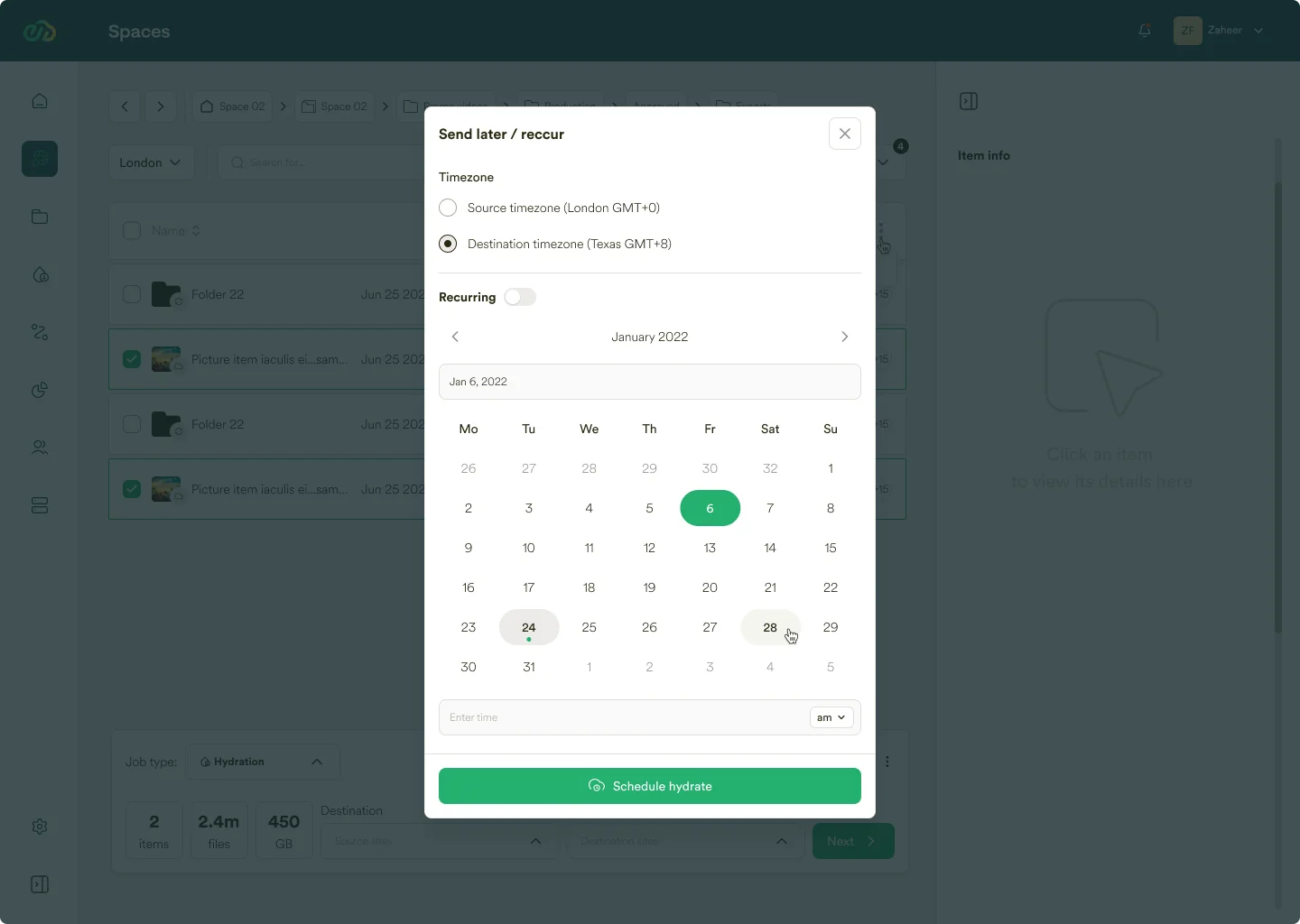
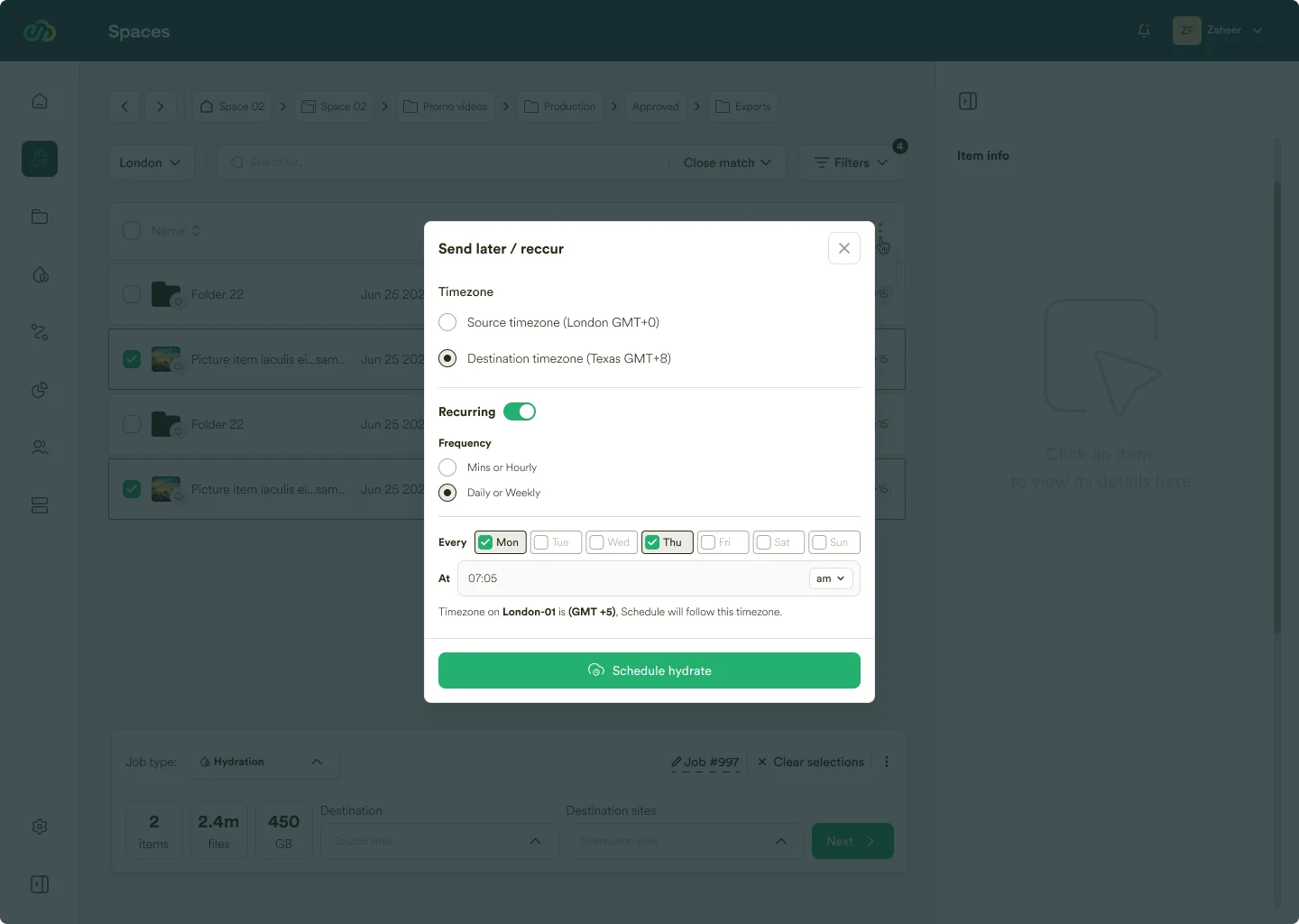
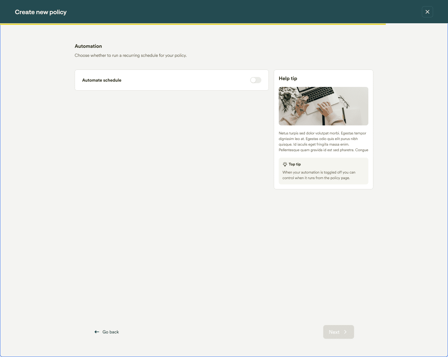
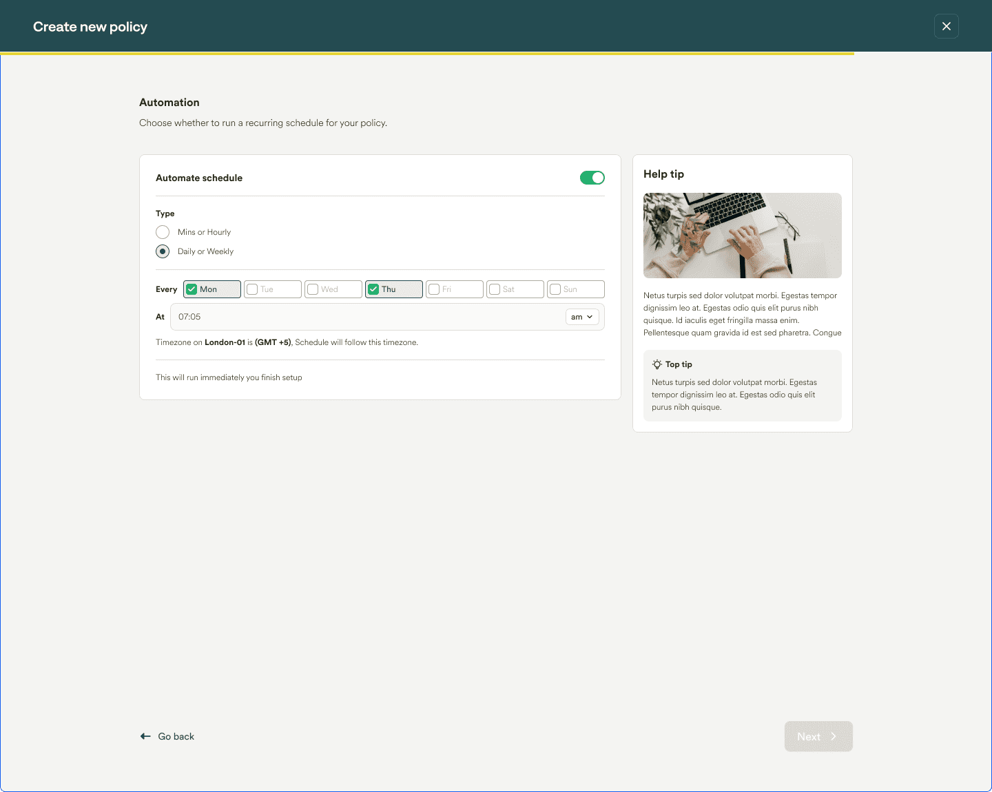
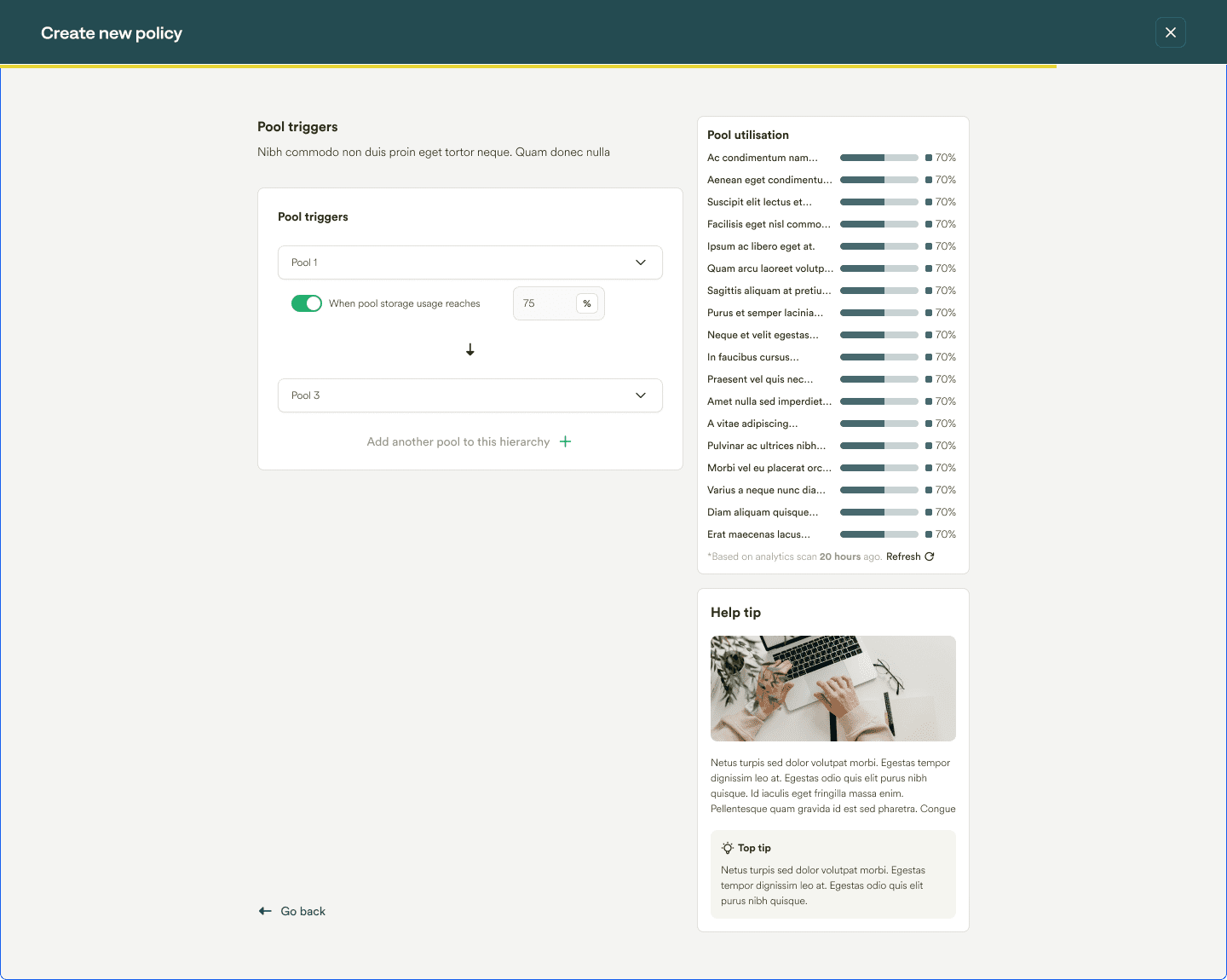
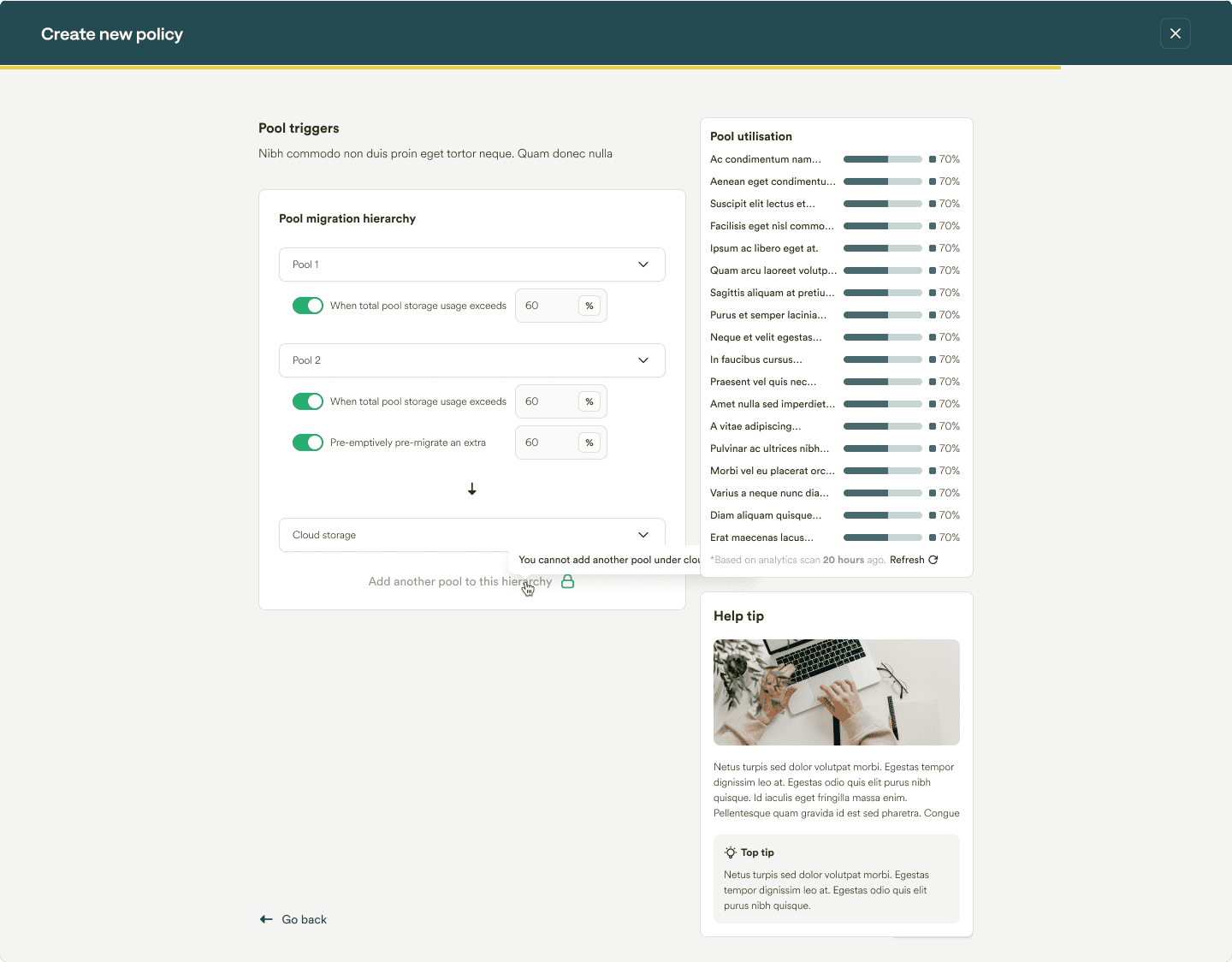
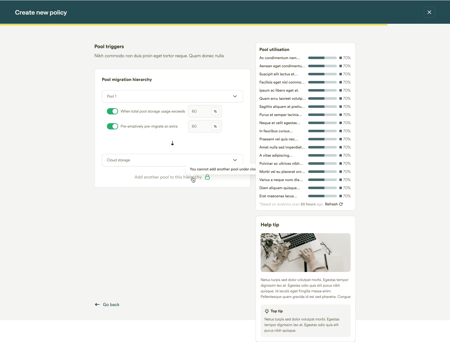
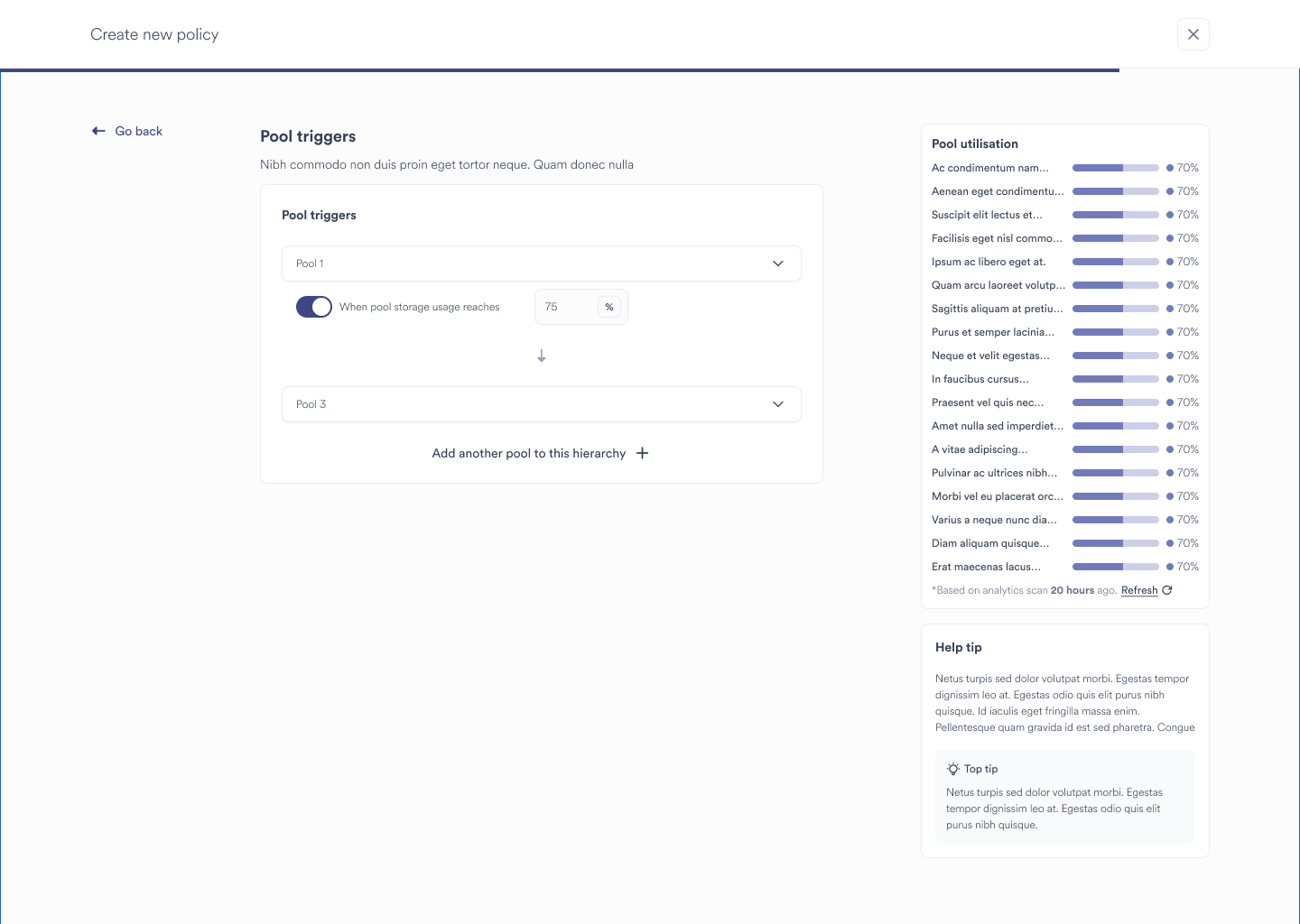
4. Automation, Flexibility, and Customization:
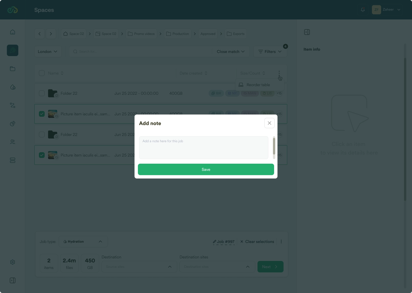
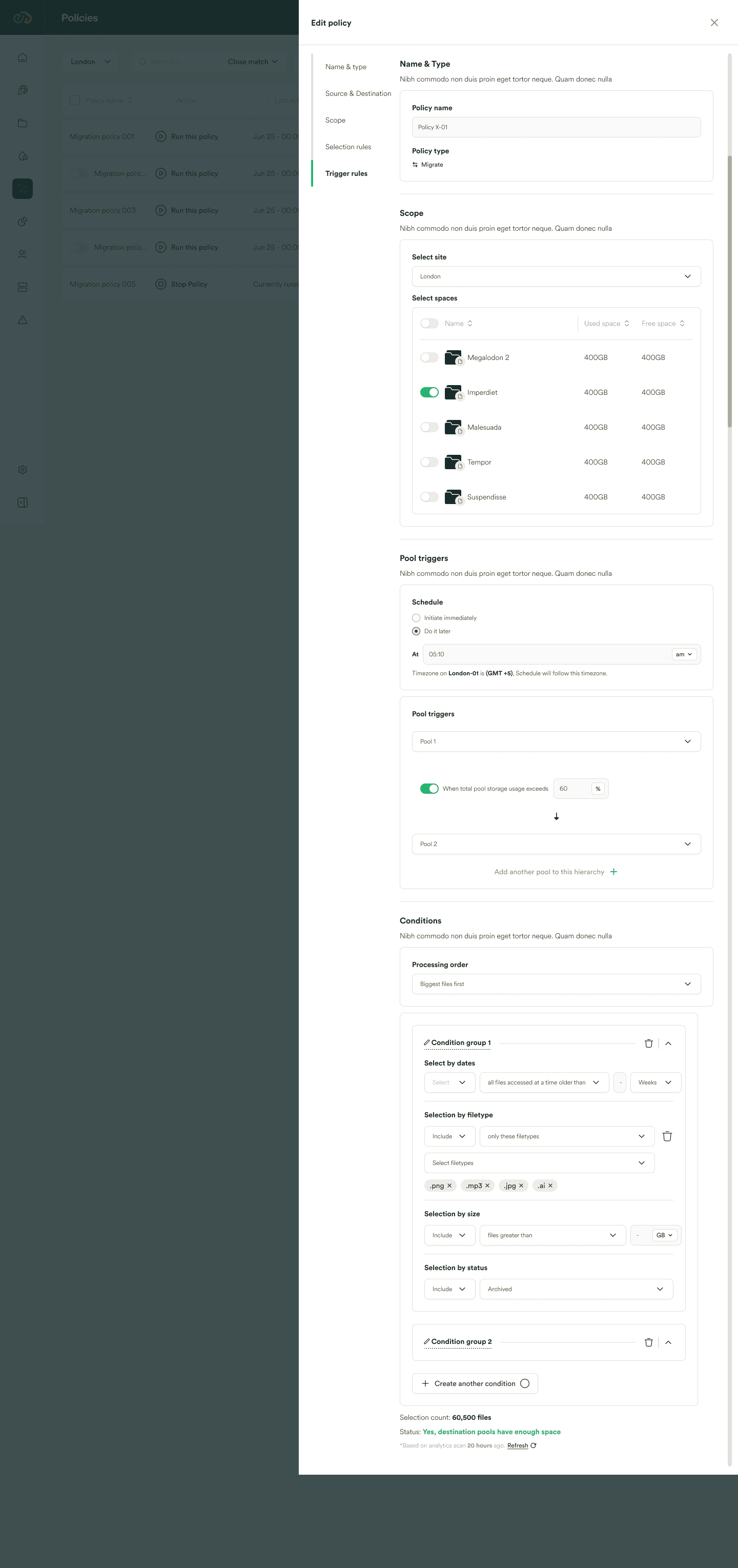
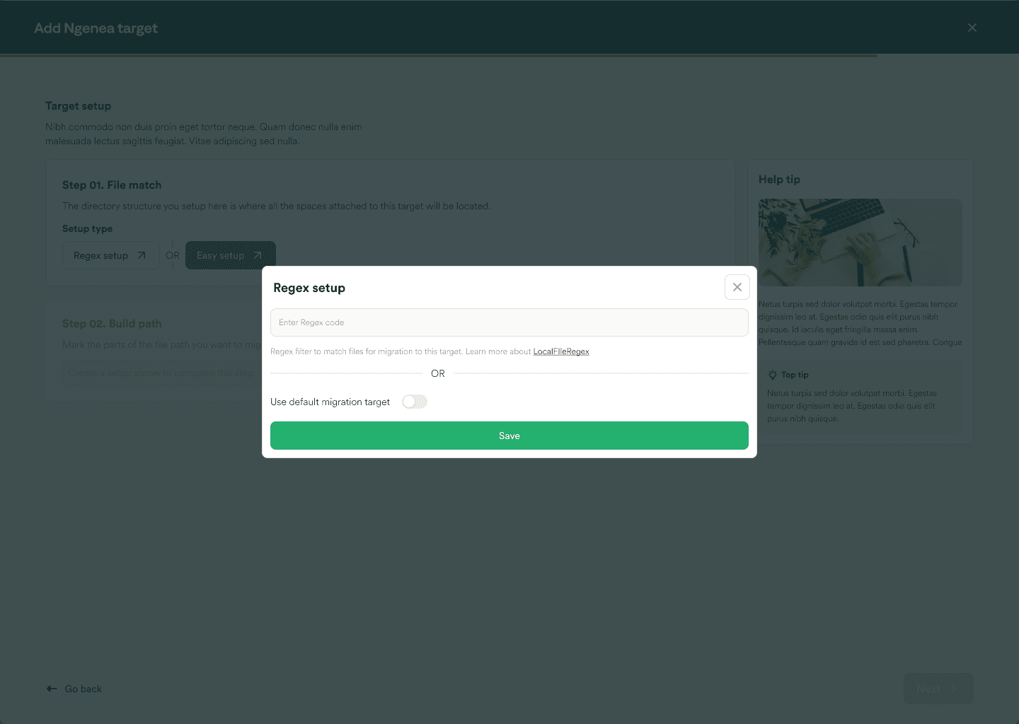
Users require automation features for tasks like policy scheduling, real-time updates, and error prevention mechanisms. Flexibility in customizing policies, storage settings, and workflows is essential to adapt to evolving needs and preferences.

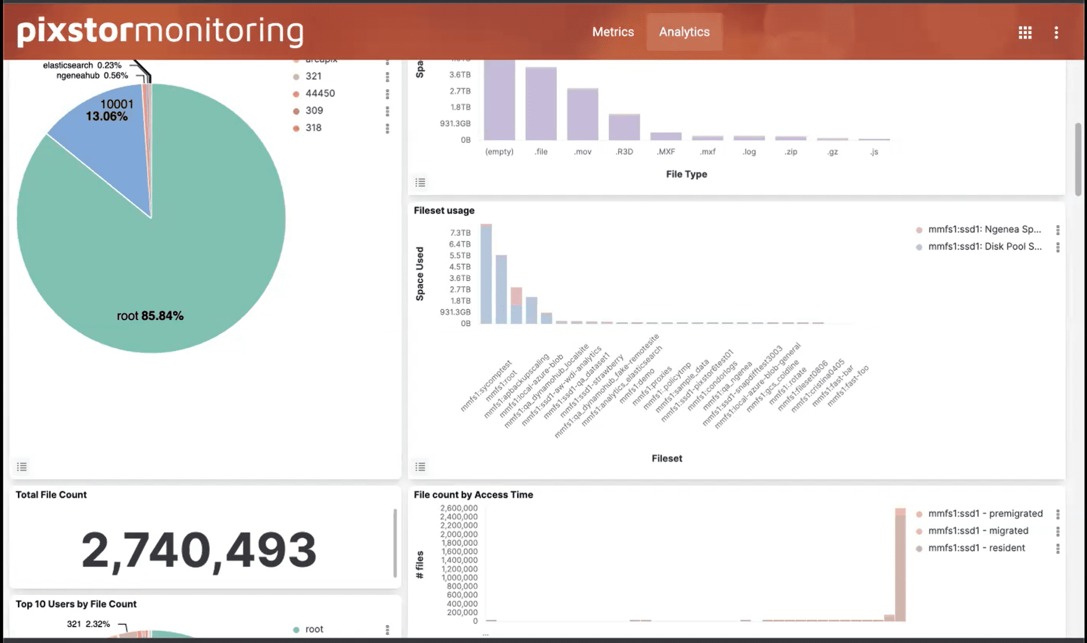
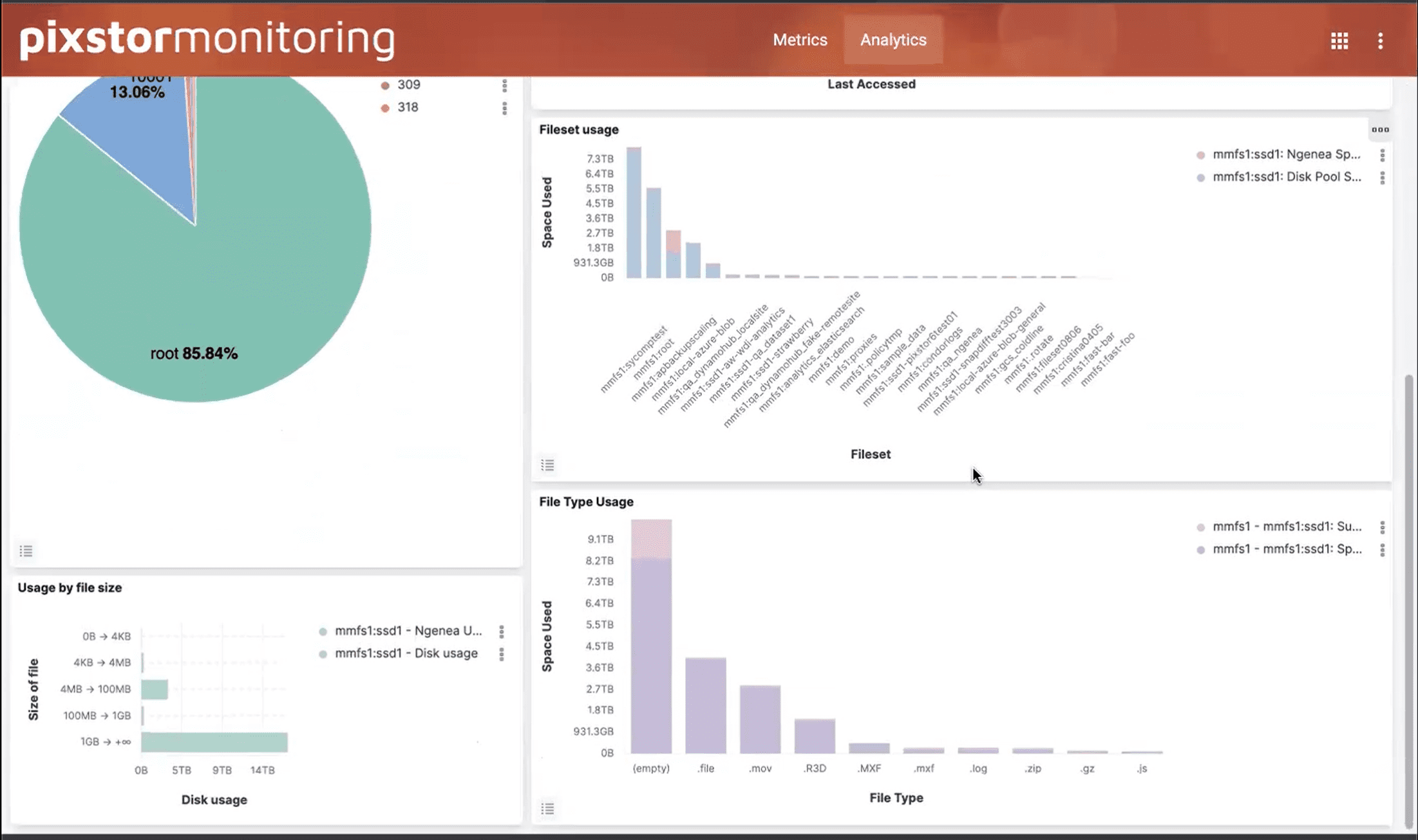
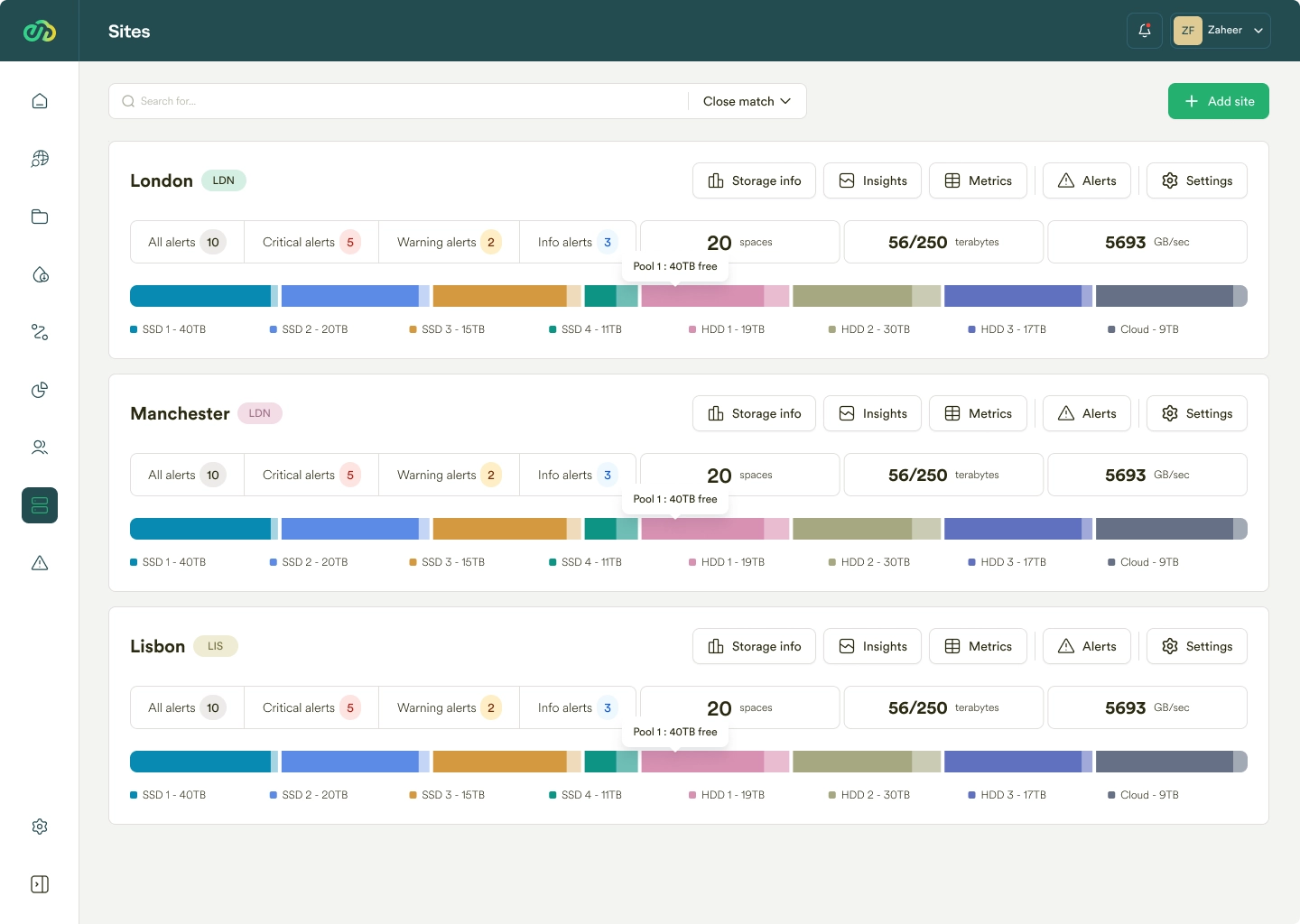
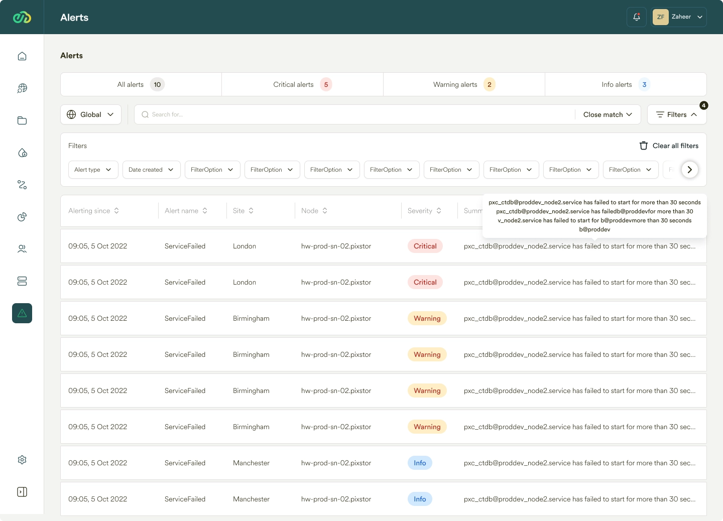
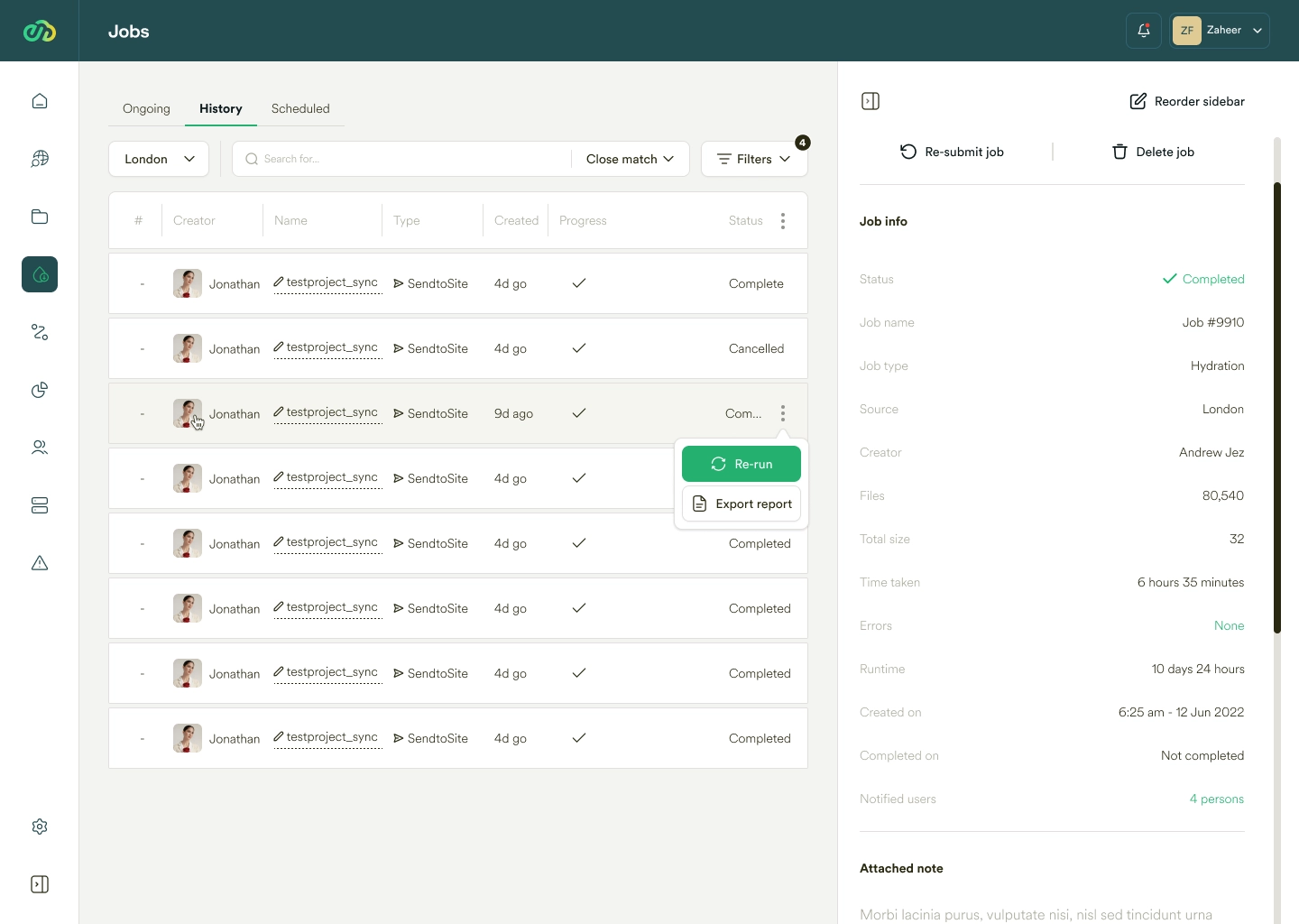
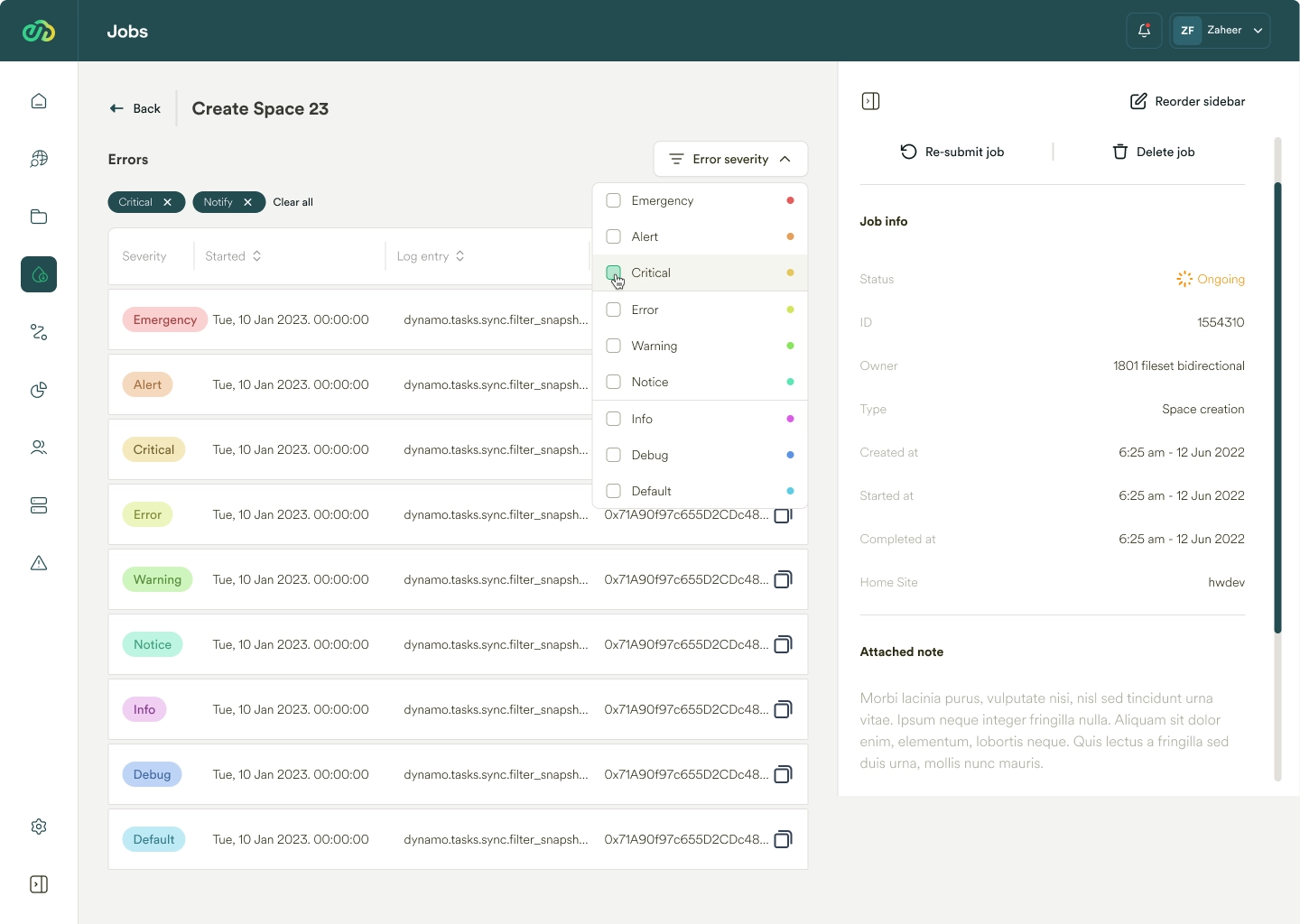
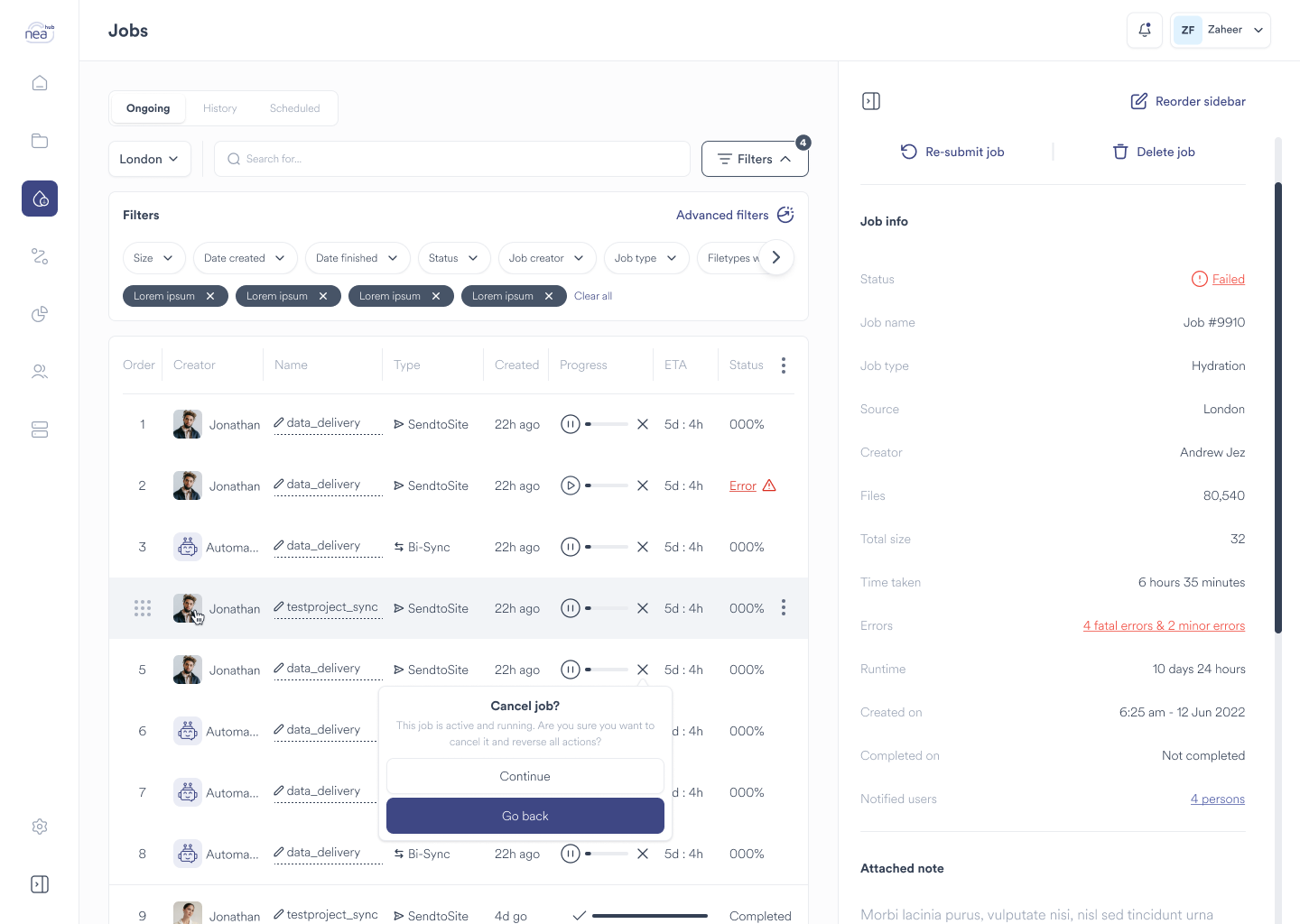
5. Visibility and Monitoring:
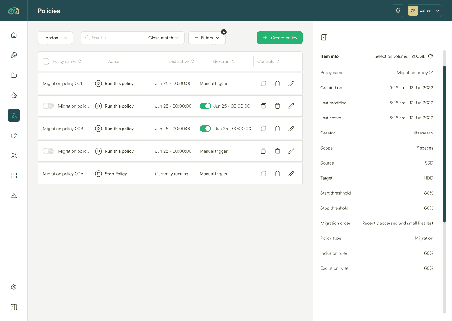
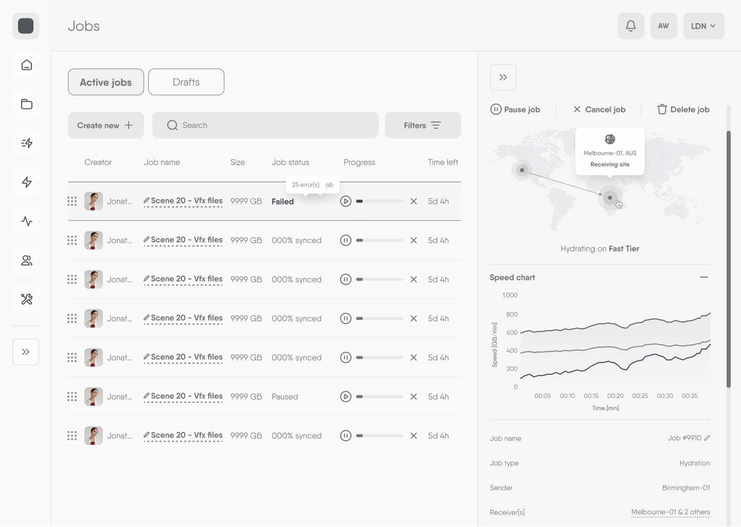
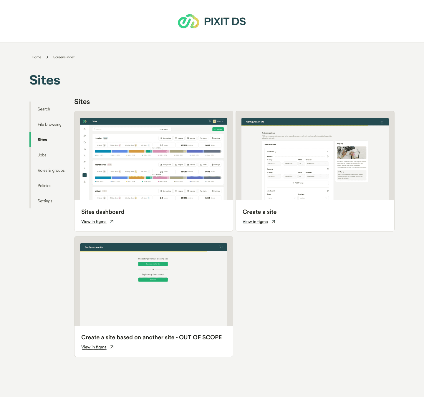
Real-time tracking, visual aids, and comprehensive dashboards are needed for effective monitoring and management of files, storage, and system health. Users want to feel informed and in control by having a clear overview of system status, file paths, and processing statuses.

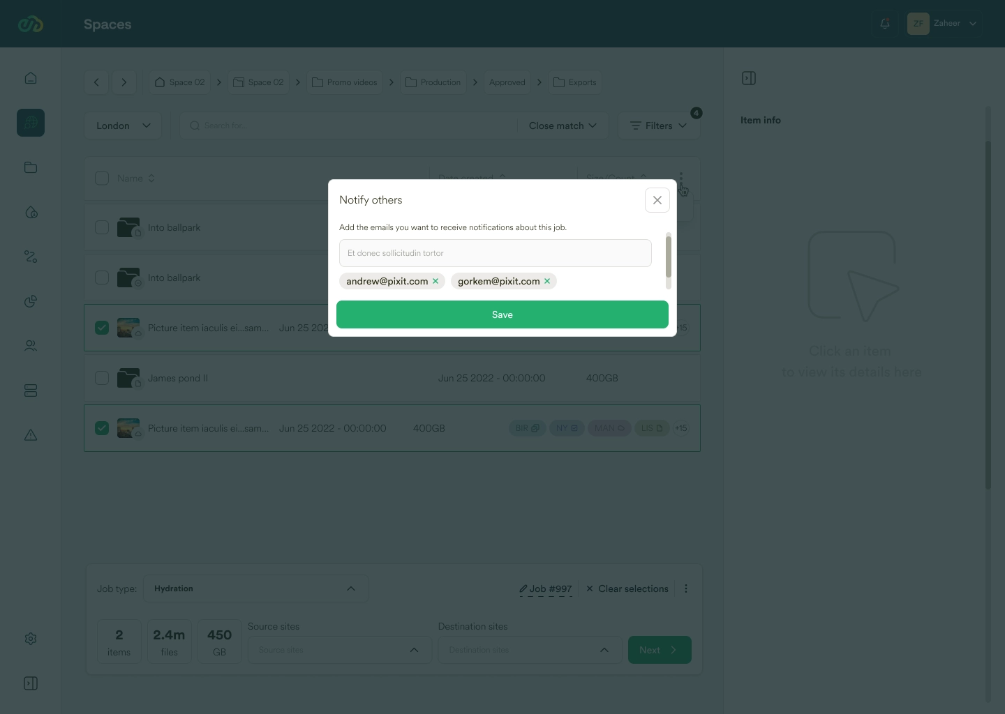
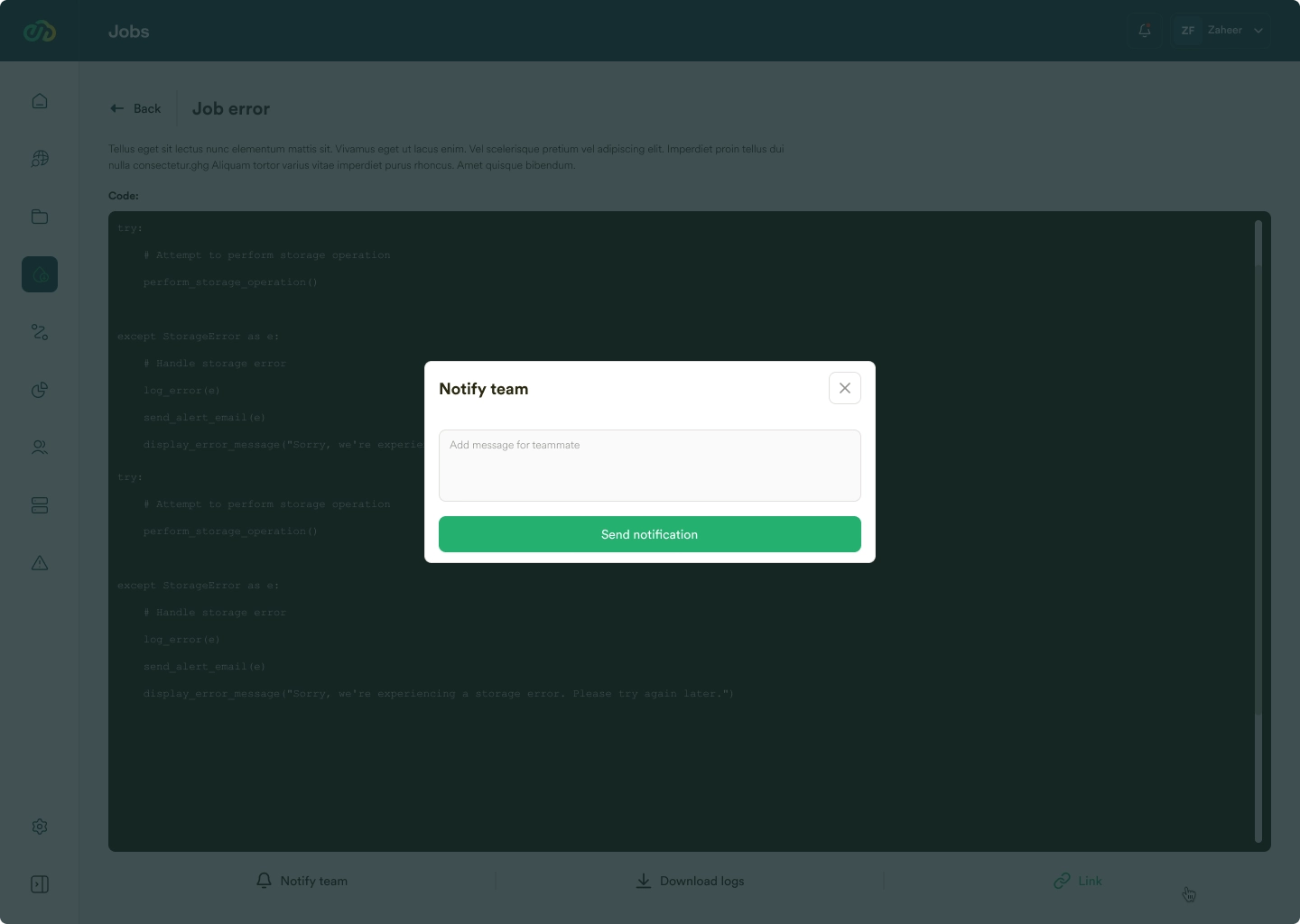
6. Communication and Notifications:
Efficient communication systems and notification controls are desired for better coordination and timely responses. Implementing alert categorization, real-time notifications, and a dedicated notification center will help users stay informed and responsive.

7. Data Analysis and Reporting:
Users need tools for generating targeted reports and analyzing data. Customizable report generation features and data descriptors are important for in-depth analysis and management.

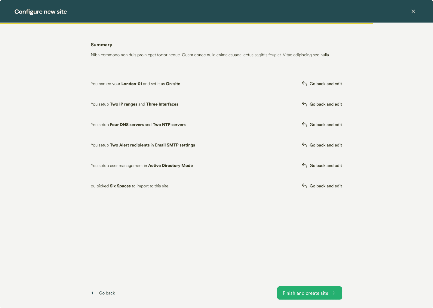
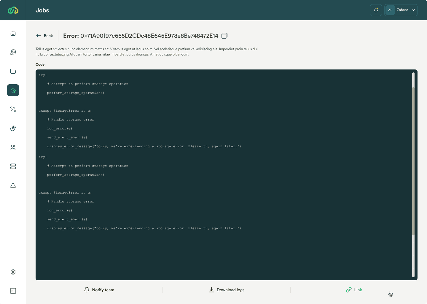
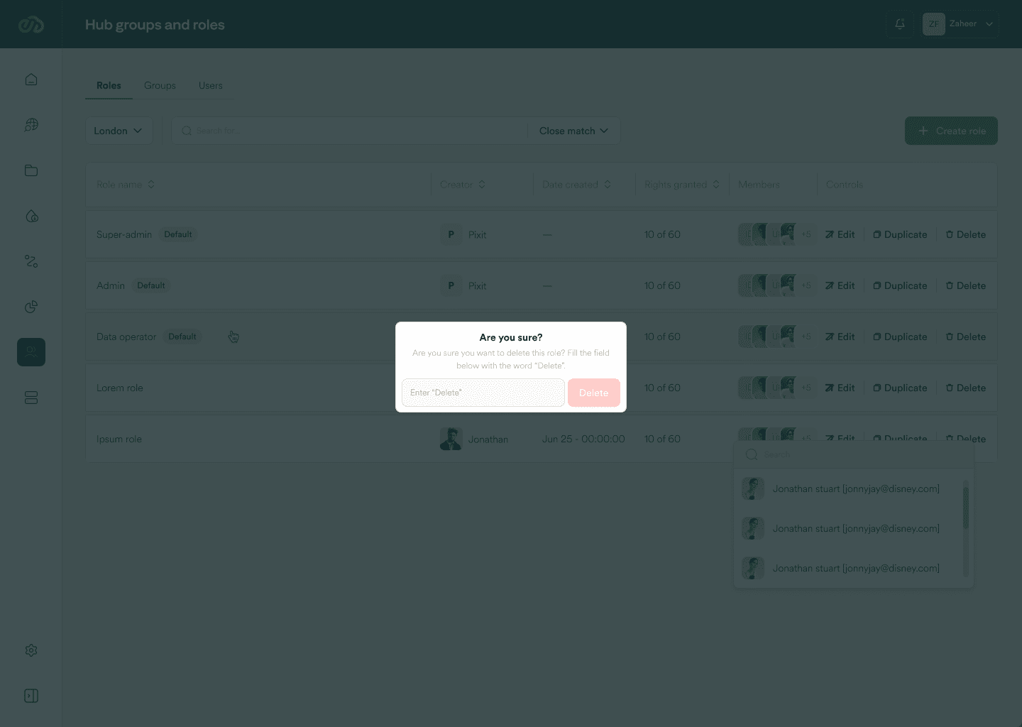
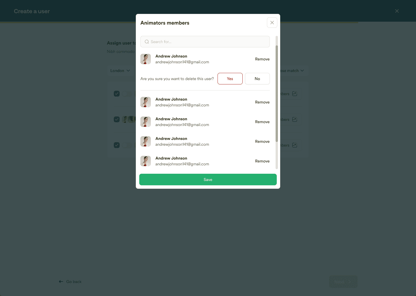
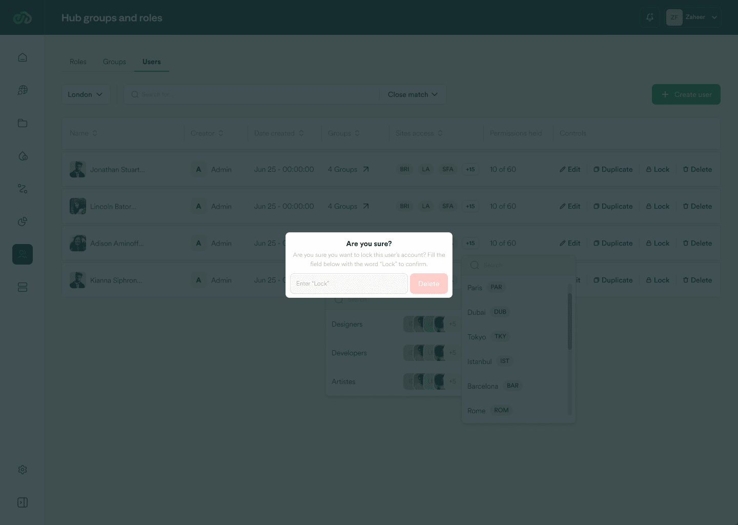
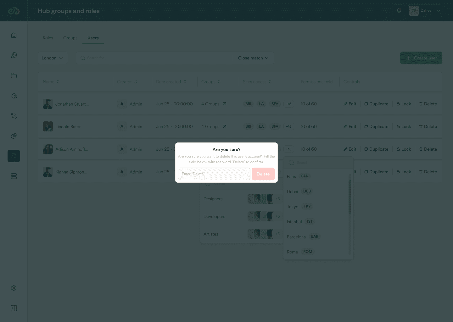
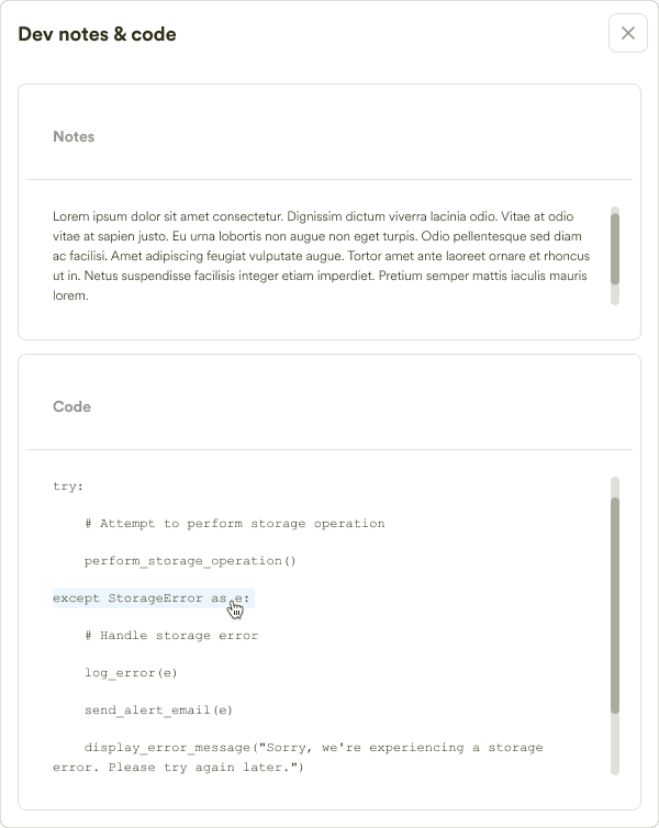
8. Error Prevention and User Confirmation:
There’s a focus on preventing errors and providing confirmation steps to enhance system reliability. Users want to avoid accidental changes and ensure accuracy in their configurations and actions.

9. Support and Documentation:
Access to immediate support, comprehensive documentation, and user-friendly help resources is crucial for user empowerment and self-sufficiency. This includes FAQs, help guides, and contextual assistance for technical configurations.

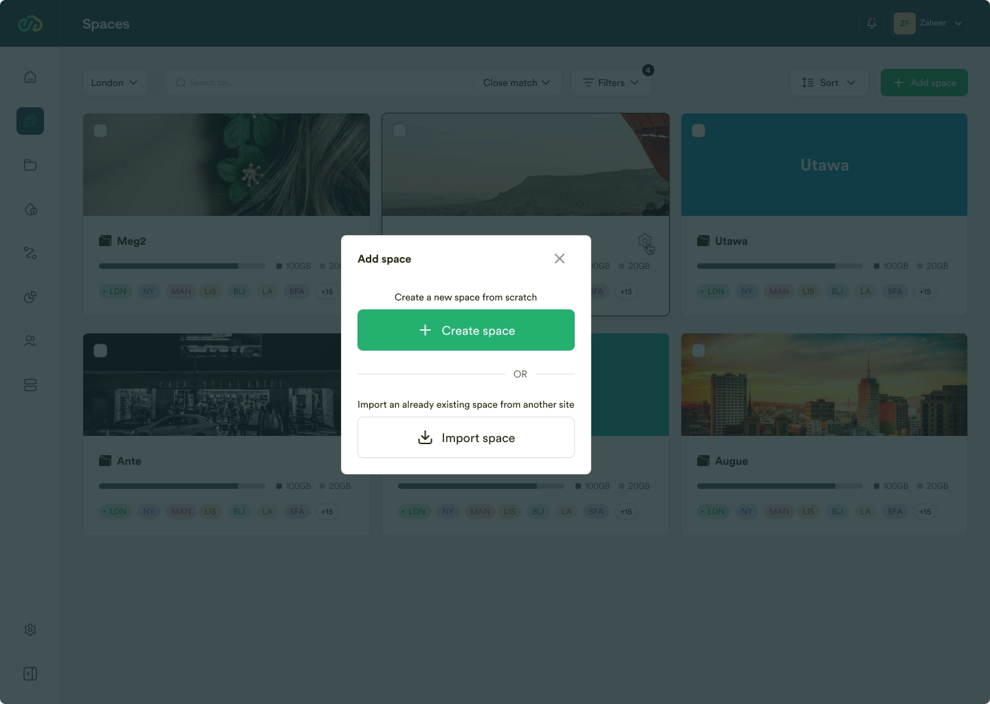
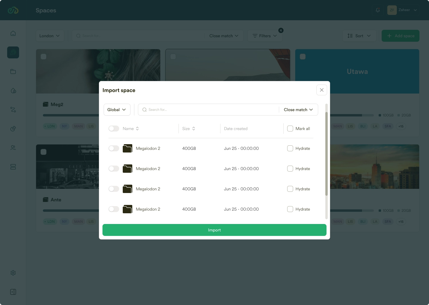
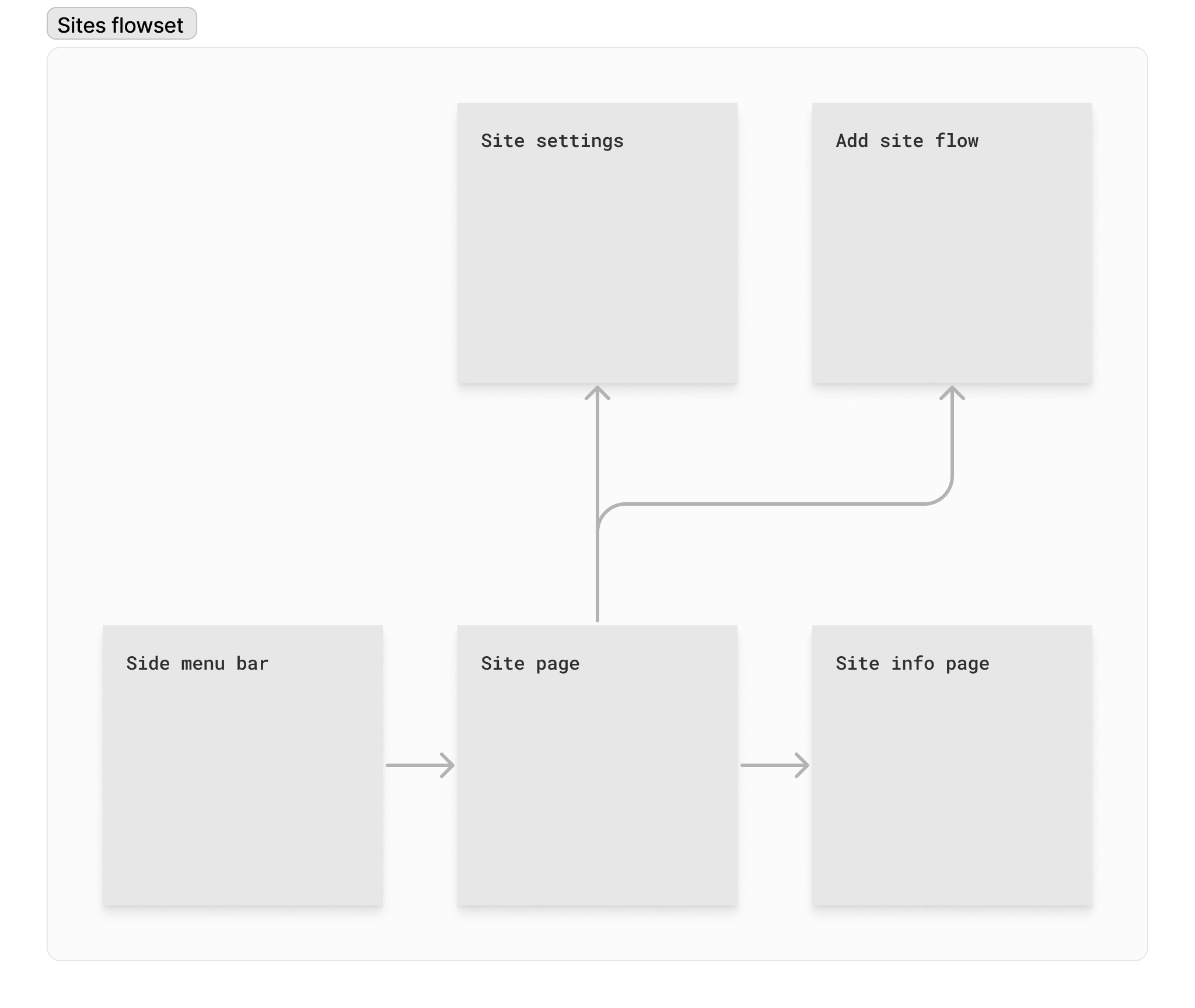
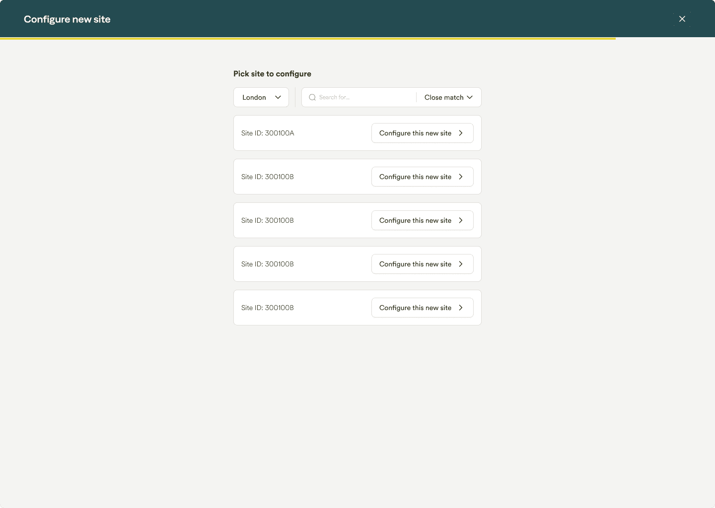
10. System Integration and Scalability:
Users require seamless integration of new features or sites and tools for managing system expansion. Streamlined onboarding processes, setup wizards, and scalable solutions are key for managing growth and change.

These insights highlight the importance of creating user-centric systems with advanced search capabilities, intuitive interfaces, robust security, flexible customization options, effective monitoring and communication tools, and comprehensive support resources.

Below are examples research reports, scroll left to see them all.

User persona creation

Putting faces to the users

Creating personas for the Pixit Ngenea redesign project was essential because it helped us better understand and represent our users. After conducting research sessions, we developed these personas to encapsulate the diverse needs, behaviors, and goals of our users. This approach allowed us to visualize and empathize with our target audience more effectively, making it easier to tailor the redesign to suit their specific requirements and enhance their overall experience with the product.

Feature prioritization

What do we build first?

After generating a list of features, it was time to decide how to allocate time and resources, i.e., feature prioritization. In my method for determining which features to prioritize, I use specific measurements and simple mathematical formulas to effectively weigh different aspects. This approach ensures that the prioritization document balances urgency, user needs, stakeholder needs, and the demands of the industry in which the business operates during that period of technological advancement.
 
Firstly, I divide features into three distinct categories:
  1. Non-negotiables: These are essential features that must be included.
  2. Negotiables: These are important features, but there’s some flexibility in their implementation.
  3. Delight-focused: These features are primarily aimed at enhancing user delight and engagement.
This goal is to prioritize and develop features in this order: first, the non-negotiables are addressed. Once these are in place, we move on to the negotiable features, and finally, we focus on delight-focused features.
 
However, within each category, there’s further prioritization. Within the non-negotiables, flows / set of features are prioritized based on the ‘flow prioritization score.’ and within each flow / set of features, specific features are prioritized according to their individual ‘feature prioritization score.’ This structured approach ensures a balanced development process, addressing critical needs first while also considering user engagement and satisfaction.
Framework Metrics
  1. User Desirability Score (UDS): This metric evaluates user interest in a feature, focusing on the extent of desire and delight it brings, rated on a scale from 1 to 7. It measures the anticipated positive impact on user experience. This score is also influenced by the designer’s knowledge of how often users use or are likely to use the feature.  The score is primarily assigned by designers, who represent user perspectives gathered through interactions.
  2. Stakeholder Desirability Score (SDS):

    This score rates stakeholder interest, considering the feature’s potential impact on the company and expected return on investment (ROI). It ranges from 1 to 7, reflecting the value stakeholders perceive in the feature, and is mainly assigned by the company’s stakeholders.

  3. Strategy Alignment Score (SAS): This assesses how well a feature aligns with the company’s long-term strategy and vision. The score, ranging from 1 to 7, measures the feature’s congruence with the company’s goals and strategic direction. This metric is jointly assigned by designers and stakeholders.
  4. Market Trend Alignment Score (MTAS): This score evaluates the feature’s alignment with current and emerging market trends, including user behavior shifts, technological advancements, and industry dynamics. Rated on a 1 to 7 scale, it reflects the product’s positioning in the evolving market. Predominantly influenced by stakeholders, this is also a joint assignment metric.
  5. Competitive Differentiation Score (CDS): This evaluates the feature’s potential to differentiate the product in the market. It assesses if the feature fills a market gap, offers superiority to competitors, or adds a unique value proposition. Rated from 1 to 7, this score emphasizes the feature’s uniqueness and competitive edge. This joint assignment metric is influenced by insights from designers’ competition research and stakeholders’ industry knowledge.
  6. Effort Score (ES): This estimates the effort and resources required for feature development. Rated on a 1 to 7 scale, it gauges the feasibility and resource intensity of the development, considering time, cost, and labor. This metric is mainly influenced by design and development teams, who reach a consensus on the effort required from both design and development perspectives.
Formulas for Prioritization
  1. Impact Score (IS): Calculated by adding the User Desirability Score, Stakeholder Desirability Score, Strategy Alignment Score, Market Trend Alignment Score, and Competitive Differentiation Score. IS=UDS+SDS+SAS+MTAS+CDS
  2. Feature Prioritization Score (FPS): Determined by dividing the Impact Score by the Effort Score. FPS=IS/ES
  3. Flow Total Prioritization Score (TPS): The sum of all individual Feature Prioritization Scores in that flow / feature set. TPS=SumofallFPS

To see all this in practice, below is a part of our feature prioritization doc

Wireframes

Making ideas visible

Once we had decided on the order to build things I startedcreating the physical representation of the ideas we had come up with.

Inspiration gathering & Moodboard creation

To translate our ideas into effective visuals, my partner and I had searched the internet for existing UI patterns that aligned with our vision. We examined design patterns in products like Dropbox, OneDrive, and my Samsung phone’s file manager, as well as other products that effectively aggregated data from multiple sources. Although we needed to present more details to the user compared to traditional storage management apps, observing how they simplified their interfaces proved very useful.

Below are some wireframes we made, explore the figma file to view them all.

Use the +,- buttons to zoom in and drag with your mouse to move around

I also created interactive prototypes to begin testing assumptions and ideas as early as possible.

After months of designing, testing, and iterating, the wireframes underwent numerous changes. We realized the need to modify, remove, and add various elements. Below, you can see the initial wireframes compared to the final designs of a few screens that were ultimately shipped.

Before After
Before After
Before After
Before After
Before After
Before After
VIsual direction docs

How do we want this to look?

Once the wireframes reached a satisfactory stage, the focus shifted towards increasing their fidelity. The design team collectively chose a minimalist aesthetic, primarily using a white color scheme with strategic splashes of blue. This approach was aimed at creating a clean, visually appealing interface that emphasizes simplicity and ease of use.

Three weeks into the high-fidelity design phase, two stakeholders with veto power intervened, influenced by the company’s recent acquisition by Kalray. They advocated for a palette shift towards green and greenish-gray to align with the parent company’s branding. This led to a complete overhaul of the existing style guide, now developed collaboratively with all stakeholders, including the developers and my co-designer.

After some debate on visual elements like font choice, we transitioned from Gilroy to Circular Std, considering its legibility at various sizes, especially smaller ones. Below is the final style guide.

Early in the design process, I recognized the importance of developing a design system in parallel with the high-fidelity designs to ensure utility and immediate value upon handoff.

This approach involved identifying frequently reused elements, naming them appropriately, and documenting them with descriptions and variants. After additional weeks post-project to refine the system, I delivered a highly useful design system tailored to the company’s specific needs and workflows, adhering to the principle that design systems should be created only when necessary and designed to be maximally beneficial.

To showcase this system, we launched a design system website, featuring various screens I designed to illustrate its components and usage.

Foundations—

Components—

Screen index—

Impact

Results & closing remarks

At Pixit, my work on redesigning the flagship product Ngeneahub significantly enhanced user adoption by 20%, directly contributing to the company’s growth in the competitive media and entertainment technology sector.

The reduction of support queries by 38% and errors by 31% not only improved operational efficiency but also strengthened Pixit’s market position by elevating customer satisfaction and trust in our solutions.

Back